Grid System
Our brand communications are underpinned by grids that enable the construction of our distinctive layouts.
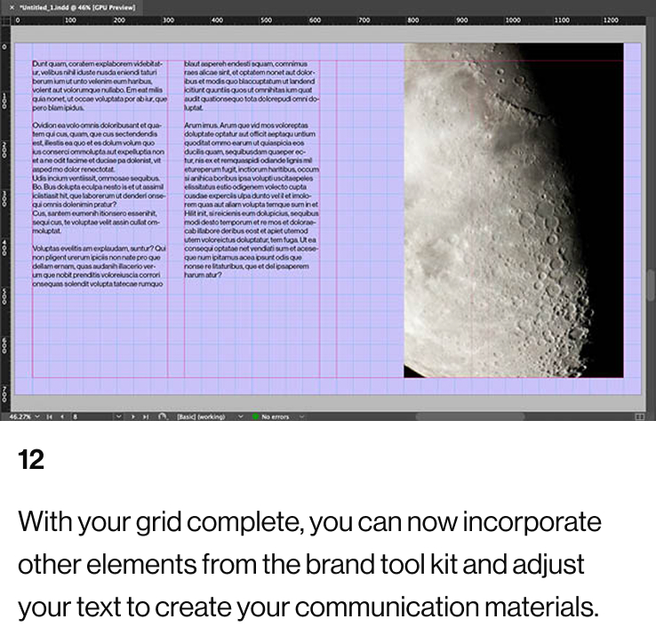
This section of the Brand Portal shows how you can use the grids to creatively and correctly incorporate imagery, colour blocks, typography, and other design elements.

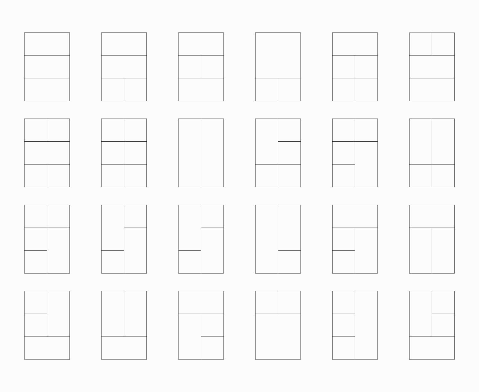
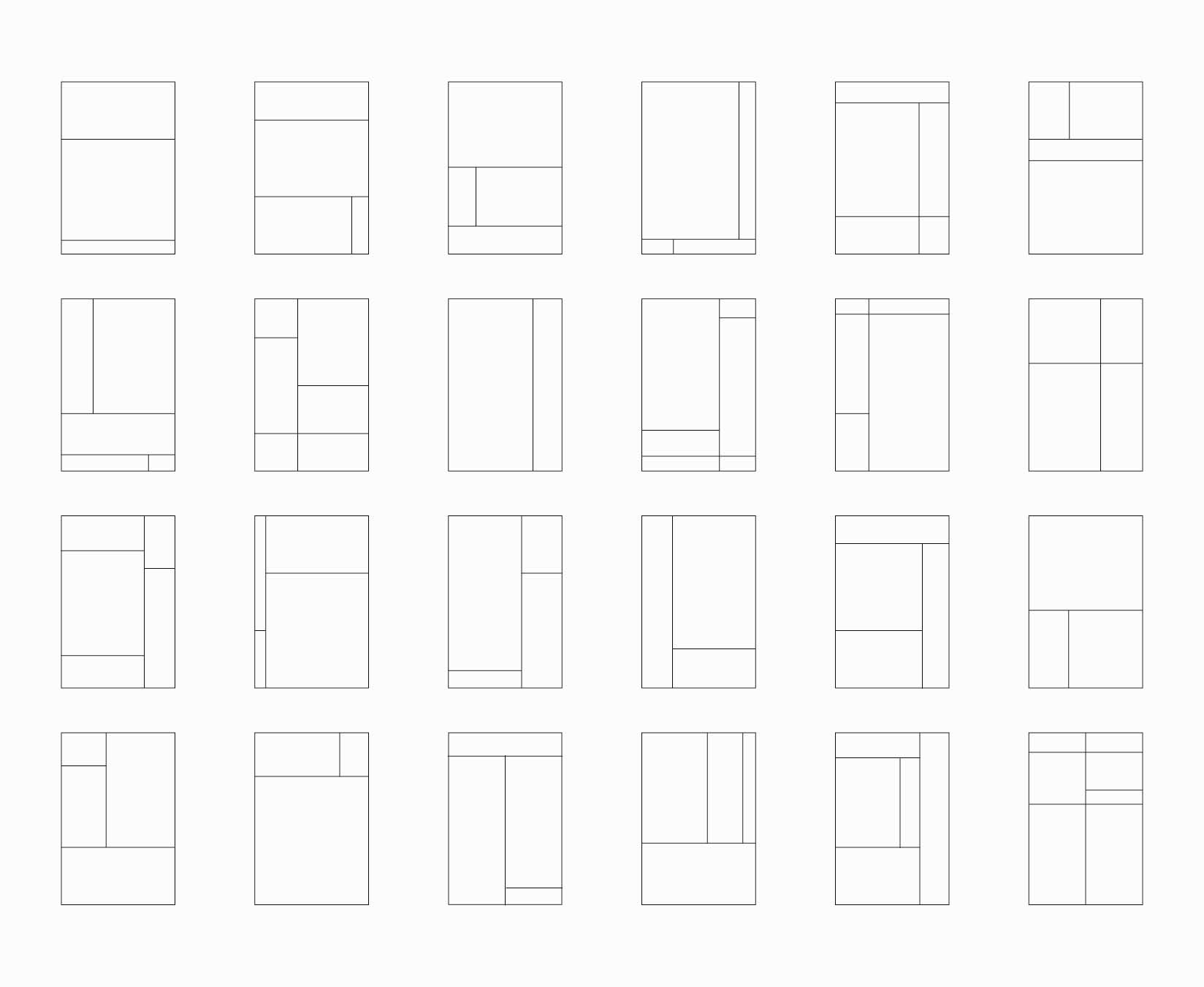
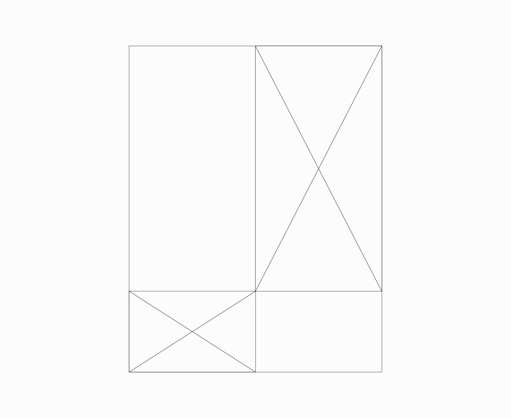
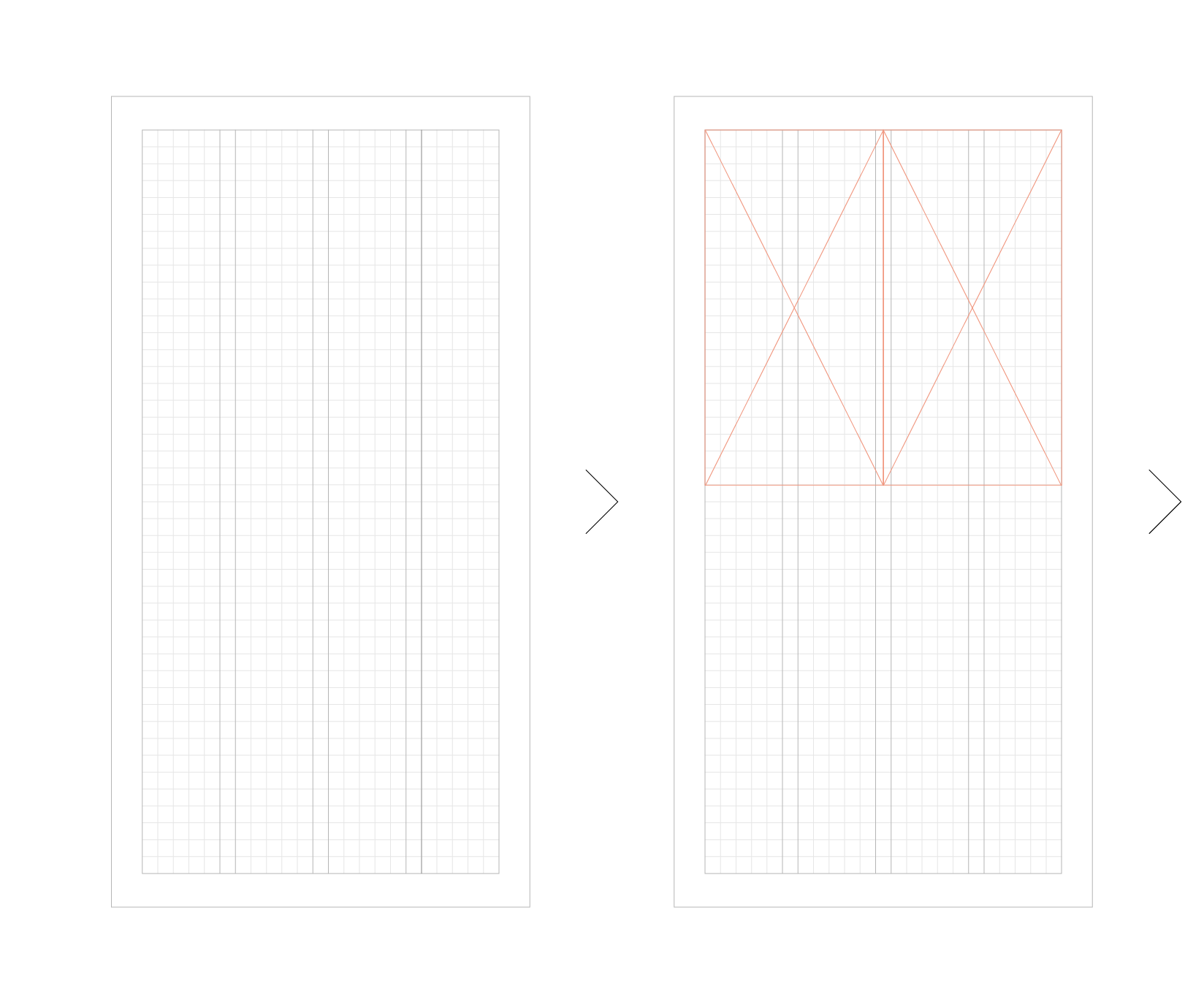
Symmetrical and Structured Layouts
Our brand system in its purest form is a container system, where blocks can be used to construct layouts. These blocks will be determined by the underlying grid of a given format. The blocks can contain imagery, colour, typography, or our Wordmark and Crest.
For illustrative purposes, portrait formats have been used here to demonstrate some of the symmetrical and structured layouts that can be achieved. These layout examples can also be applied to any type of four-sided format,
with the complexity of the layout being determined by the dimensions and ratios of the format itself.
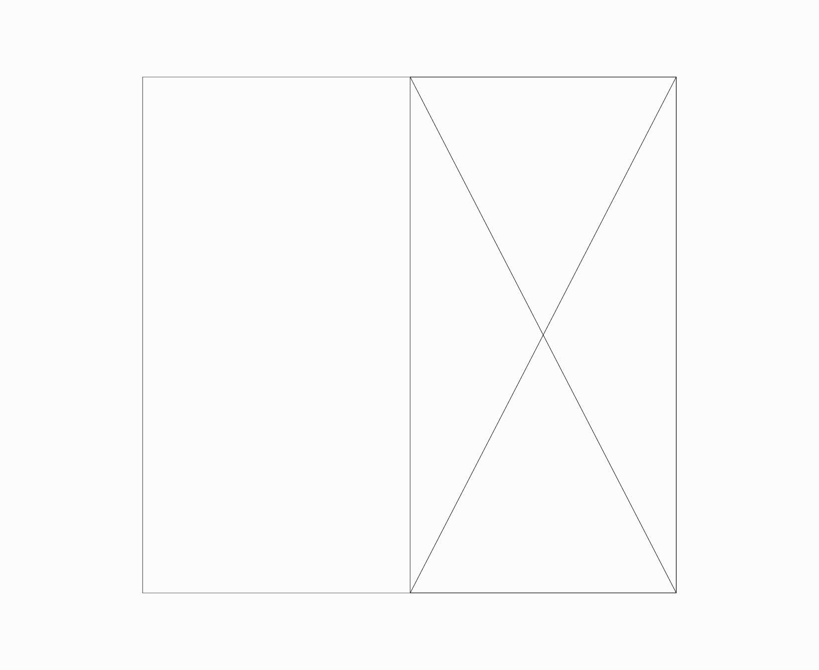
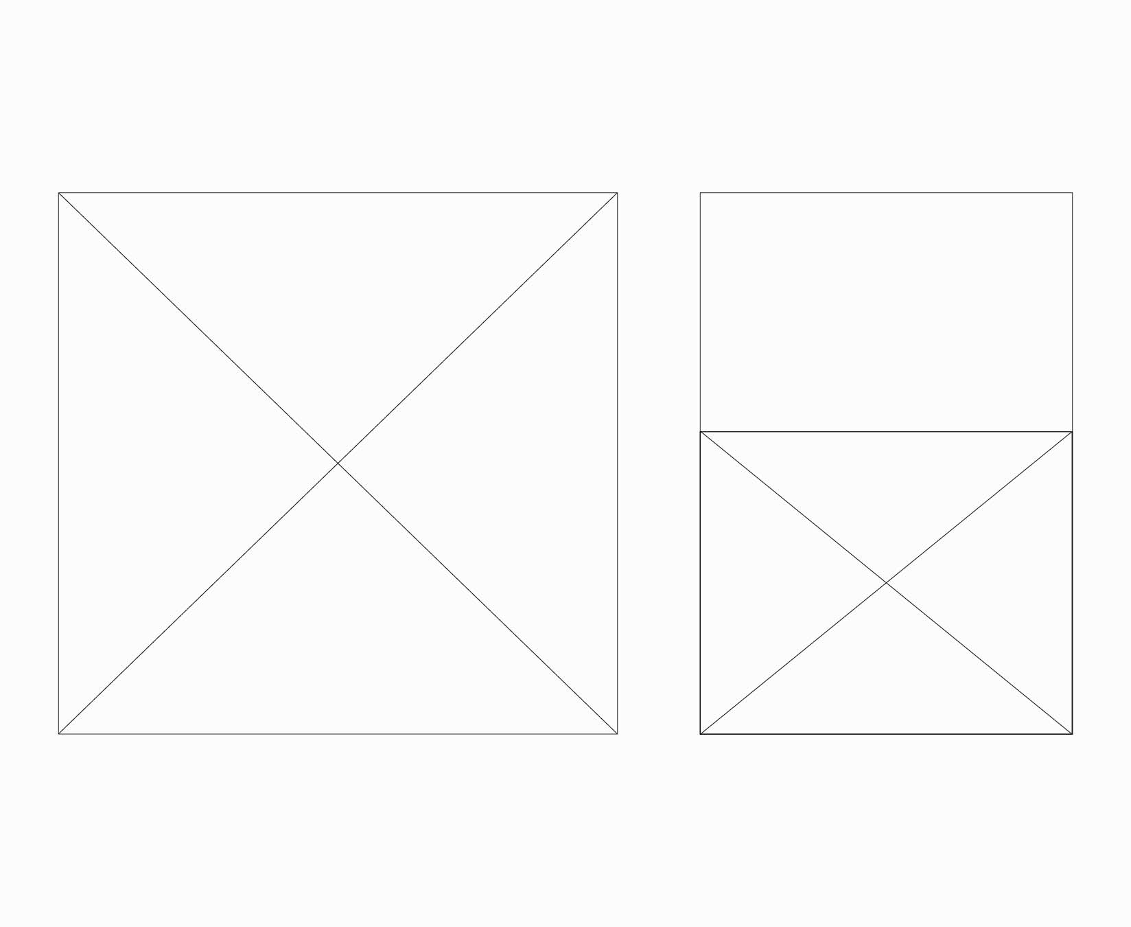
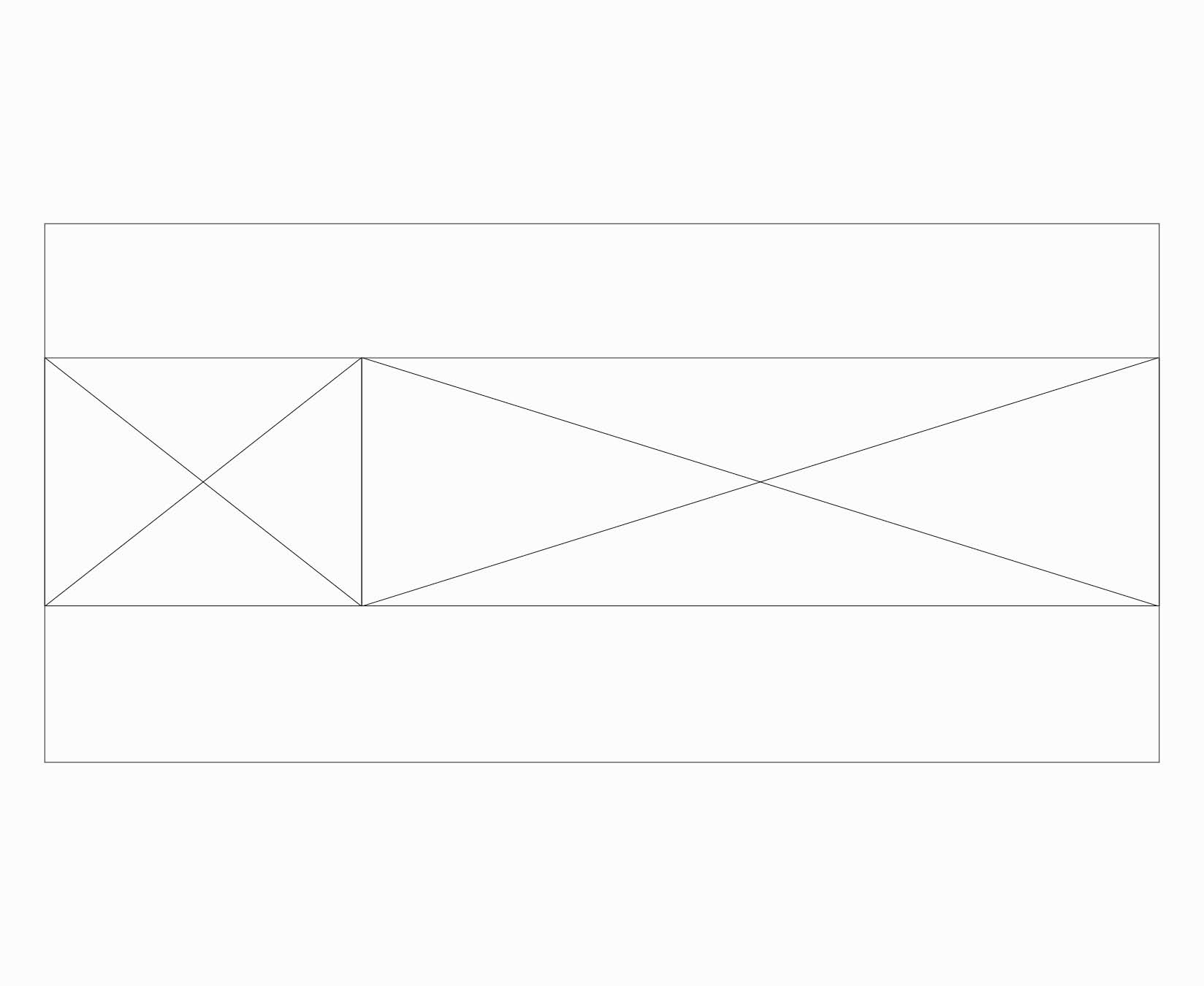
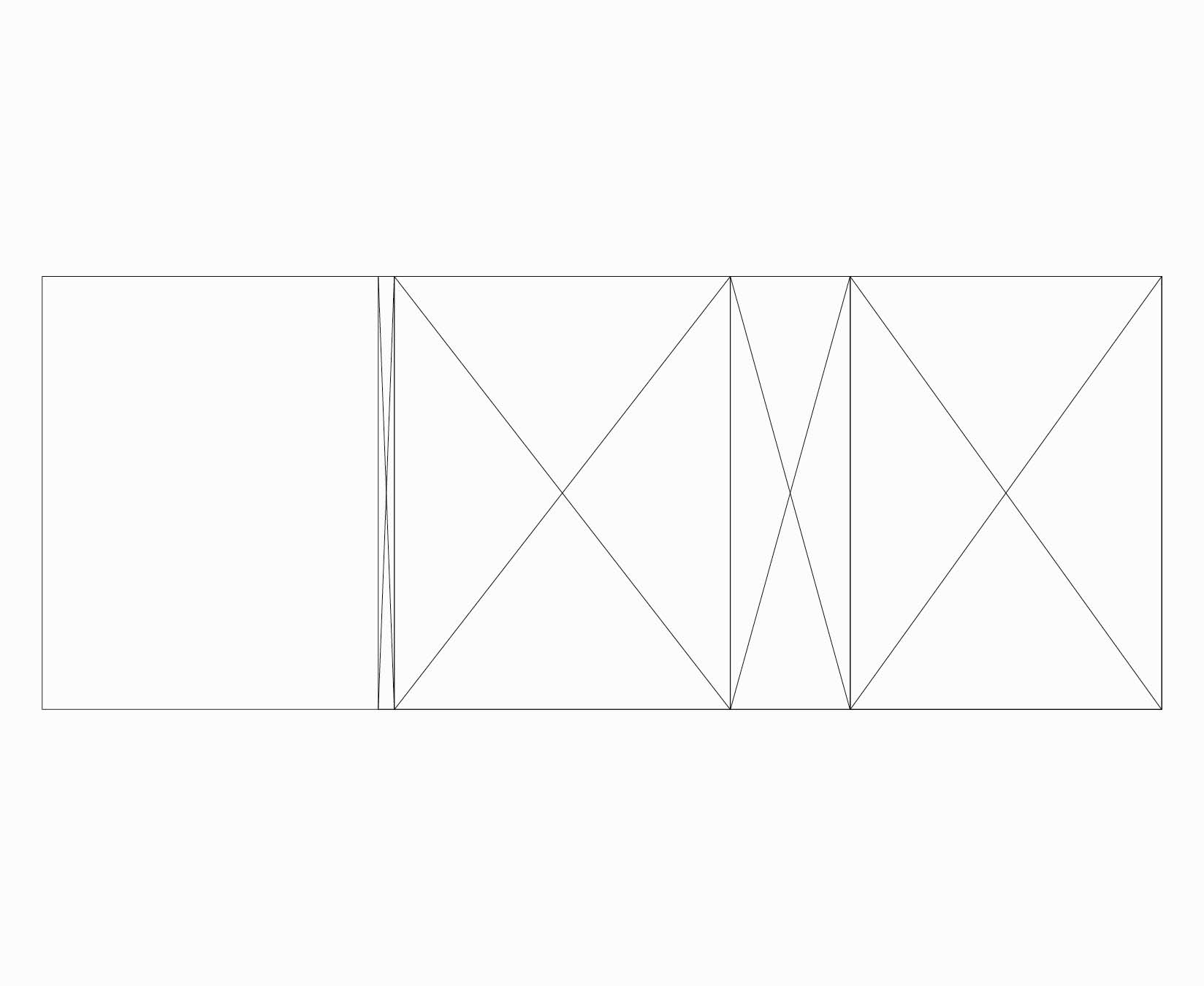
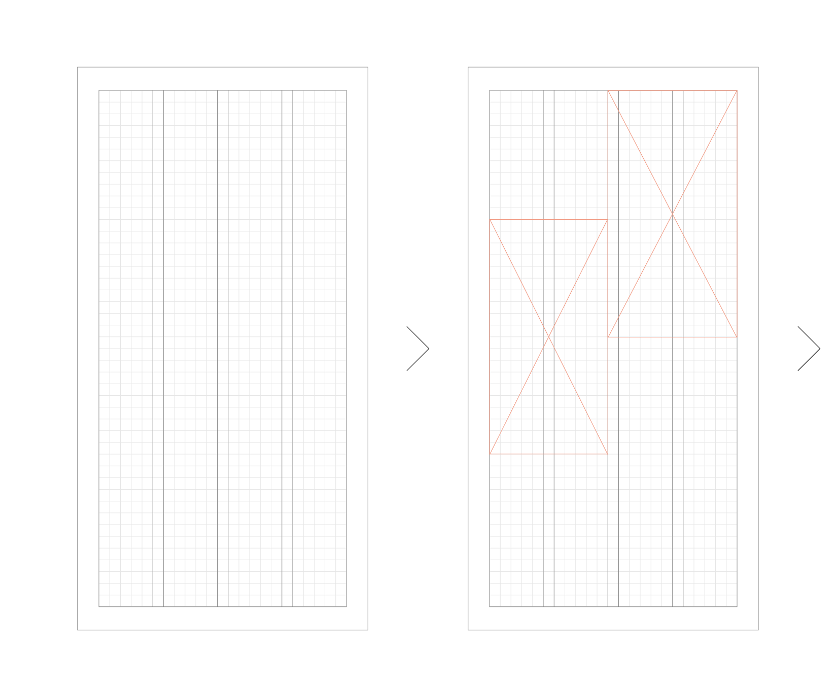
Asymmetrical and Fluid Layouts
Our system also enables asymmetrical and fluid layouts. These examples show how the symmetrical layouts from the previous page can be adjusted to make new layouts.
Structural Layout Examples
These examples show how the brand structures can be applied to different format shapes. The layout principles will always remain the same, no matter the shape of the format. However, the complexity of the design will be dictated by the size of the format and the amount of content that needs to be included on it.
These are the questions you should ask when you are creating layouts:
- Does the layout have sufficient space for the content/messages?
- Is typography given enough prominence?
- Will imagery be impactful in these dimensions and at this scale?
- Is the layout style correct and on-brand?
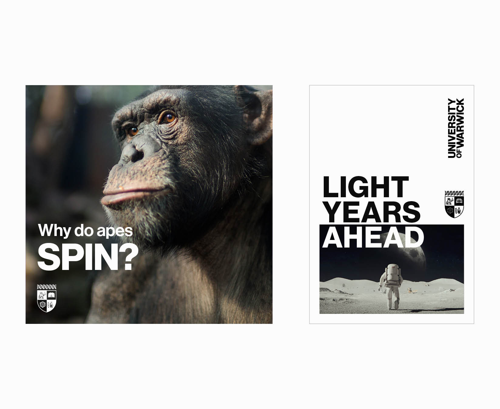
You should also consider how many images to use on a given format. There is no overarching rule to govern this, as it will vary depending on format size and image selections. However, as a general guide, we recommend a maximum of three images for smaller formats, and one to five images on larger formats.
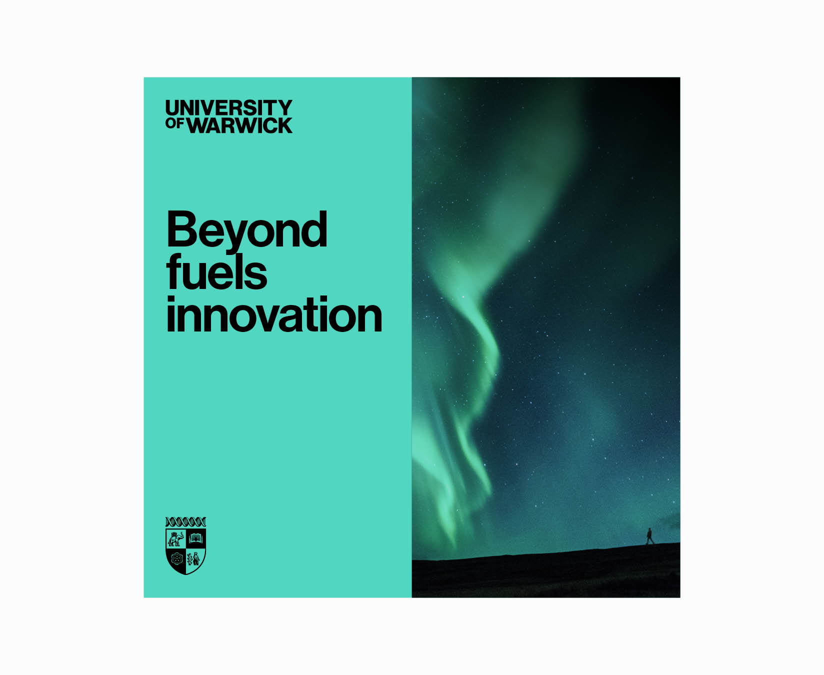
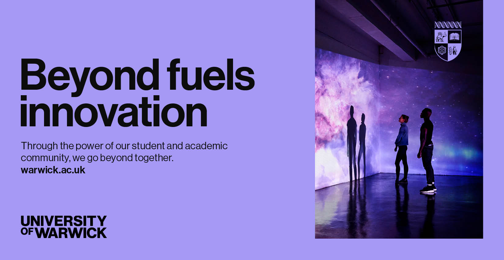
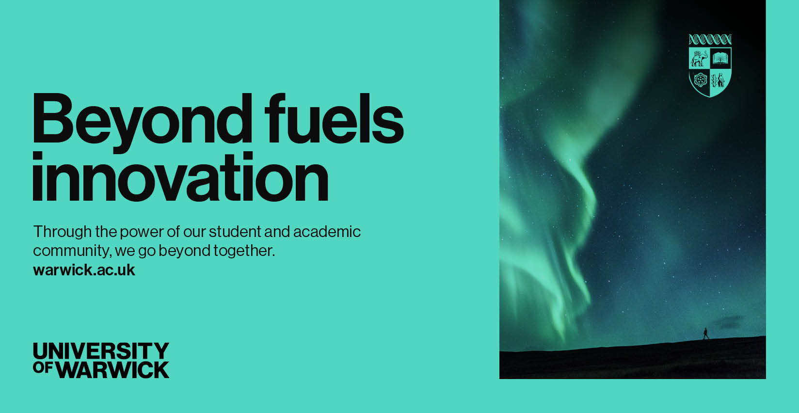
Colour Matching Layouts
We elevate our brand communications by selecting a dominant colour from the key image and using it as the background colour of the design.
These examples show how a key or tonal colour of an image can be matched against our primary colour palette. This won’t always be necessary or appropriate – but it gives greater ownership to our brand communications, therefore use the colour matching technique wherever possible.


These examples show how the background colour can be informed by key colours found in the imagery of a format.
As previously stated, this will not always be possible or appropriate for a number of reasons, such as:
- The image may not have one standout colour or tone
- Multiple images with multiple colours are being used at once
- The subject matter of the piece requires a more neutral design approach
It may also be decided that a layout has greater impact and contrast if imagery sits with a black or white background. Good design sense will determine this.
As stated in our logo section, there are times when the Crest can be placed in our primary colour palette. Here, you can see examples of the key background colour being used on the Crest, while the Wordmark sits on block colours. The colour that the Wordmark or Crest sit on must provide a high level of contrast to ensure legibility and accessibility.


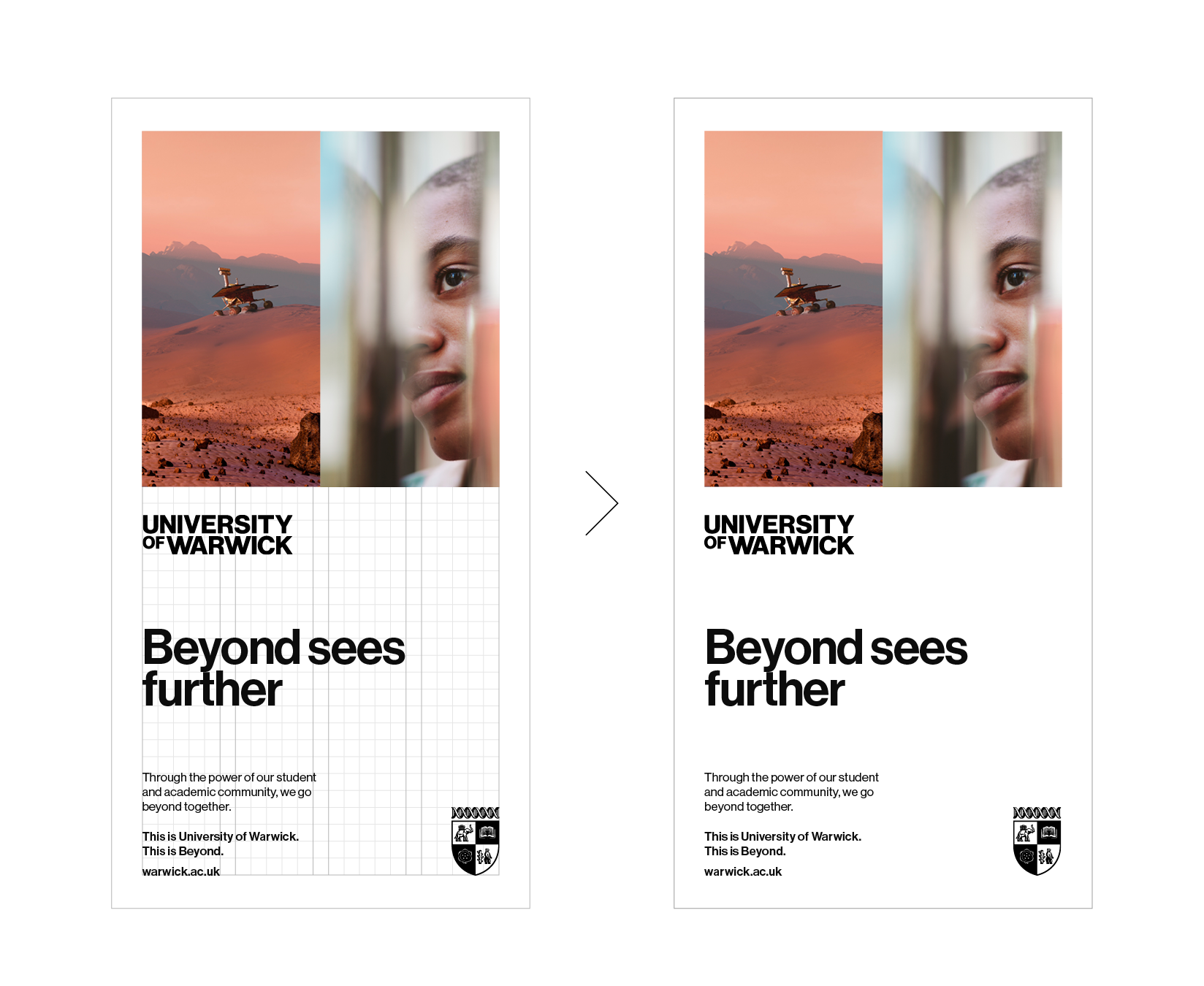
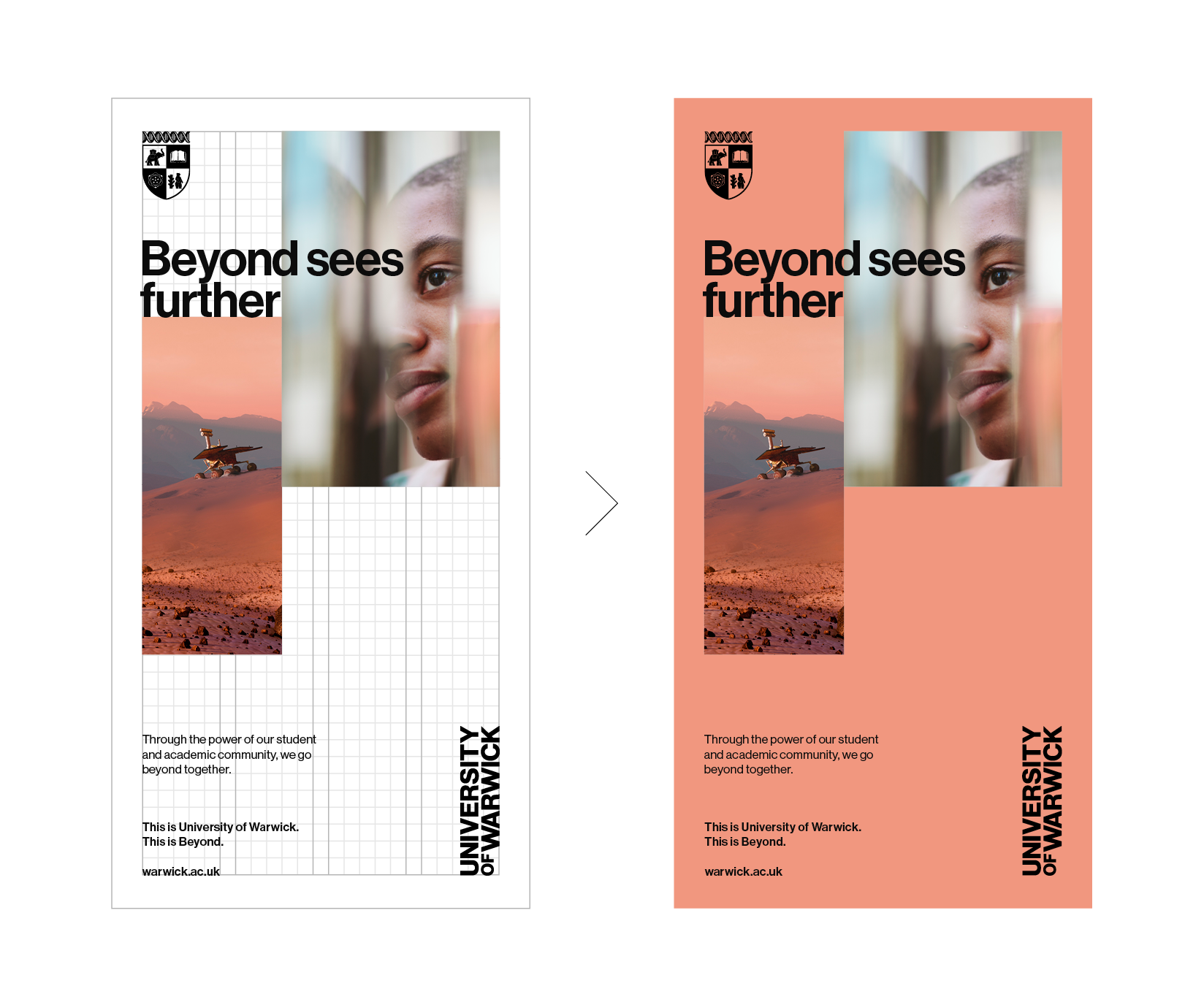
Layout Construction
The two examples shown are basic design comparisons, demonstrating how symmetrical/asymmetrical layouts can be constructed using the same grid and design elements, but achieving two different results.
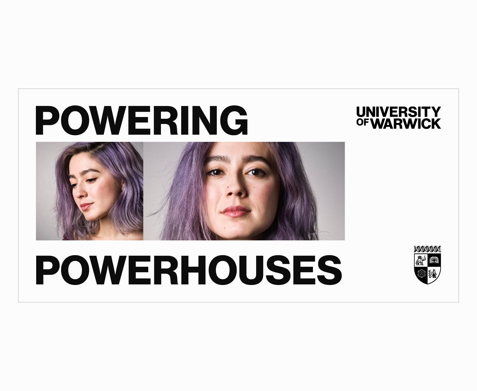
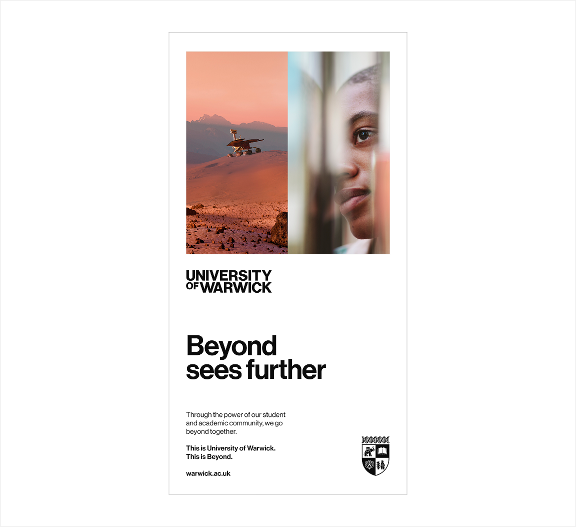
Symmetrical and Structured layout
- Image sizes are the same height and width
- Images are aligned against each other
- Headline is anchored off the bottom of the images, and placed directly above body copy
- Wordmark and Crest are split across the layout
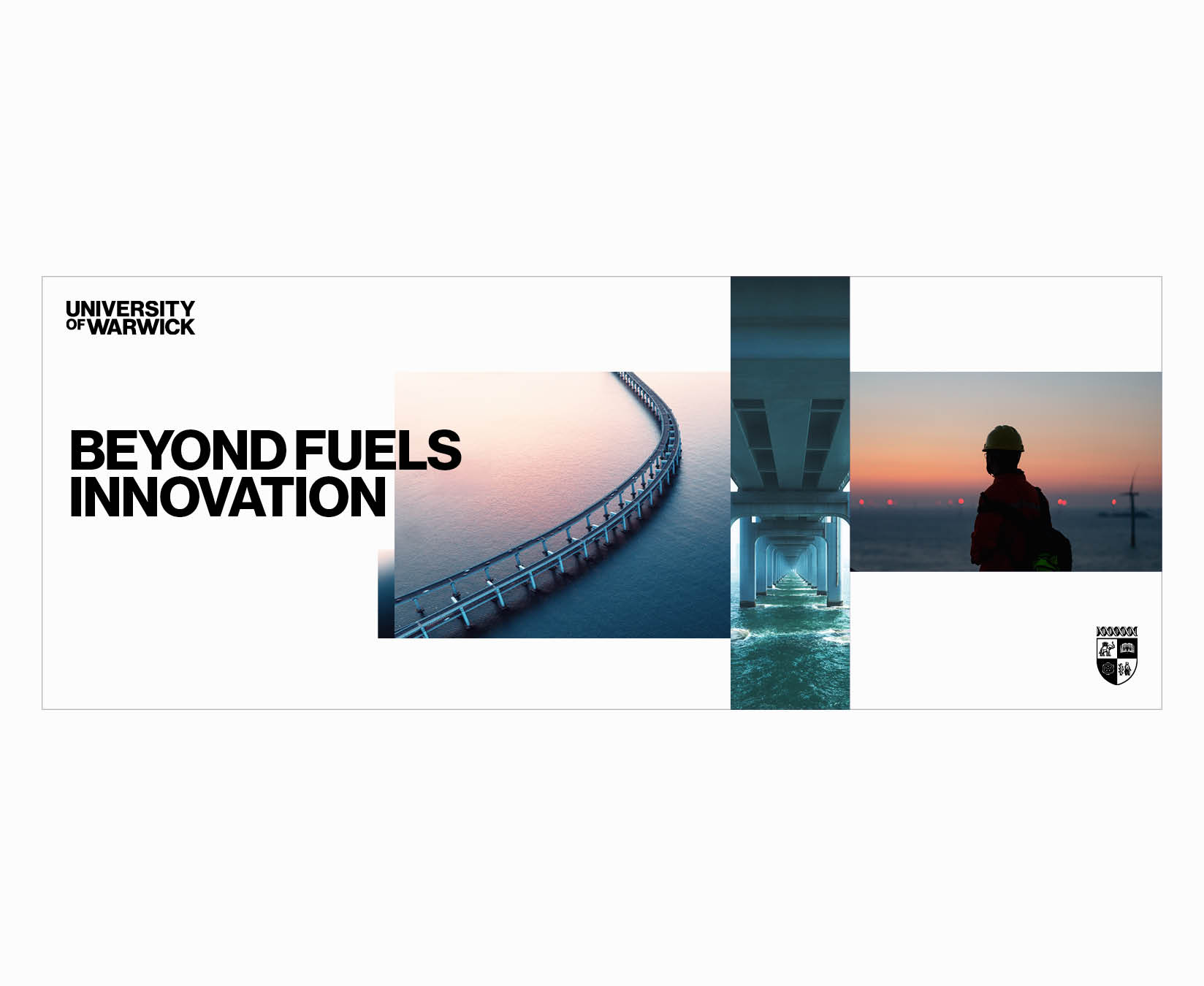
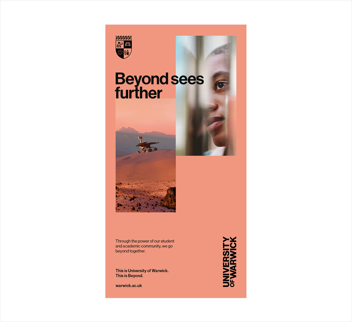
Asymmetrical and Fluid layout
- Image sizes are different heights and widths
- Images are not aligned to each other
- Headline rests on the top of one of the images and overlaps onto another
Body copy is disconnected from the headline, anchored to the bottom left corner, with additional spacing before the call-to-action and website URL - Crest and Wordmark are still split, but the latter is rotated to its vertical format for a more unconventional layout
- Coral background colour is a dominant tone taken from one of the images
Layout Analysis
This analysis demonstrates how the same elements can be used to achieve two different styles.
Both of these designs adhere to all rules, communicate the concept of ‘Beyond’ and are on-brand.
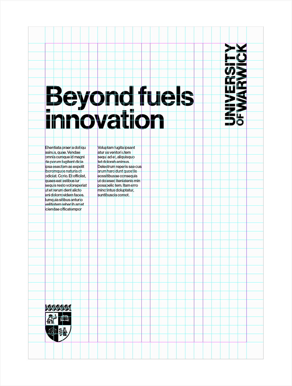
- Large headline set in Neue Haas Medium overlapping imagery
- Imagery uses symmetrical layout style and conforms to underlying grid
- Body copy set in Neue Haas Roman
- Brand sign-off and website set in Neue Haas Medium
- Wordmark aligned with margins of the underlying grid and set in a landscape orientation
- Crest sitting separate from the Wordmark and placed correctly around the margins of the format
- White background which emphasises the use of clear space in our communications
- Crest sitting separate from the Wordmark and placed correctly around the margins of the format
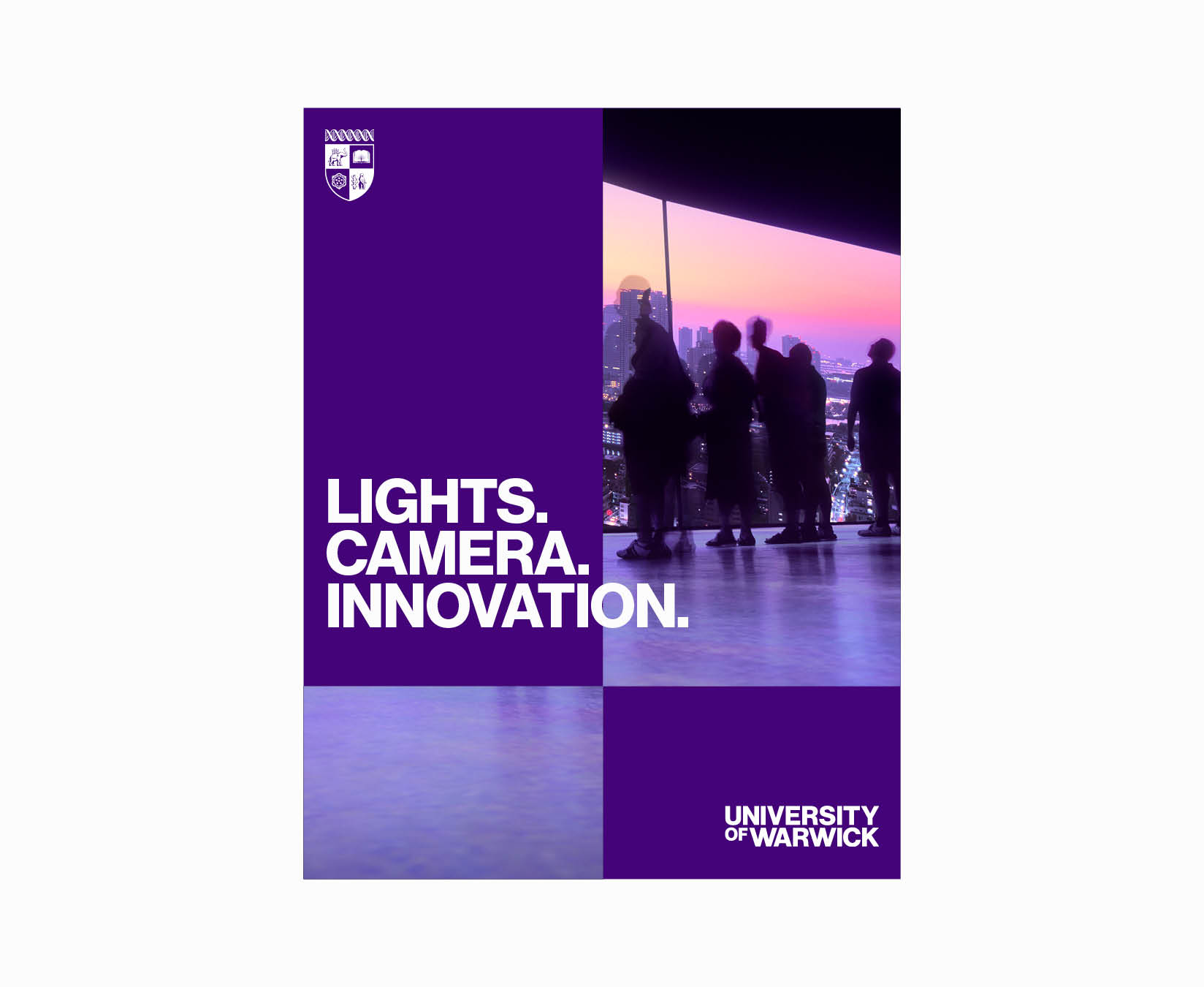
- Large headline set in Neue Haas Medium overlapping imagery
- Imagery uses asymmetrical layout style and conforms to underlying grid
- Body copy set in Neue Haas Roman and sits separately from the sign-off
- Brand sign-off and website set in Neue Haas Medium
- Coral background taken from the colour palette of the selected imagery
- Wordmark aligned with margins of the underlying grid and set in a portrait orientation
Grid System Styles
Our communication style seamlessly combines bold headlines, concise body copy and eye-catching imagery. This approach is carefully aligned with the underlying grid structure, achieved through the use of two grid types; those with gutters and those without.
The choice of grid depends on the format size.
Smaller formats, such as leaderboard web banners or A6 postcards, forgo gutters due to their limited space and reduced need for extensive text.
In contrast, larger formats, like digital presentations or A4 brochures, utilise text column grids with gutters. These grids effectively organise substantial text within the layout.
When formats are at the following sizes or higher, text column grids should be utilised:
- Approximately A5 for print applications
- 1200px x 600px for digital applications
Examples of templates with and without gutters are shown below.
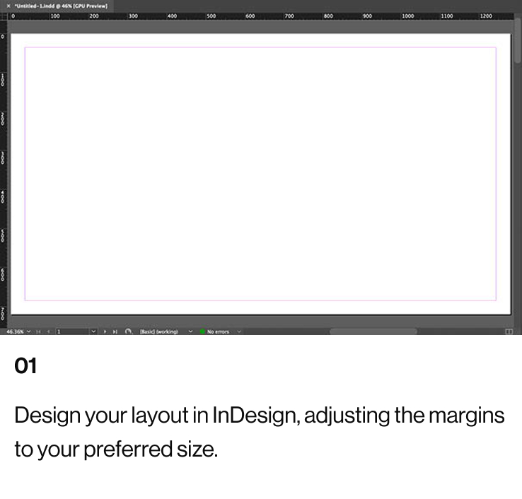
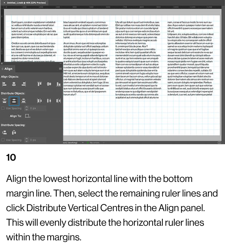
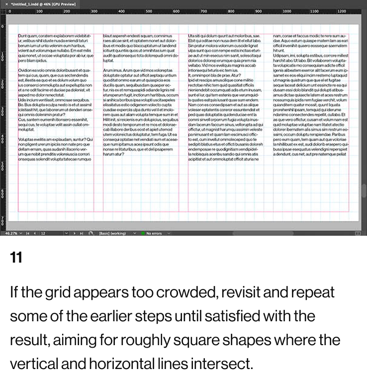
Creating Grids For Small Formats
For smaller formats, create grids using the standard grid setup process in Adobe software such as InDesign and Illustrator.
Aim to position vertical and horizontal guides so their intersections form approximate squares within the margins of the format. Ensuring these guides create square-like proportions helps maintain consistent proportions for imagery across all communications.
- Horizontal guides sit within the top and bottom margins of the format
- Vertical and horizontal guides roughly create square shapes
- Vertical guides sit within the left and right margins of the format
Creating Grids For Medium and Large Formats
Designs for medium and large document formats, such as presentations or brochures, require underlying text column grids.
These grids are more complex to create, as the gutter widths must seamlessly integrate with the rest of the grid by matching the exact width of the columns. This ensures uniformity throughout the format and enhances alignment between the graphic elements used on a design.
For example, in an A4 template, the underlying grid features gutters that match the column widths. These gutters define text columns, providing a structured layout for body copy and contributing to a cohesive overall design.
- Horizontal guides sit within the top and bottom margins of the format
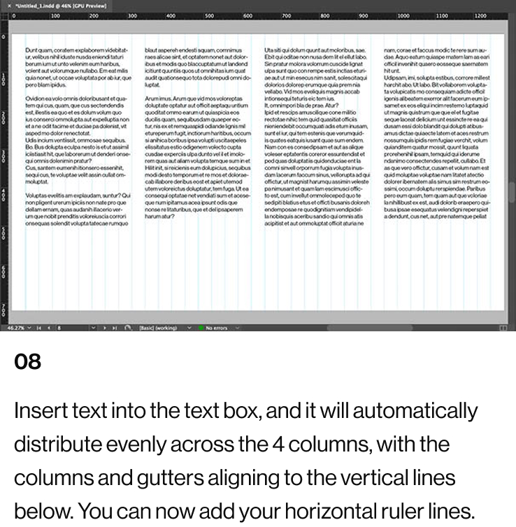
- Gutters equal in width to the rest of the columns form text columns
- Body copy flowed into the text columns
- Vertical and horizontal guides roughly create square shapes
- Large amounts of body copy running across two text columns
- Vertical guides sit within the left and right margins of the format
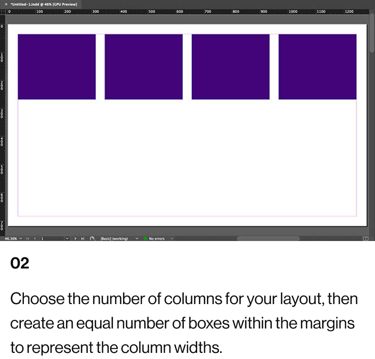
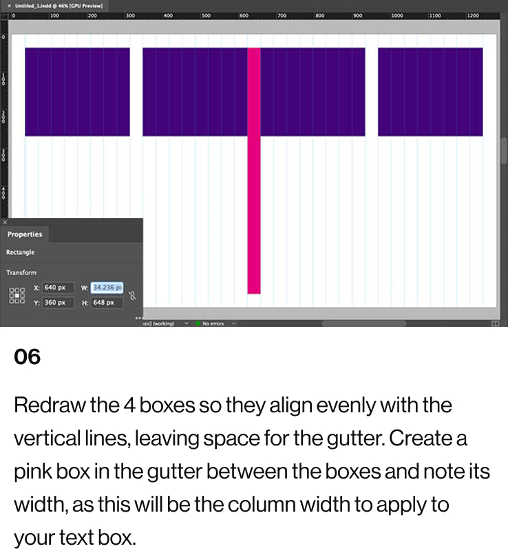
Creating Grids For Medium and Large Formats
This example illustrates a 1920px x 1080px screen layout that can be easily adjusted for different sizes.
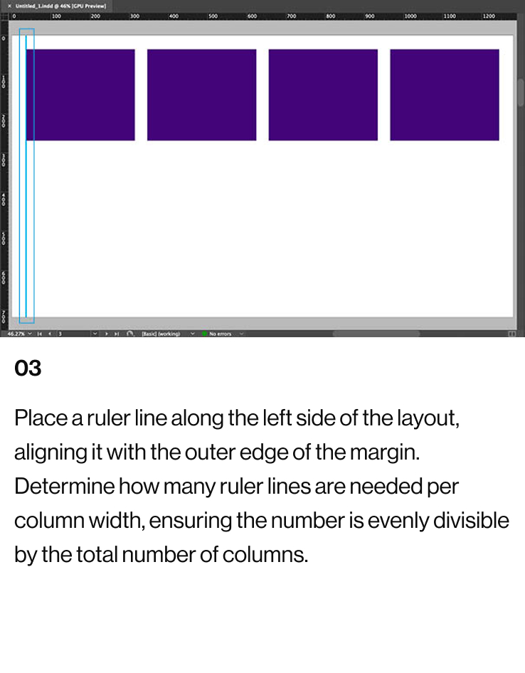
The total number of vertical guides must be evenly divisible by 4. These guides should be spaced uniformly within the left and right margins of the layout.
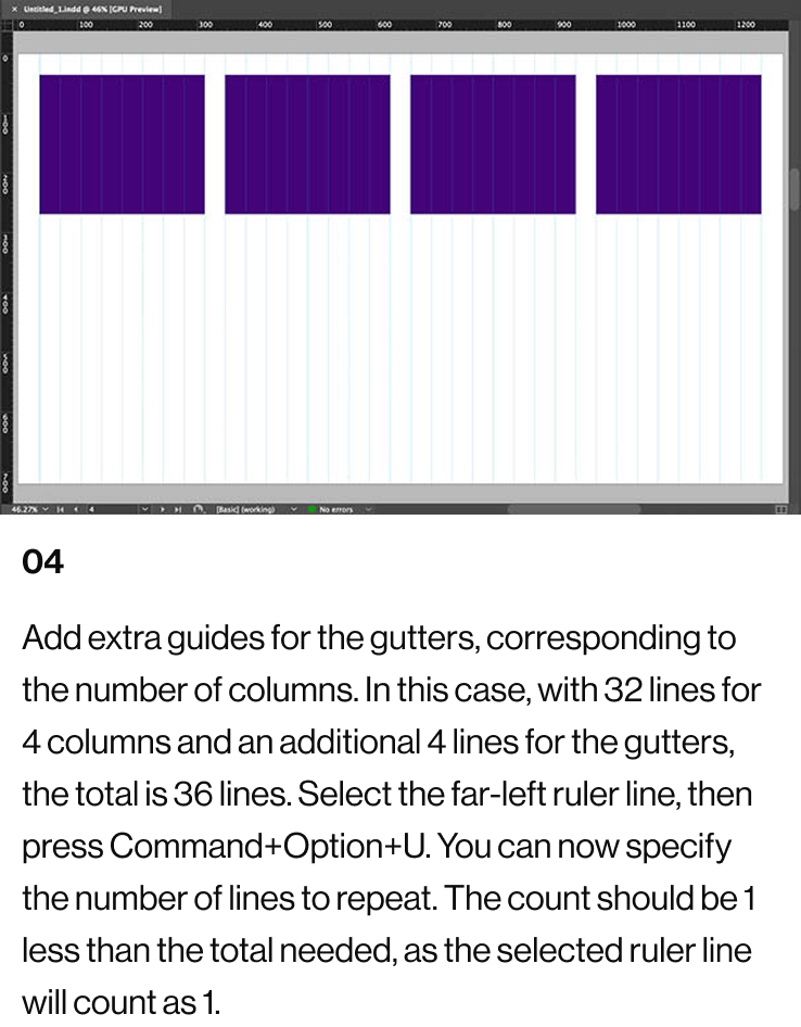
The width of the text columns is determined by the number of vertical guides. For example, with 20 vertical guides, each column will have 5 guides (4 × 5 = 20). To create gutters between the columns, add 4 more vertical guides, bringing the total to 24 guides.
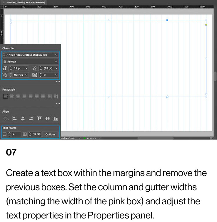
If the gutter widths are either too wide or too narrow, adjust the number of vertical guides to change the column widths. To reduce the column width, add 4 vertical guides (or any multiple of 4). To increase the column width, remove 4 vertical guides (or any multiple of 4).
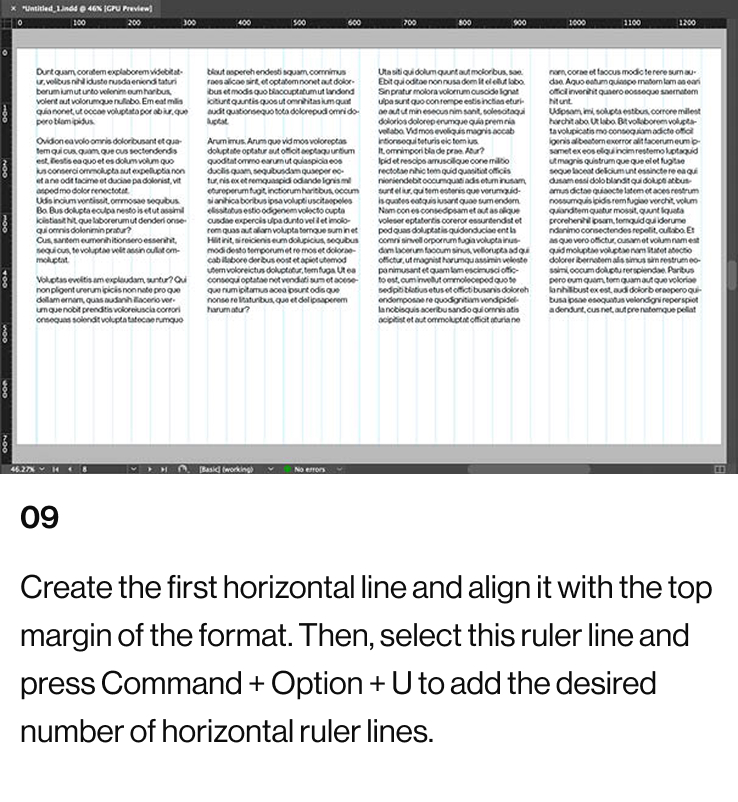
When the visual spacing between the vertical guides looks balanced, proceed to add horizontal guides. These should be positioned within the top and bottom template margins. Use the Step and Repeat function (Option+Command+U) to generate the desired number of guides. Select a quantity of horizontal guides that creates approximately square shapes where the vertical and horizontal guides meet.
This method for creating a 4-column text grid can be adjusted for other configurations. For an 8-column grid, the total number of vertical guides must be divisible by 8. For instance, 40 vertical guides, plus 8 extra guides for gutters, would give a total of 48 vertical guides.
Similarly, for a 10-column grid, the total number of vertical guides must be divisible by 10. For example, 60 vertical guides, plus 10 additional guides for gutters, equals 70 vertical guides.