


Design Elements
Colour Palette
Our Brand employs a colour palette where each colour holds equal significance. This balanced approach allows for visually impactful designs, using any of these colours as solid background.
When paired with bold headlines and coordinated imagery, the palette creates a unique brand aesthetic to stand out in the sector. It offers a modern yet timeless look, distinguishing us with its unconventional style.

Colours Tints & Breakdowns
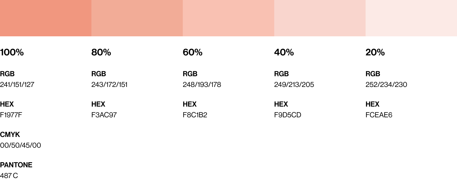
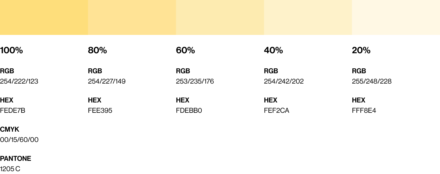
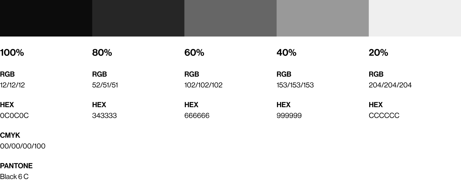
The digital and print breakdowns for each colour are provided below.
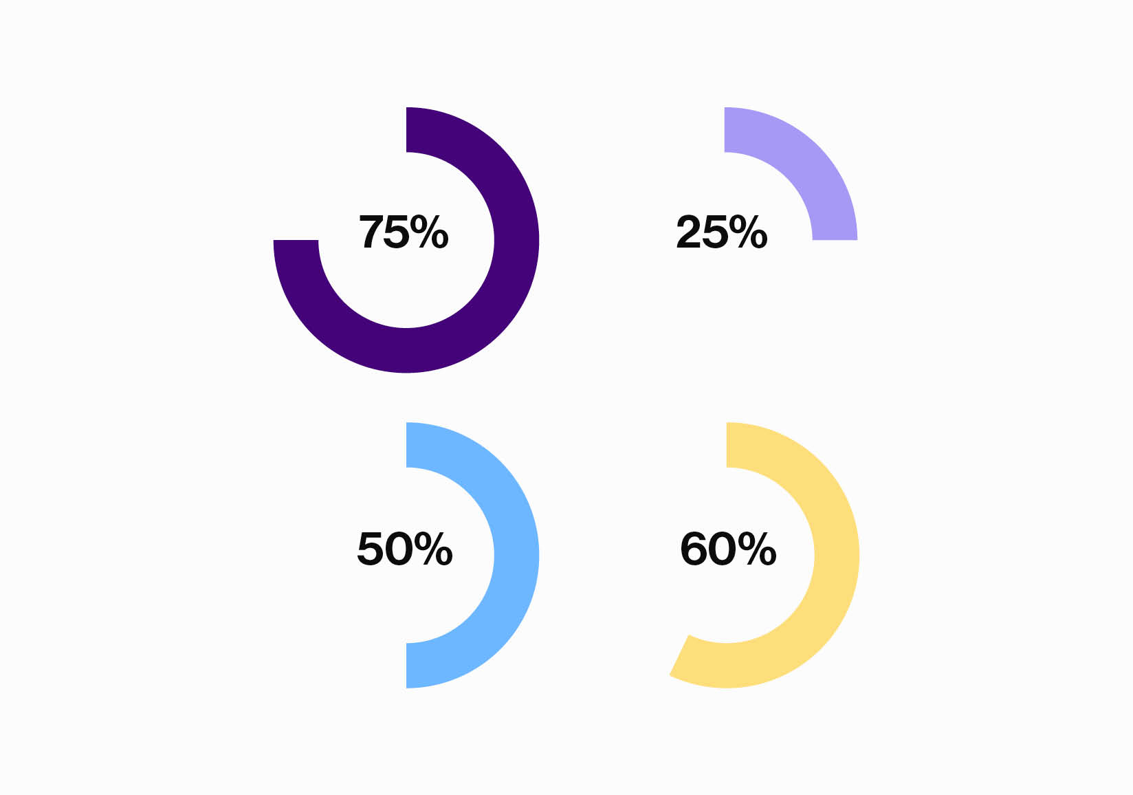
Tints of each colour (apart from white) break down into visual tones of 80%, 60%, 40%, and 20%. Each tint has been assigned its own specific colour swatch. This wide range of colours will help with graphs or data visualisations required for presentations.
Please note that digital colours may vary depending on the screens they are viewed on. On older screens, the colours may appear less vibrant than on modern screens.
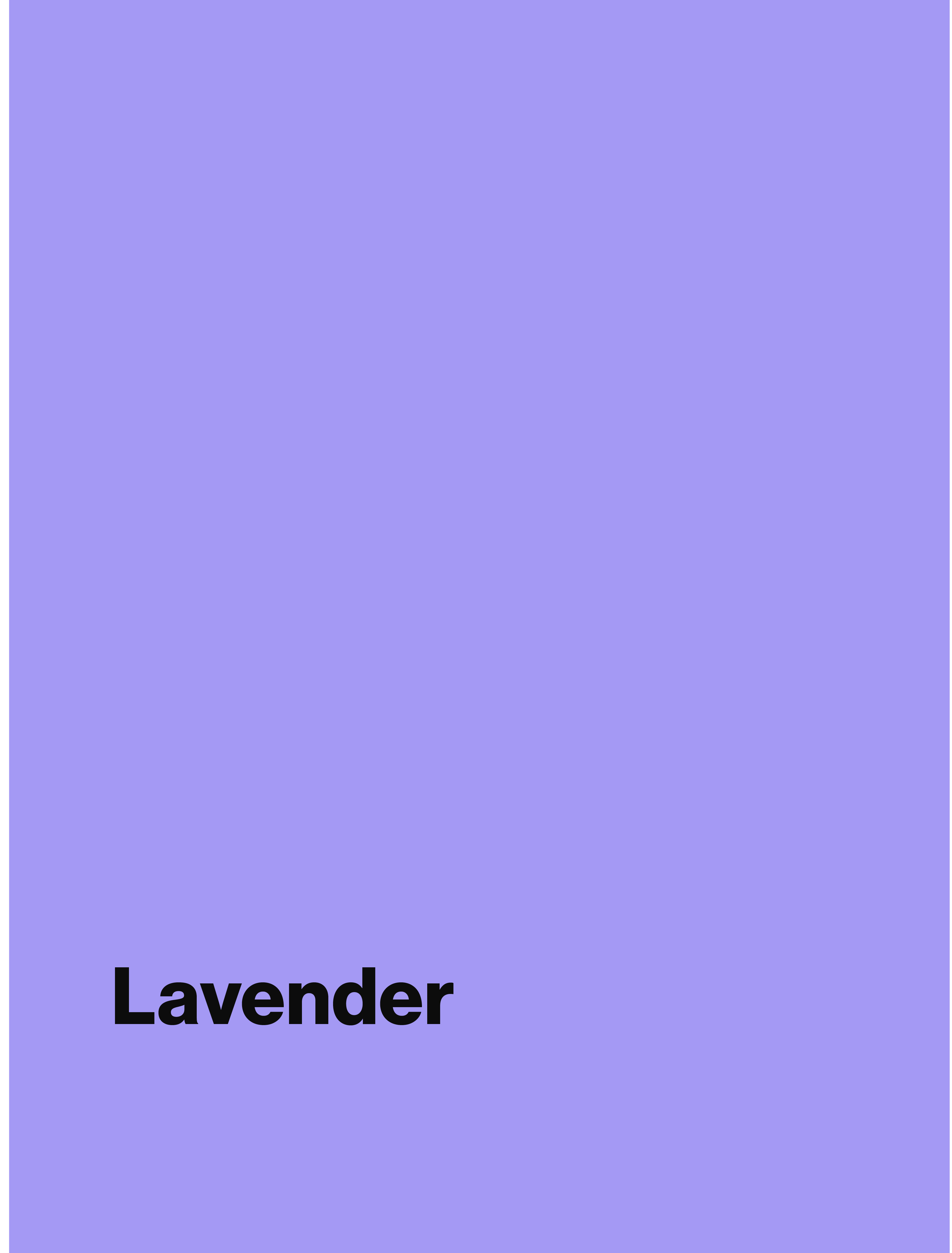
Lavender

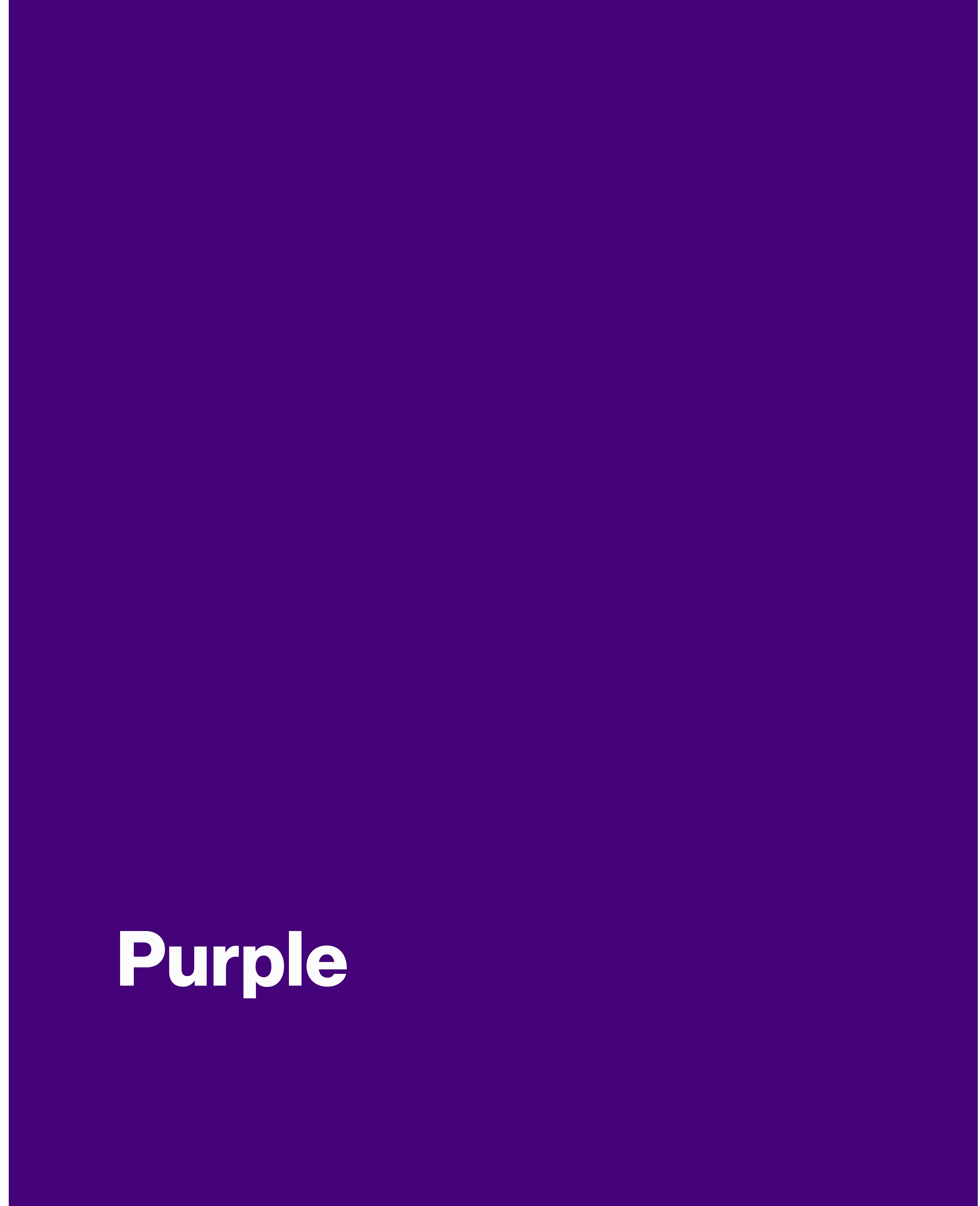
Purple

Coral
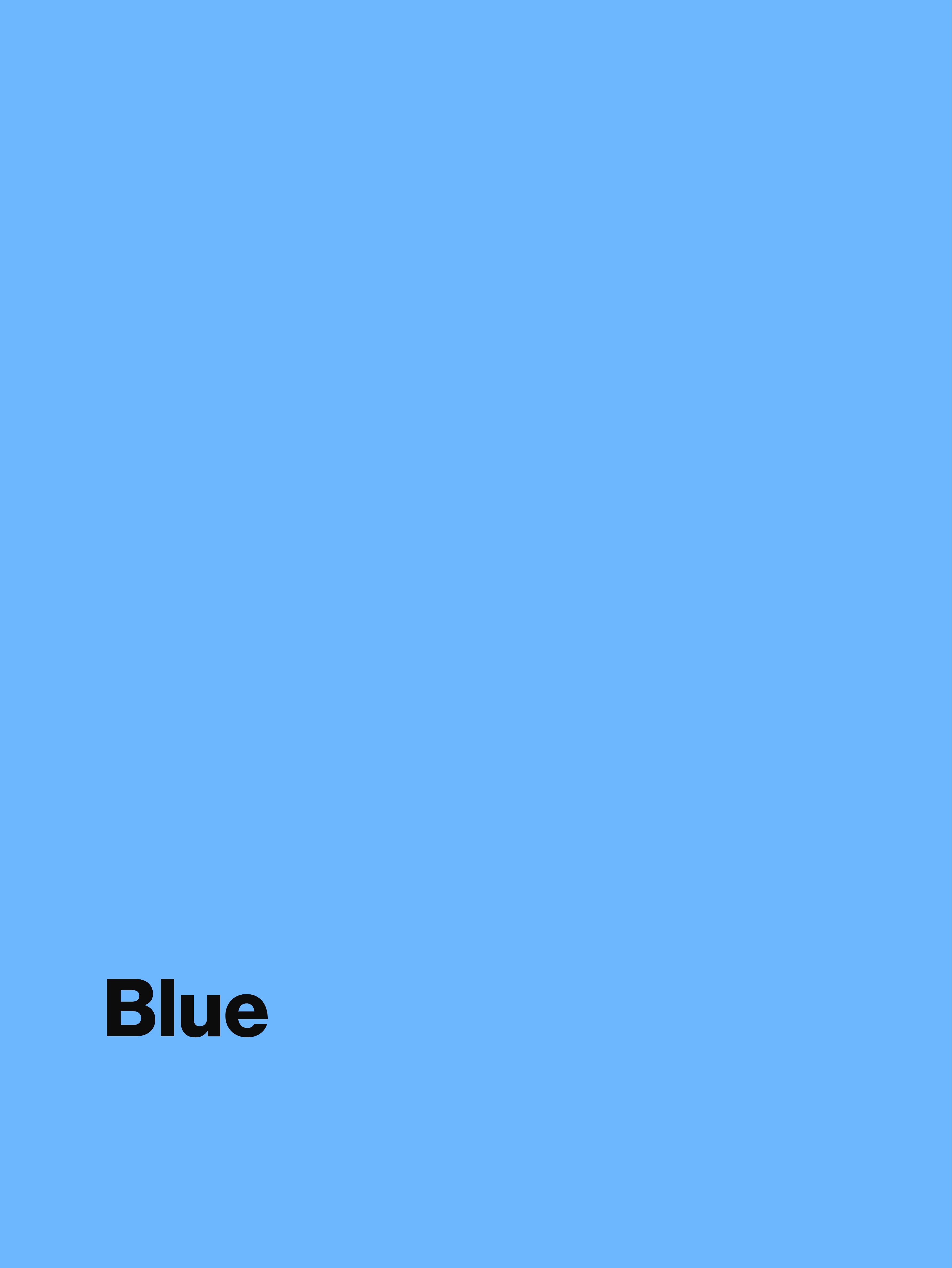
Blue

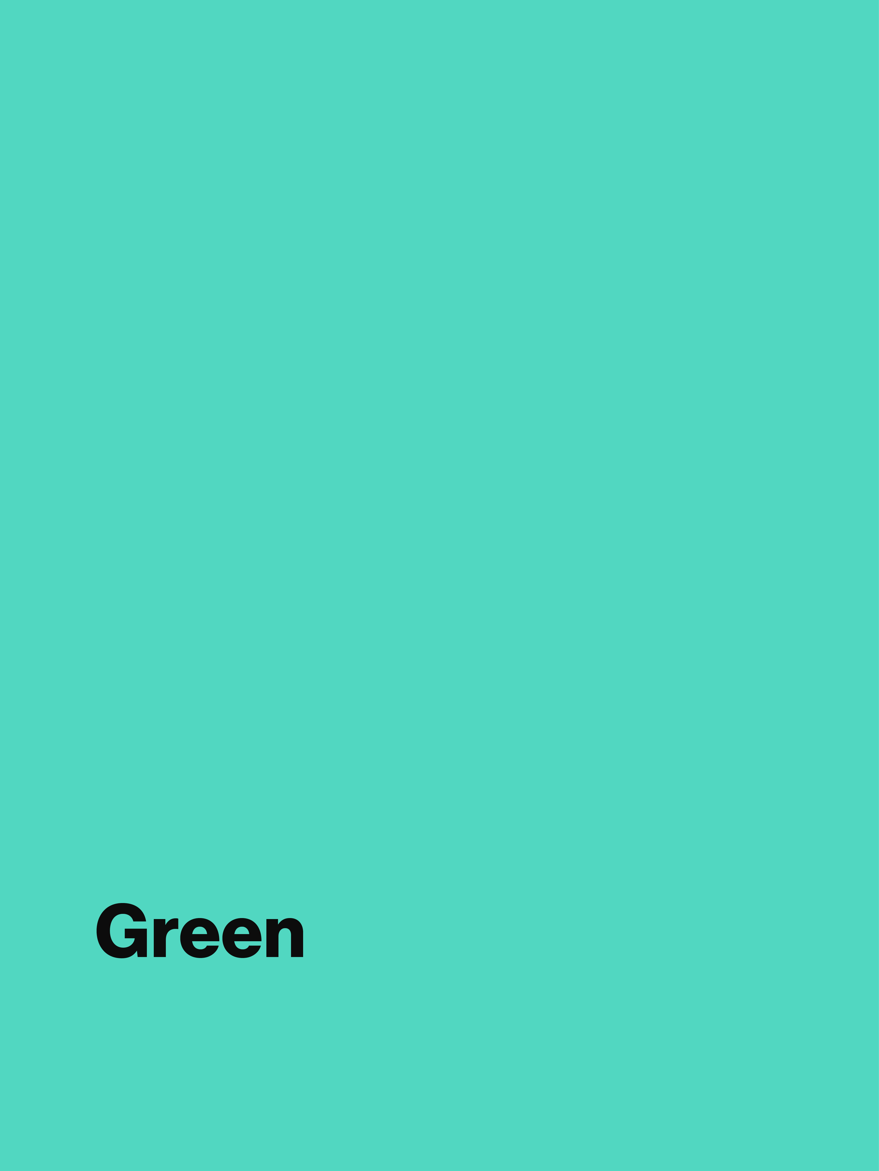
Green

Yellow
White

Black
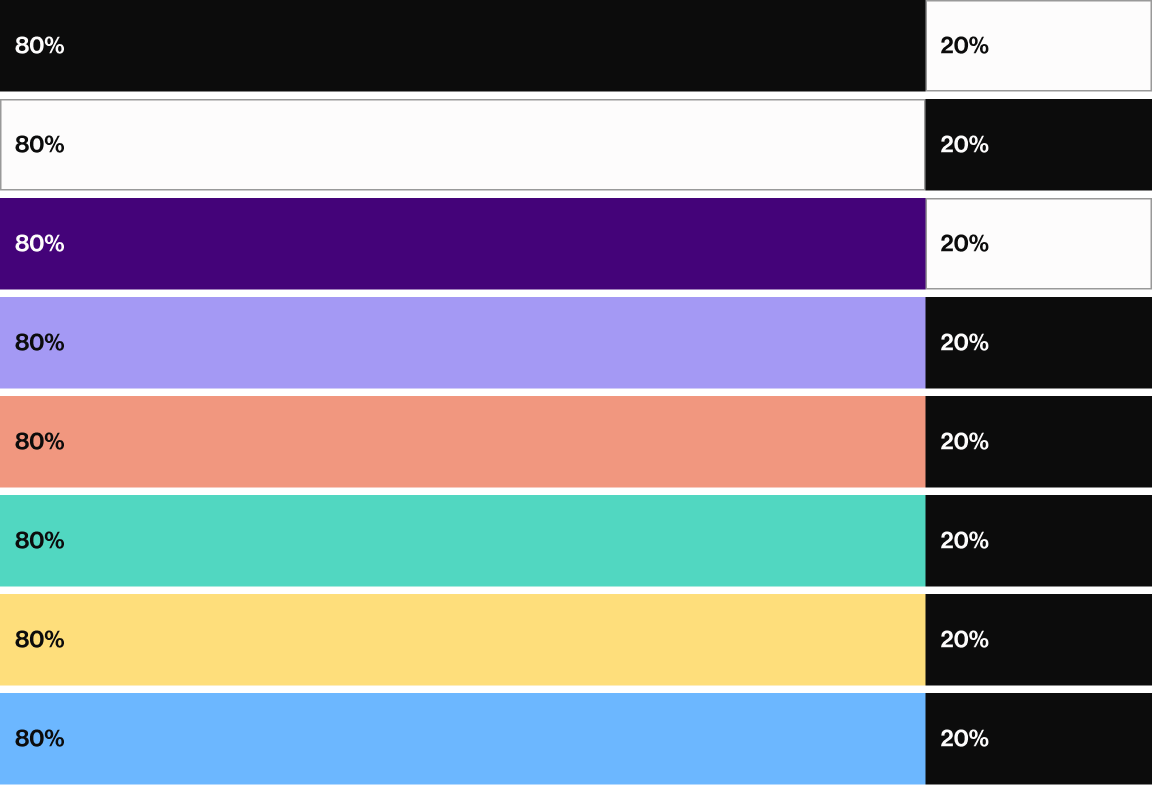
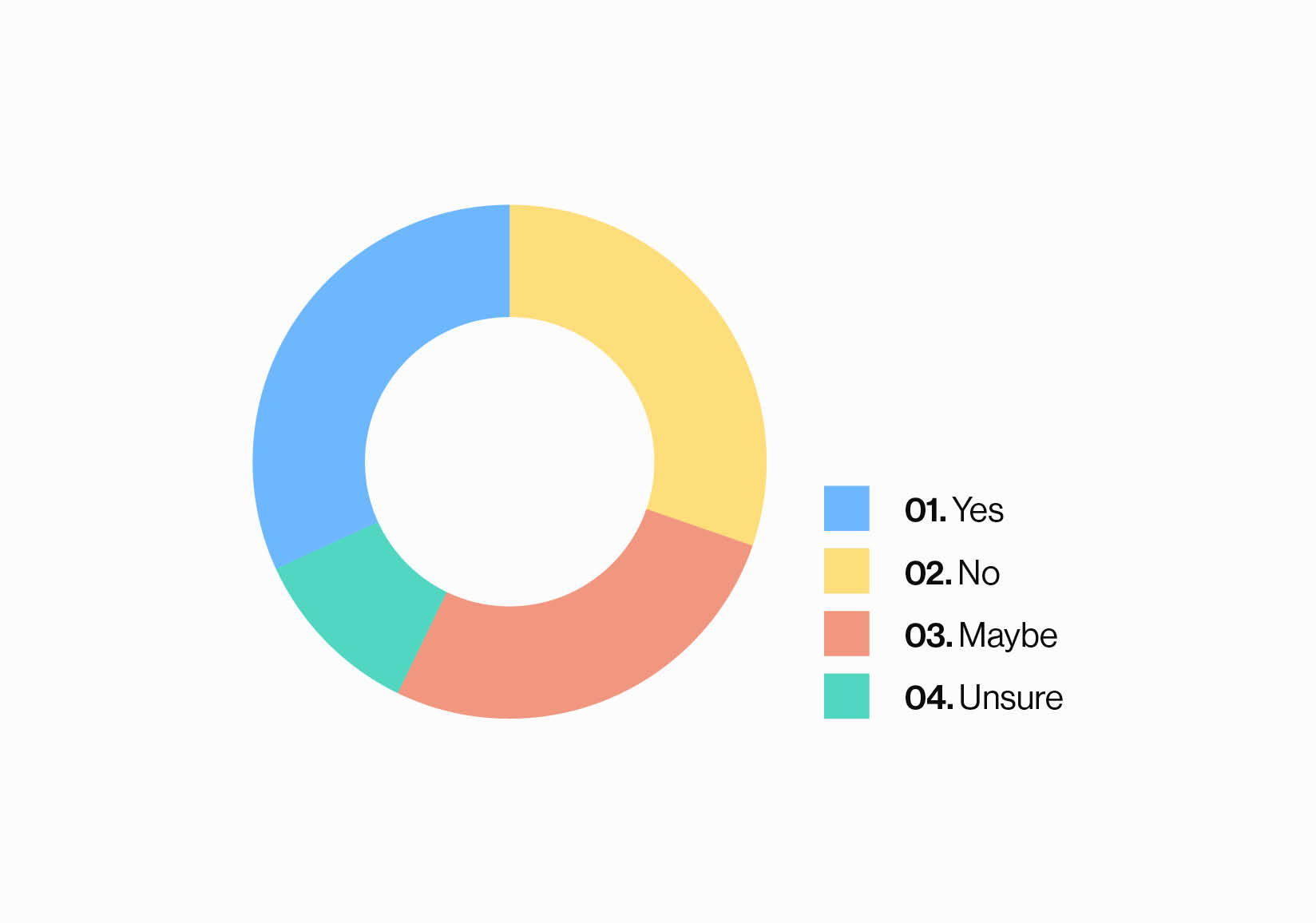
Proportional Use of Colour
The colours in our primary palette are designed to have equal visual weight, ensuring balance across all materials. Bold colour blocks paired with black or white headlines form the core of our brand identity, with specific colour combinations outlined in the Text Colour Accessibility section.
While some flexibility may be required, the colour usage guidelines help maintain consistency across our brand outputs.
This graphic shows the approximate colour breakdown, with the proportional balance maintained even when the Wordmark, Crest, and imagery are added.
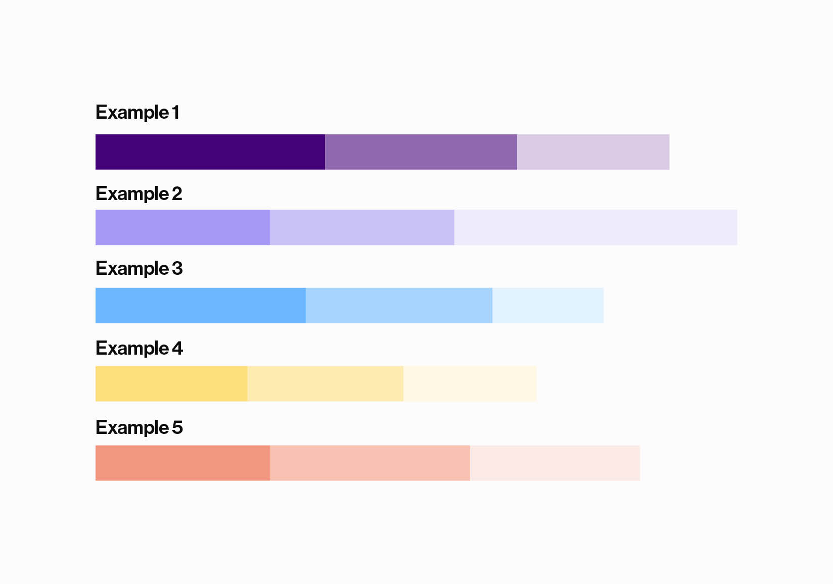
Colours for Tables and Charts
Inspired by our Heritage Crest, our modernised Crest embraces our history while being suitable for use in the digital age. Positive and negative versions of our Crest exist to work on different backgrounds.
A responsive version of the Crest sits within our toolkit. This simplified Crest should be used in both digital and print applications, when the height of the Crest sits beneath a certain size threshold. For further information, please refer to our Responsive Crest section.
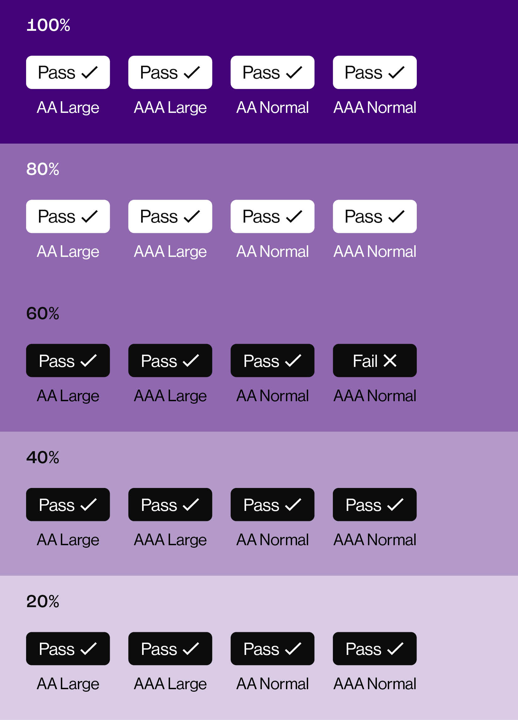
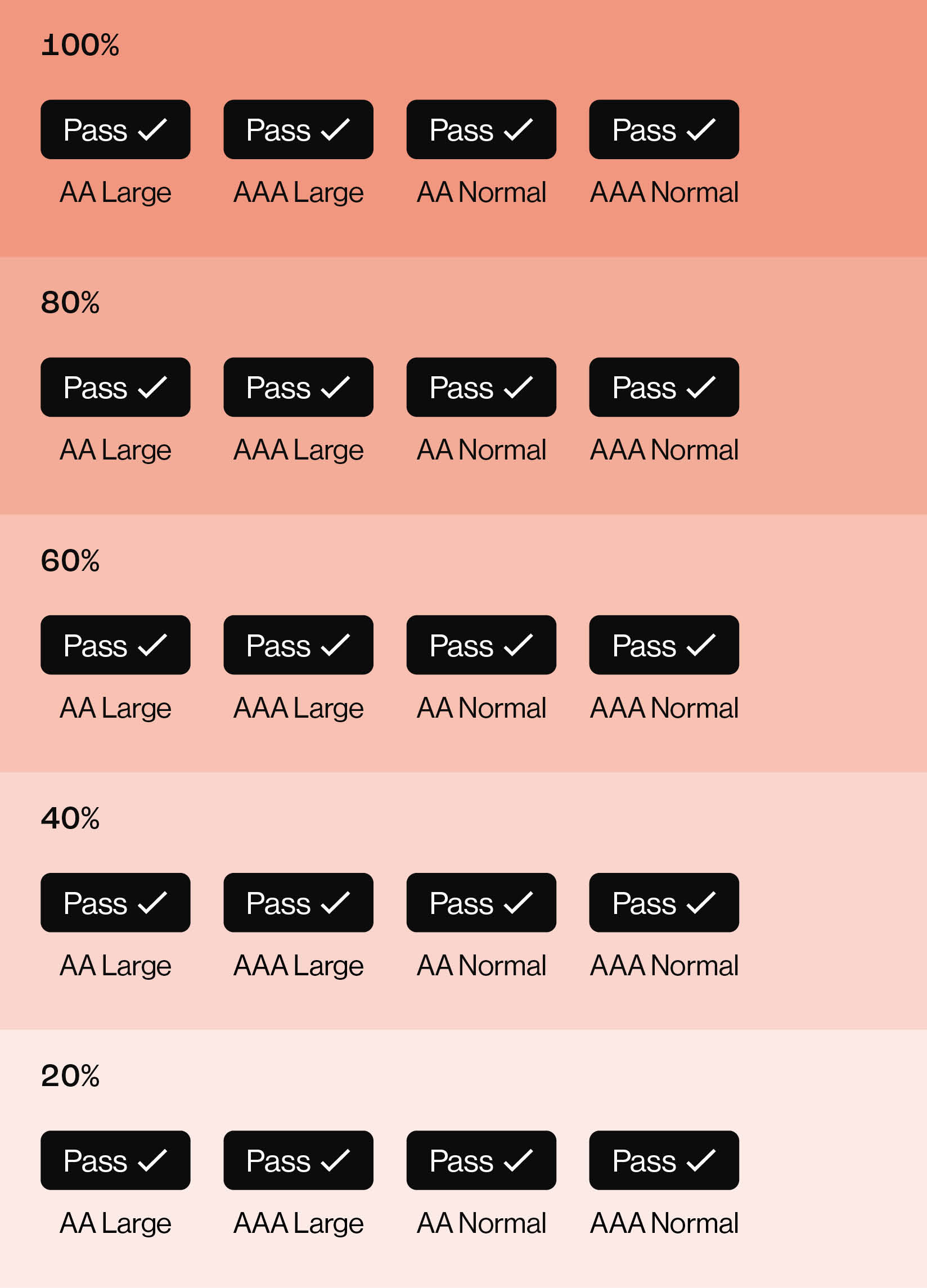
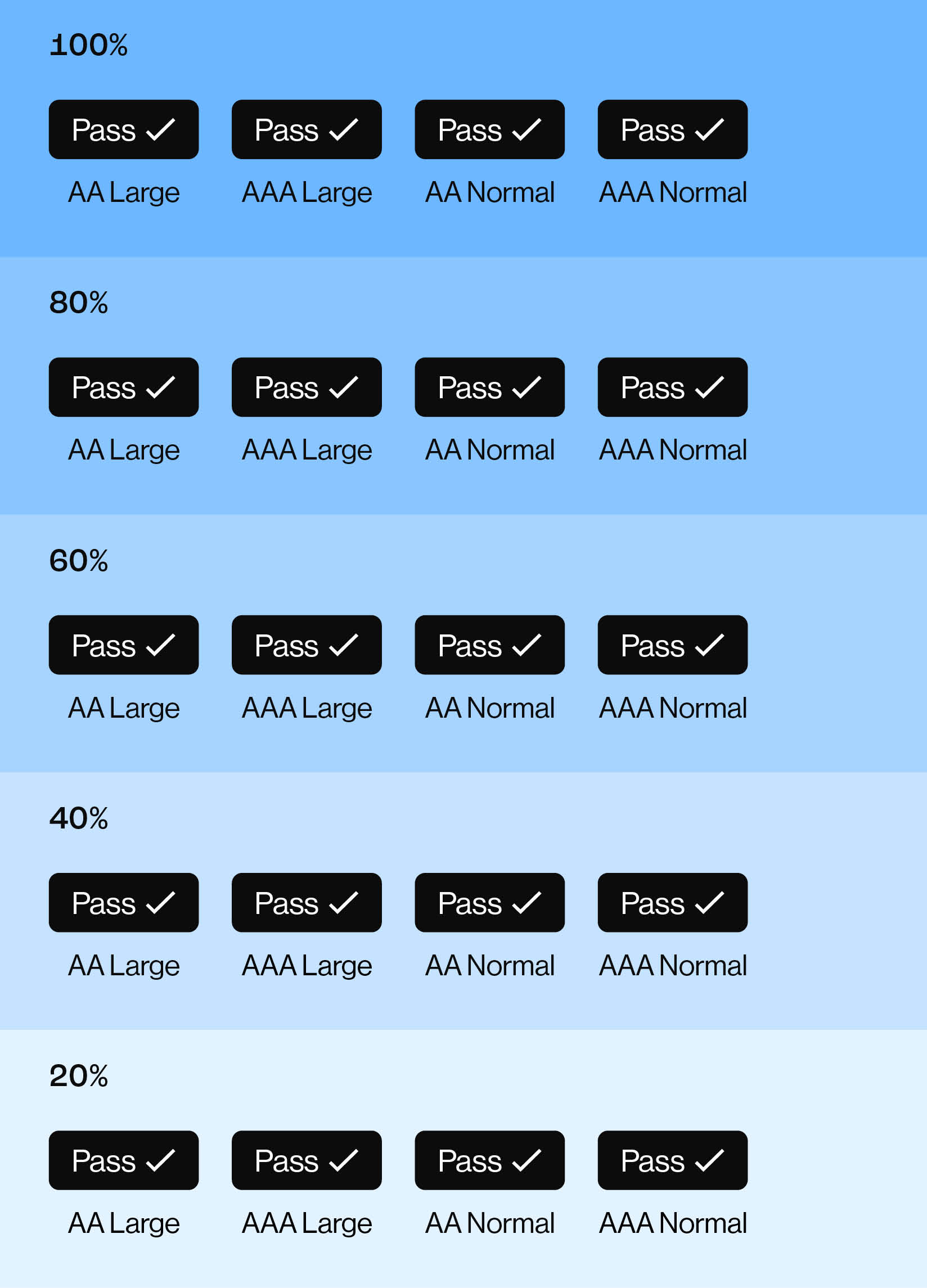
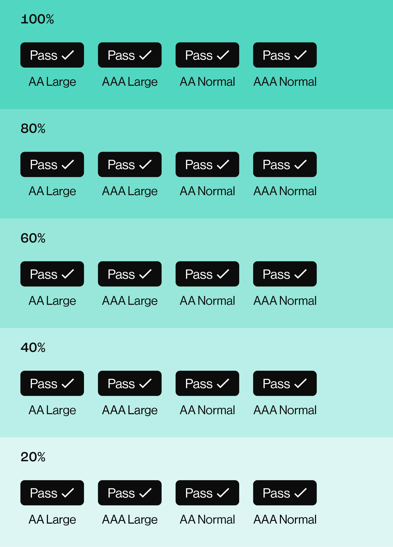
Text Colour Accessibility
“Colour accessibility” refers to the use of colour combinations for written text in digital formats. Text and backgrounds should have a high level of contrast, making content clear and distinguishable for people with visual impairments.
This does not pertain to the use of colour for graphics, shapes, or blocks of colour that do not have written text on them.
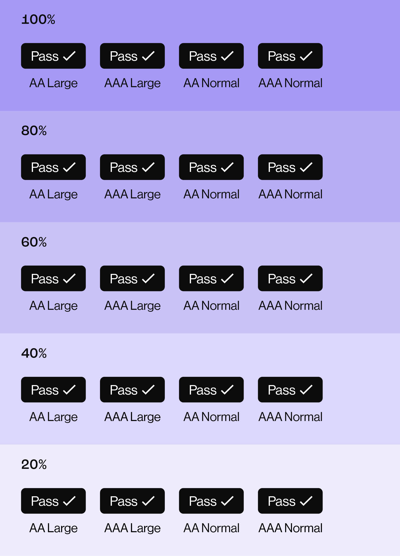
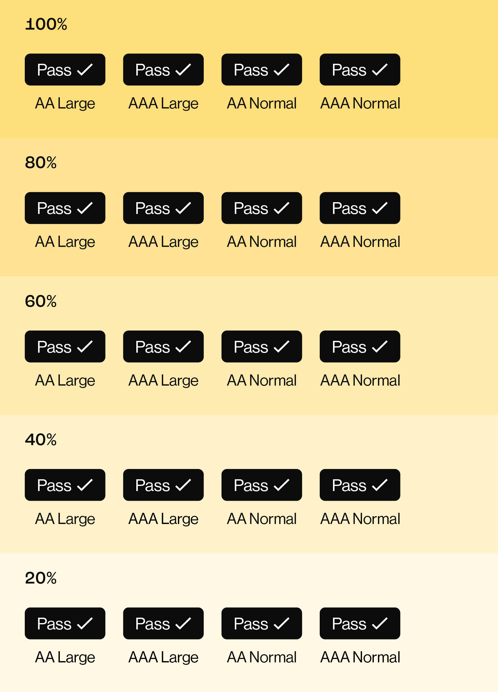
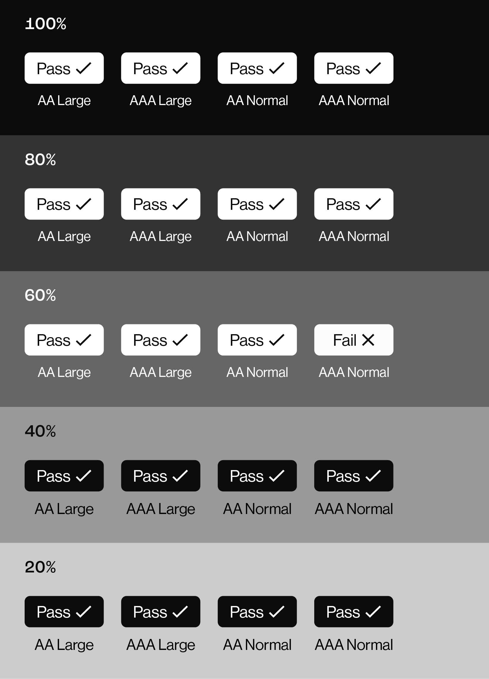
This chart outlines the colour combinations and the accessibility standards that are met at Large and Normal text sizes.
AA is a pass while AAA is the maximum level of contrast. All our primary colours at 100% tint pass both AA and AAA ratings for both large and normal sized text.
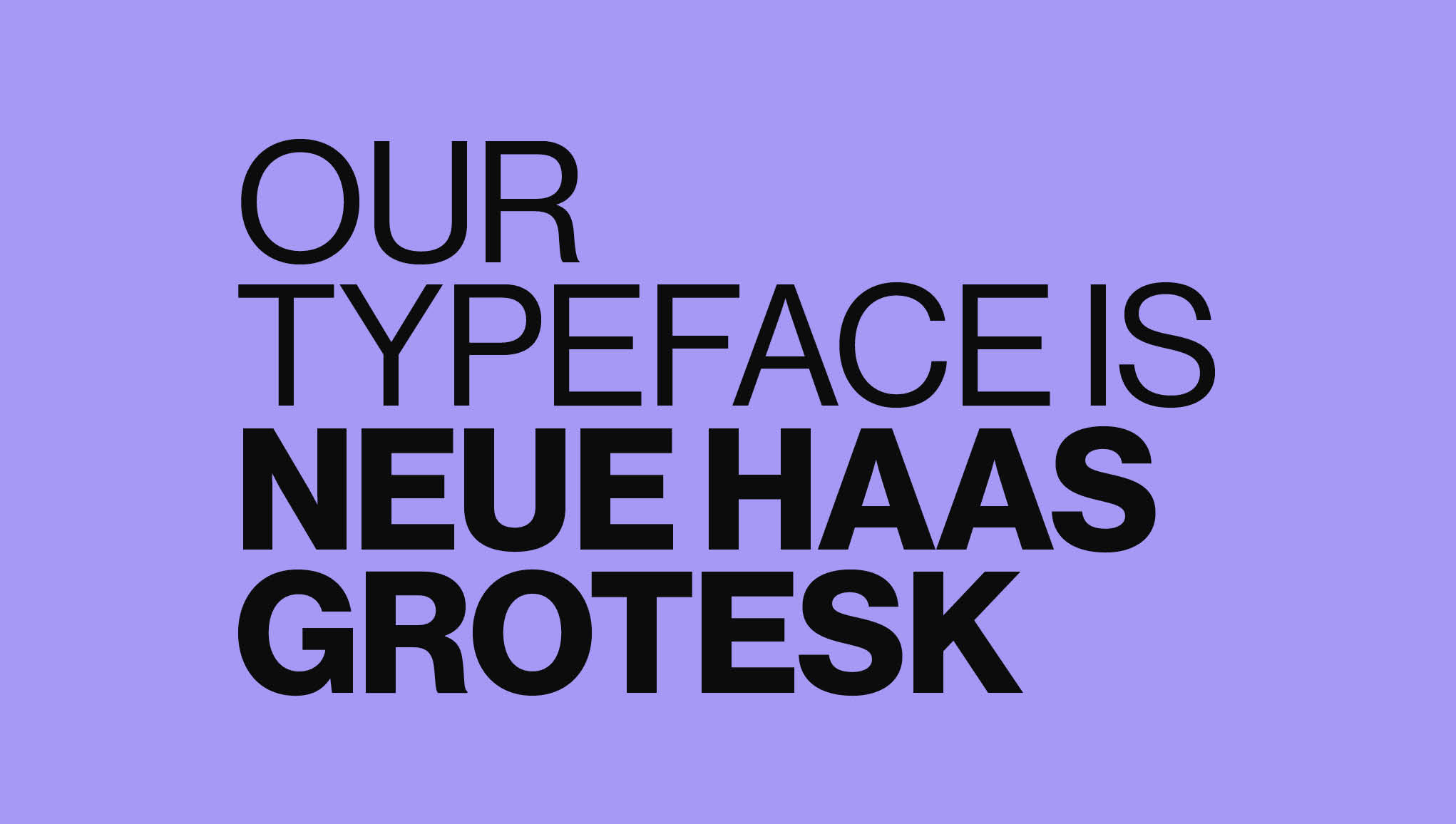
Brand Typeface
Modern yet inviting, Neue Haas Grotesk has been selected as a clean, classic typeface that works effectively in both print and digital at a range of sizes.
We use three weights from the font family to ensure we build consistently strong typographic hierarchies across our brand and marketing communications.
This typeface is free to use through Adobe Creative Suite.
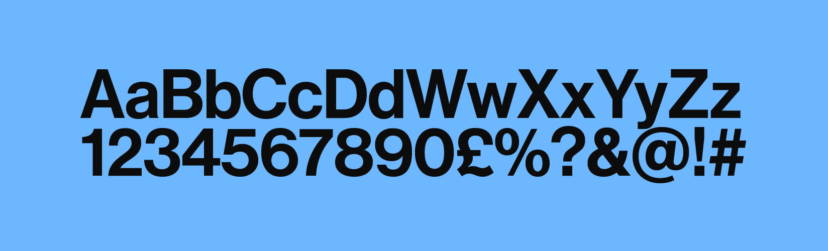
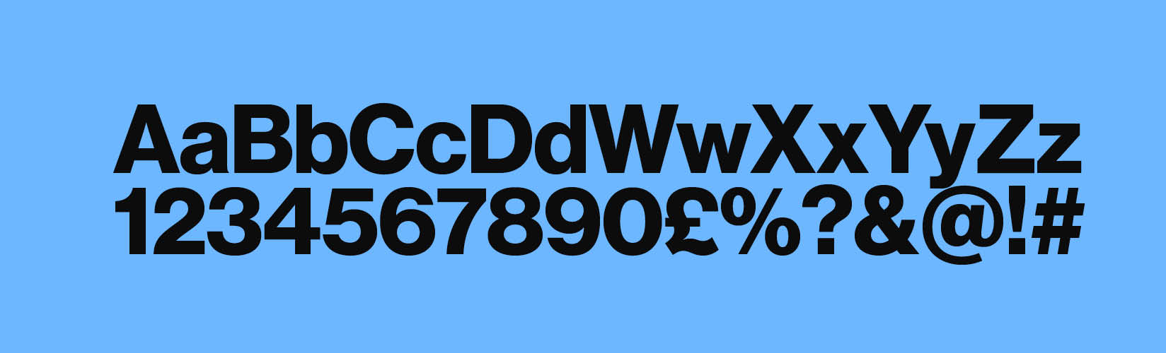
Brand Typeface Weights
Three weights of Neue Haas Grotesk are used for our communications. These weights are:
55 Roman
65 Medium
75 Bold
We use three weights from the font family to ensure we build consistently strong typographic hierarchies across our brand and marketing communications.
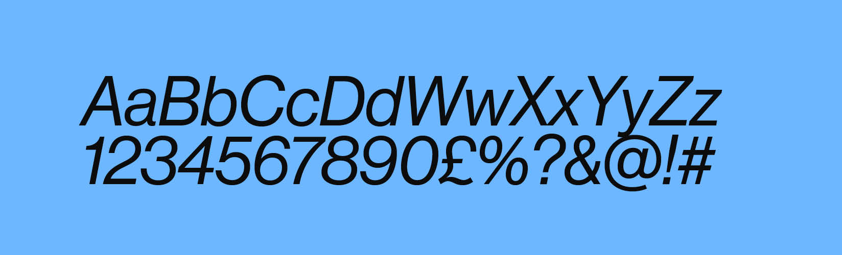
A Roman Italics weight is also available for use. However, this should only ever be used for citing sources and should never be used in headlines.
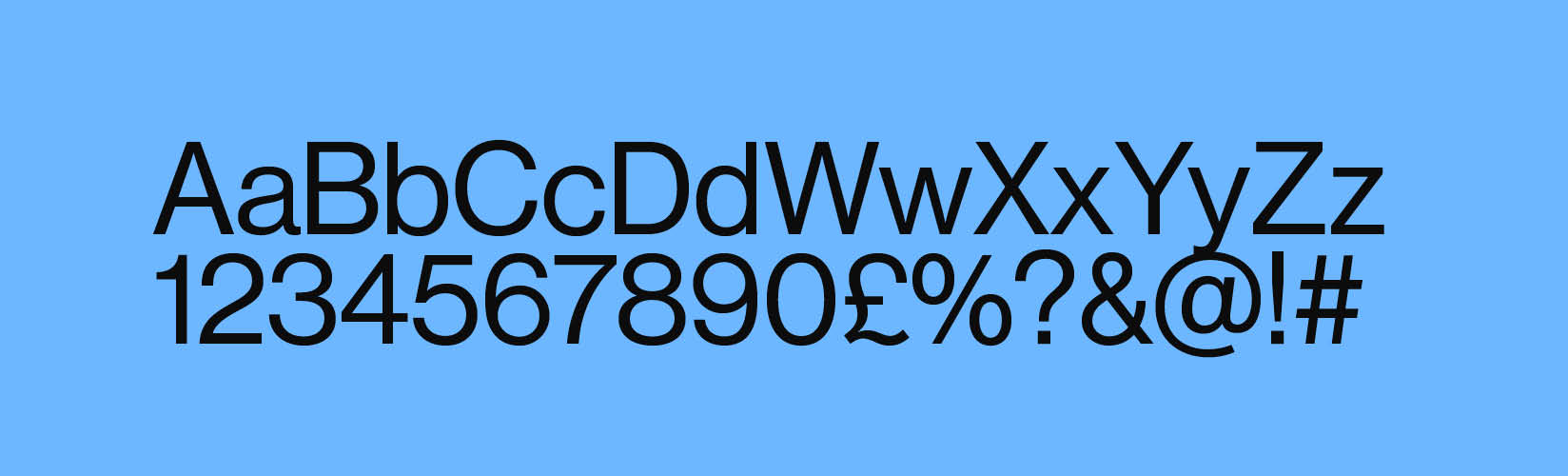
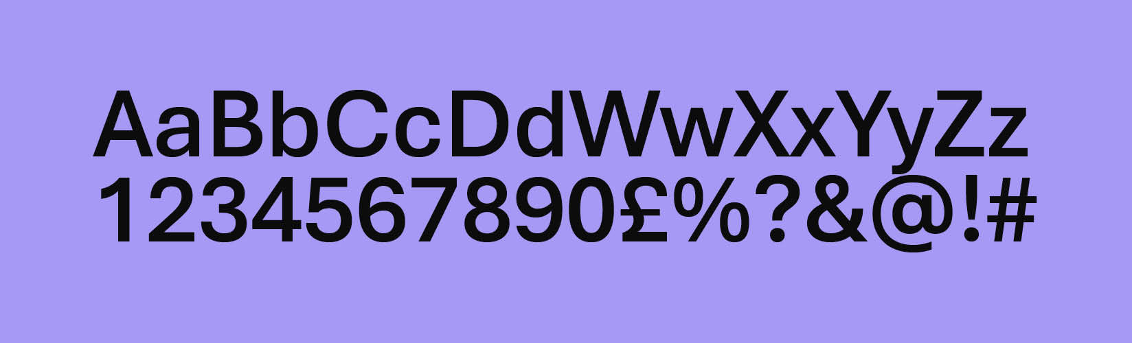
Neue Haas Grotesk 55 Roman
Neue Haas Grotesk 65 Medium
Neue Haas Grotesk 75 Bold
Neue Haas Grotesk Roman Italics
Typographic Hierarchy
Our brand typography features a clearly defined hierarchy, ensuring that every message stands out with clarity and impact. By combining distinct font sizes, weights and typesetting, we create a seamless reading experience that emphasises key information.
This thoughtful approach enhances accessibility, making our content inclusive and easy to navigate for all audiences, regardless of medium or context.
Typographic Hierarchy Explained
Headings
Left:
Neue Haas Grotesk Bold (Caps)
Metric -10
Leading: 85% e.g. 120pt/96pt
Right:
Neue Haas Grotesk Medium (Title)
Metric -10
Leading: 85% e.g. 120pt/96pt
Sub-Headings
Neue Haas Grotesk Medium
Metric +10
Leading 120% e.g. 30pt/36pt
Body Copy

Neue Haas Grotesk Roman
Metric +10
Leading 120% e.g. 10pt/12pt
Sign-off

Neue Haas Grotesk Medium
Metric +10
Leading 120% e.g. 10pt/12pt
Point size should match that of Body Copy
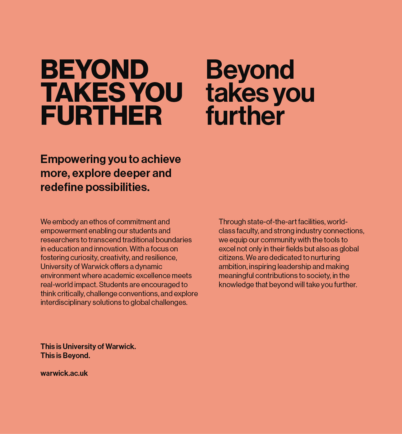
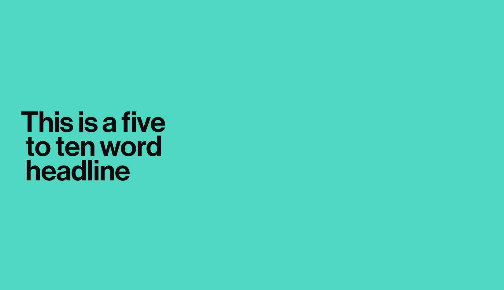
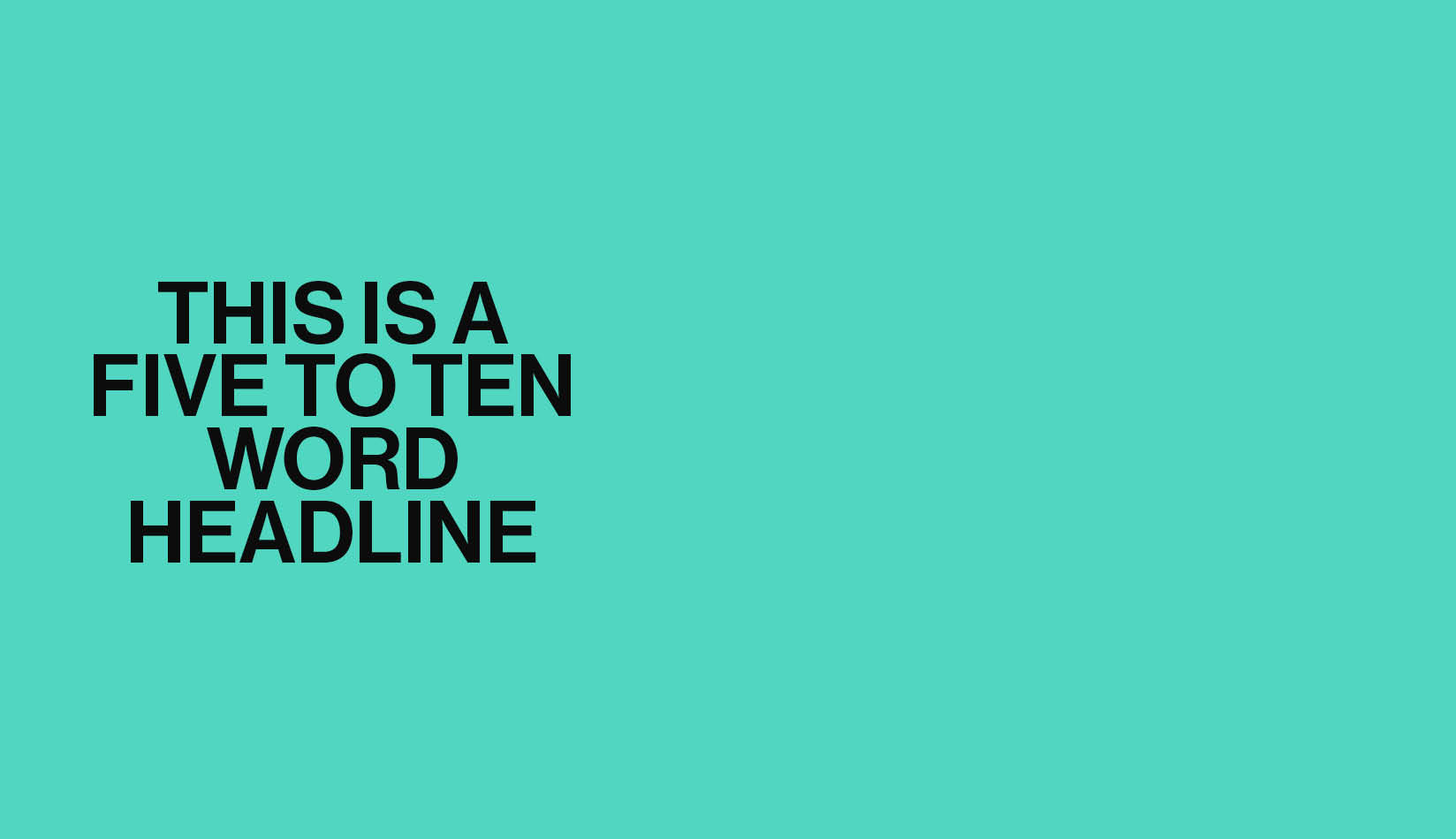
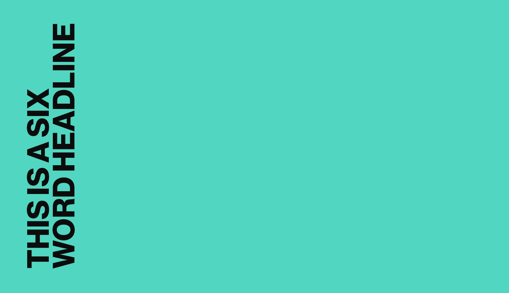
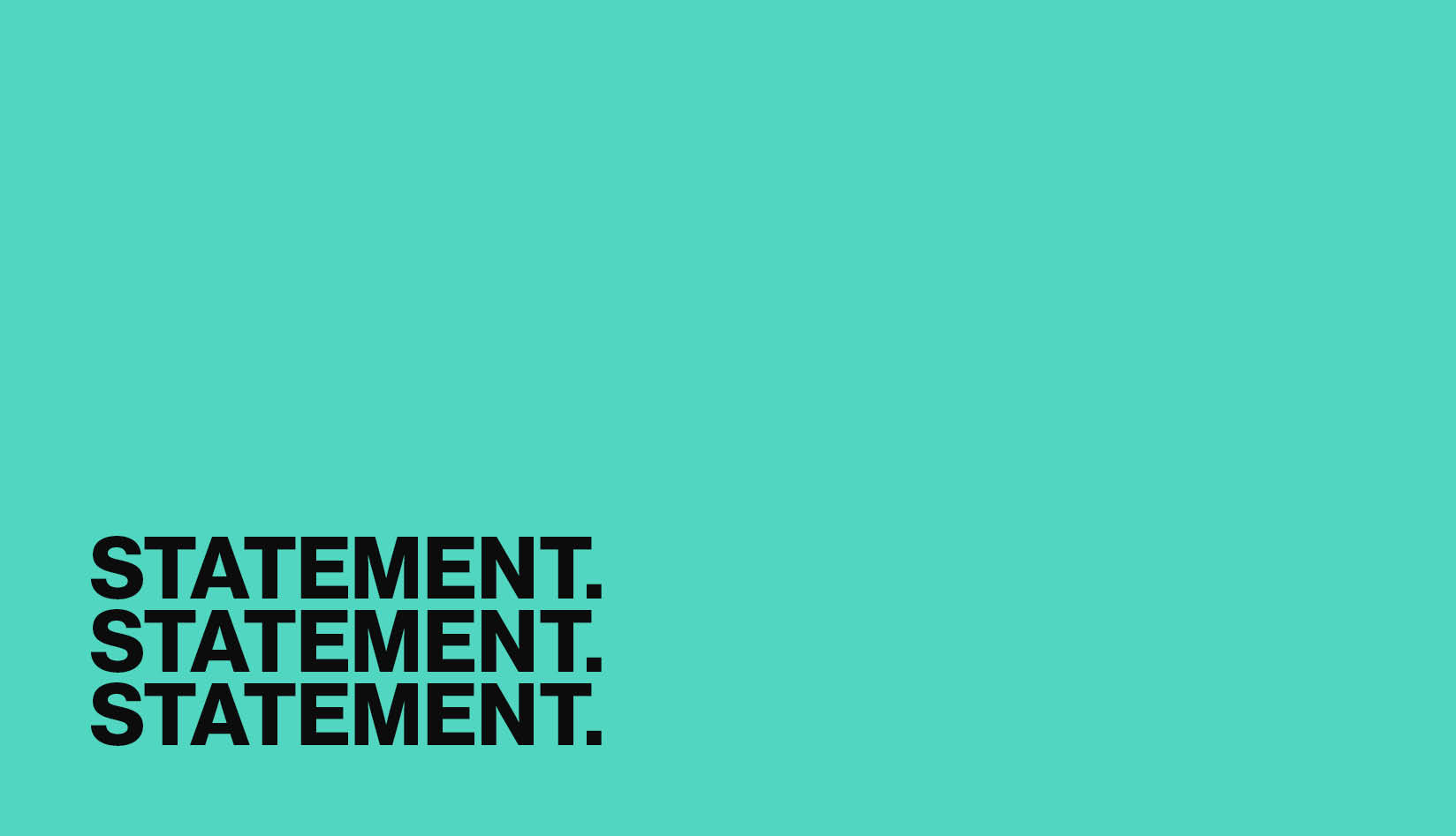
Typographic Headlines
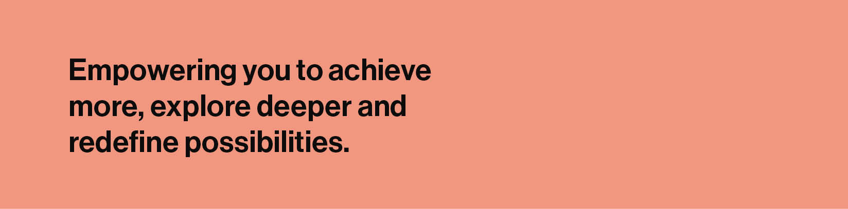
One of the most distinctive aspects of our brand is our approach to headline styling. We utilise a range of headline styles, carefully designed to align with our brand’s visual identity.
When these headline styles are combined with our typeface, thoughtfully curated imagery and signature brand colours, they create a cohesive and impactful visual language. This strategic integration enhances the distinctiveness of our communications and reinforces a strong sense of brand ownership, ensuring our messages stand out in the sector.


Substitute System Typeface
Our primary typeface, Neue Haas Grotesk, may not be available on all computers and is not compatible with software such as Microsoft Word and PowerPoint, which rely on system fonts. In these cases, Aptos is used as a substitute.
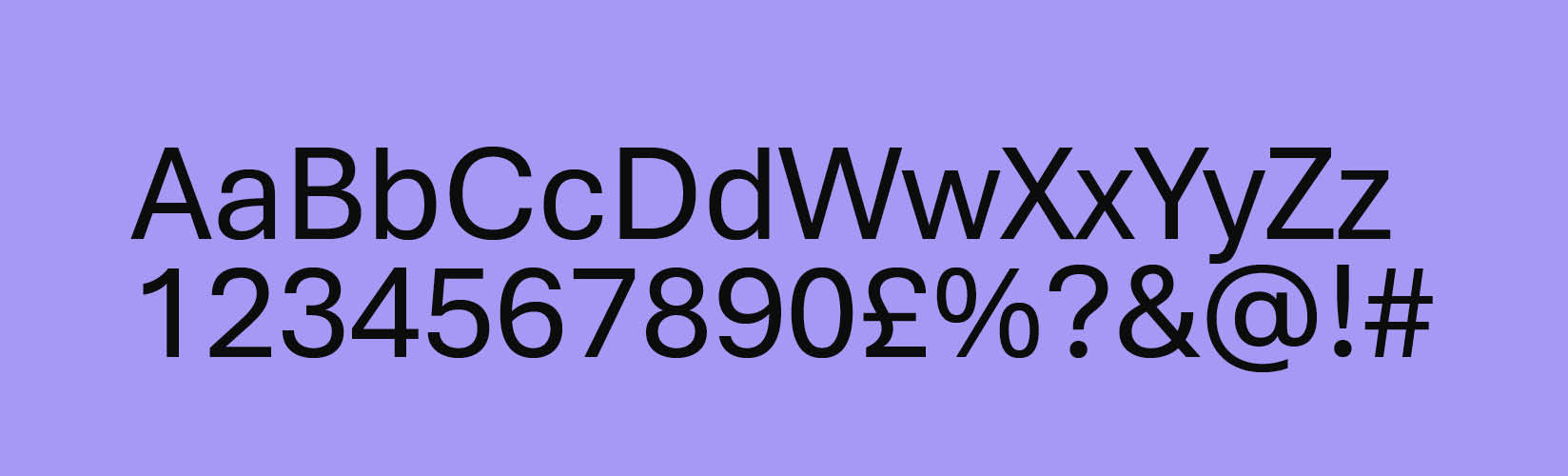
Only three weights of Aptos should be used:
Roman
Semibold
Bold
The typographic guidelines for Neue Haas Grotesk should still be followed as closely as possible.
If Aptos is unavailable, then Arial should be used (in Regular and Bold weights only).
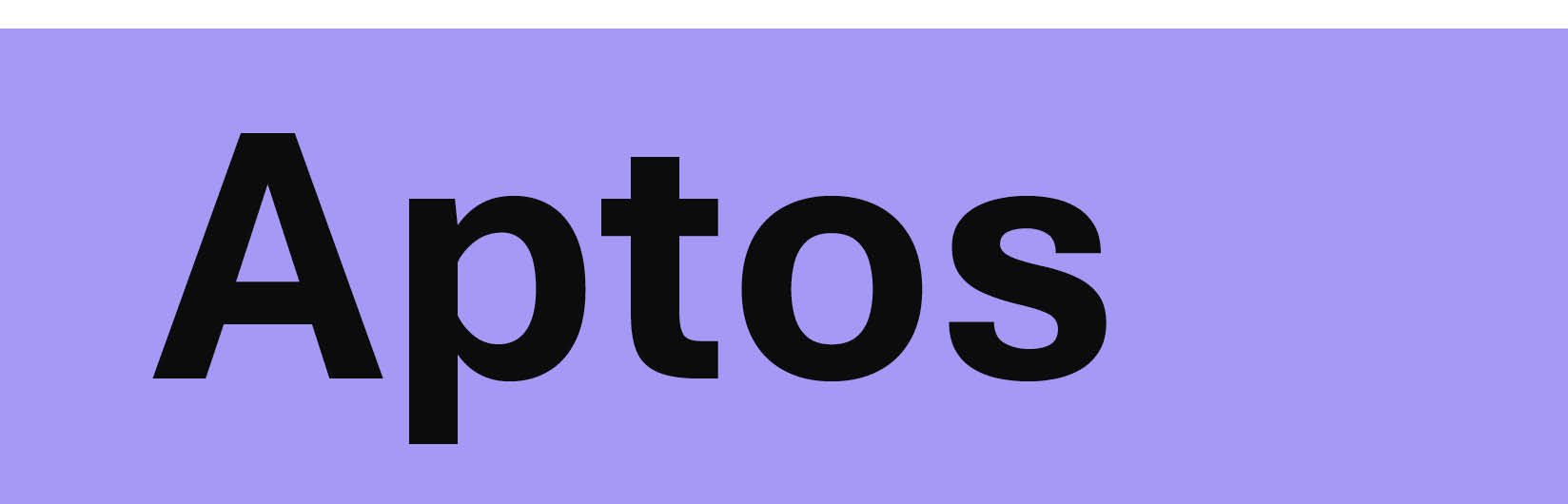
Aptos font
Aptos regular
Aptos semibold
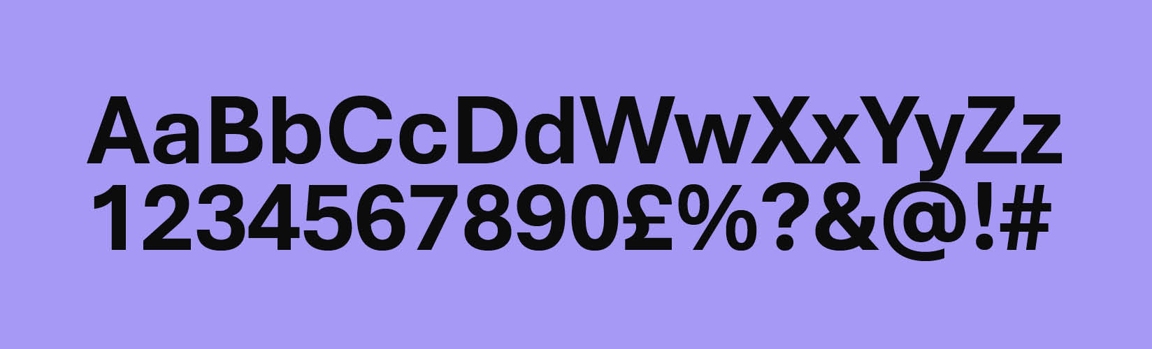
Aptos bold
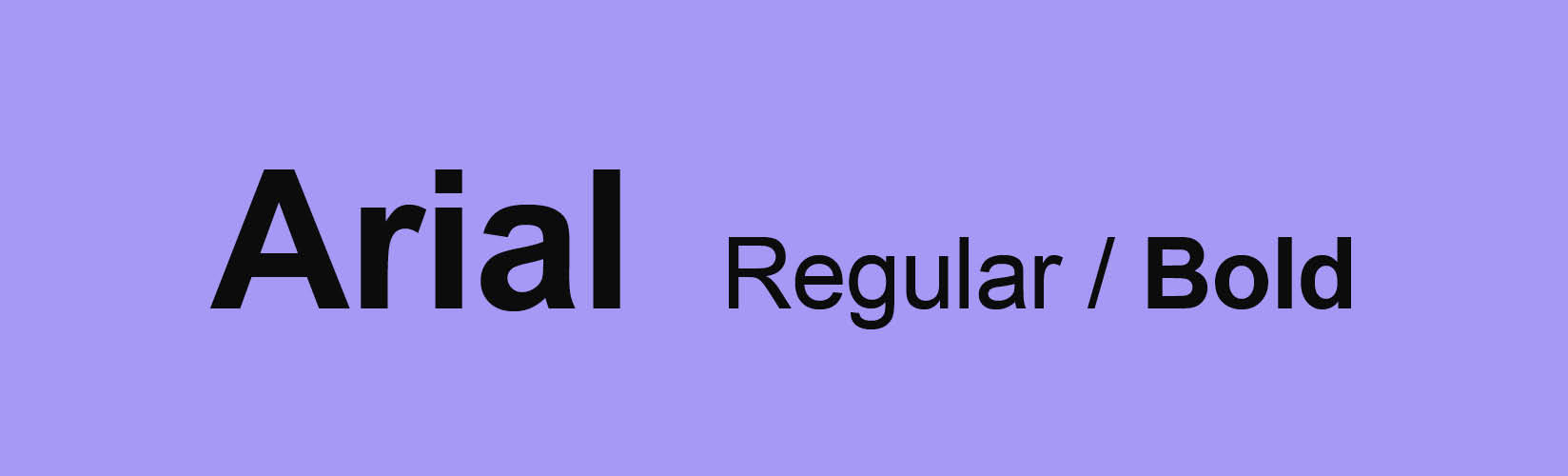
Arial regular/bold
Brand Sign-off
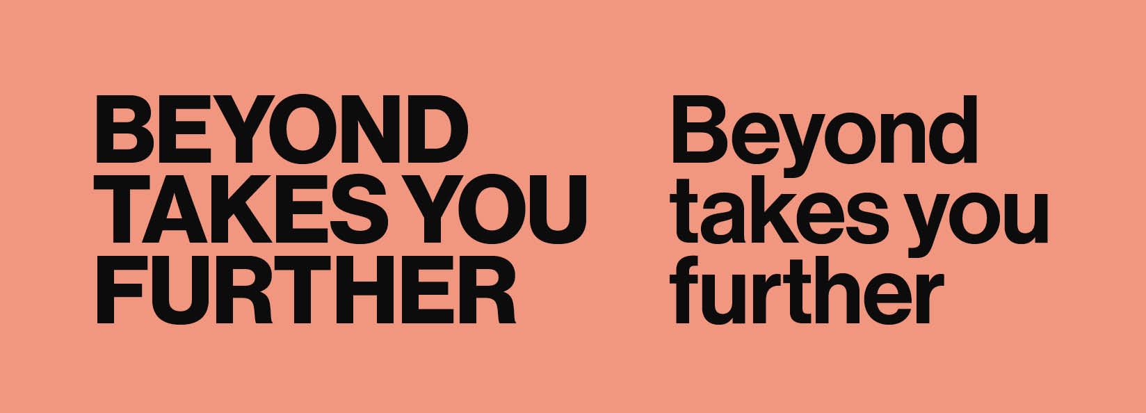
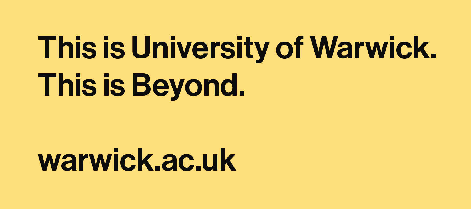
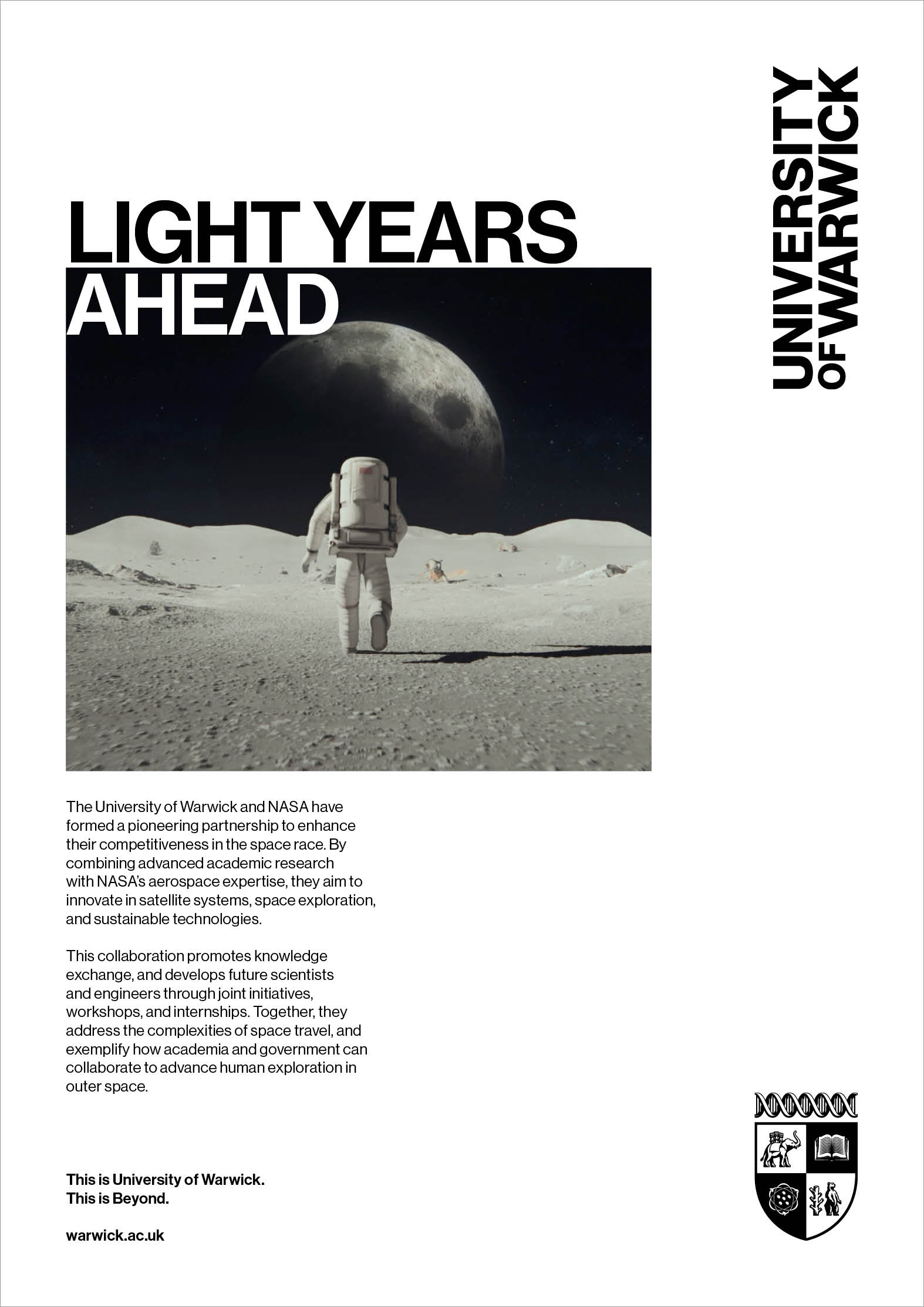
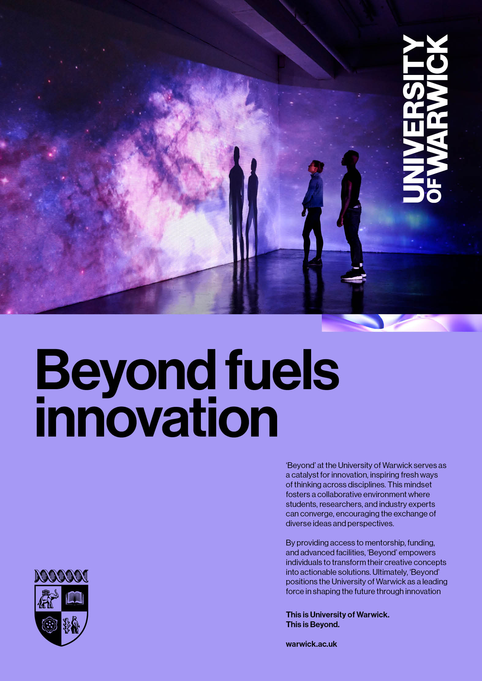
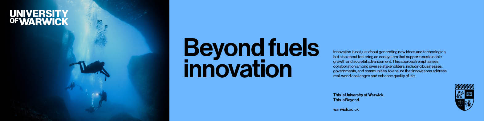
Our brand mantra, ‘Beyond’, serves as a guiding principle that reflects our commitment to pushing boundaries, fostering innovation, and striving for excellence in all that we do. This mantra is brought to life through our brand sign-off:
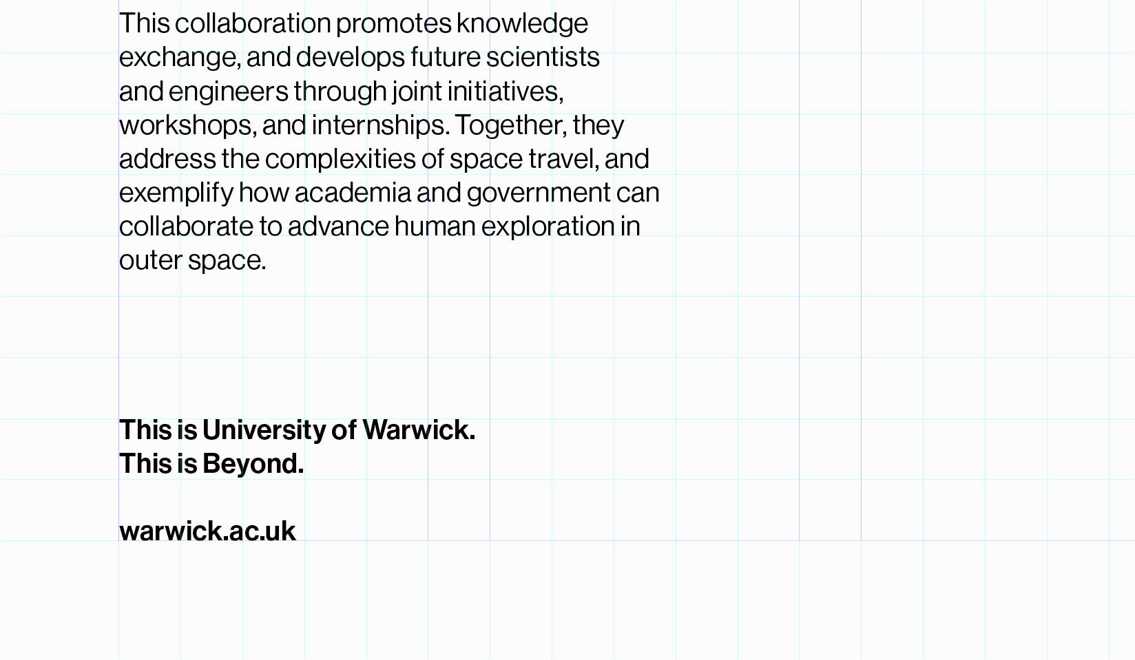
This is University of Warwick.
This is Beyond.
Our web address may also be required, depending on where the communication is being shared. For instance, if a campaign is displayed on an outdoor billboard, the web address should be included. However, if the same campaign visual is shared on our website, the web address should be excluded.
Although there is no strict rule for when the sign-off should appear, its placement should be carefully considered:
- For high-impact materials such as hero campaigns, flagship publications and institutional reports, it is important to include the brand sign-off to reinforce our core message and identity.
- For routine or informal content, such as social media posts, internal communications or smaller collateral, the sign-off is not always required.
Arrangement of Brand Sign-off
Brand Sign-off Layout
This diagram shows how our brand sign-off should be laid out to ensure consistent spacing.
The type is set in Neue Haas Grotesk Medium. The leading (the space between adjacent lines of type) should be set at 120% of the point size of the text.
When the web address is included, it should sit with the spacing of two hard returns between it and the line above.
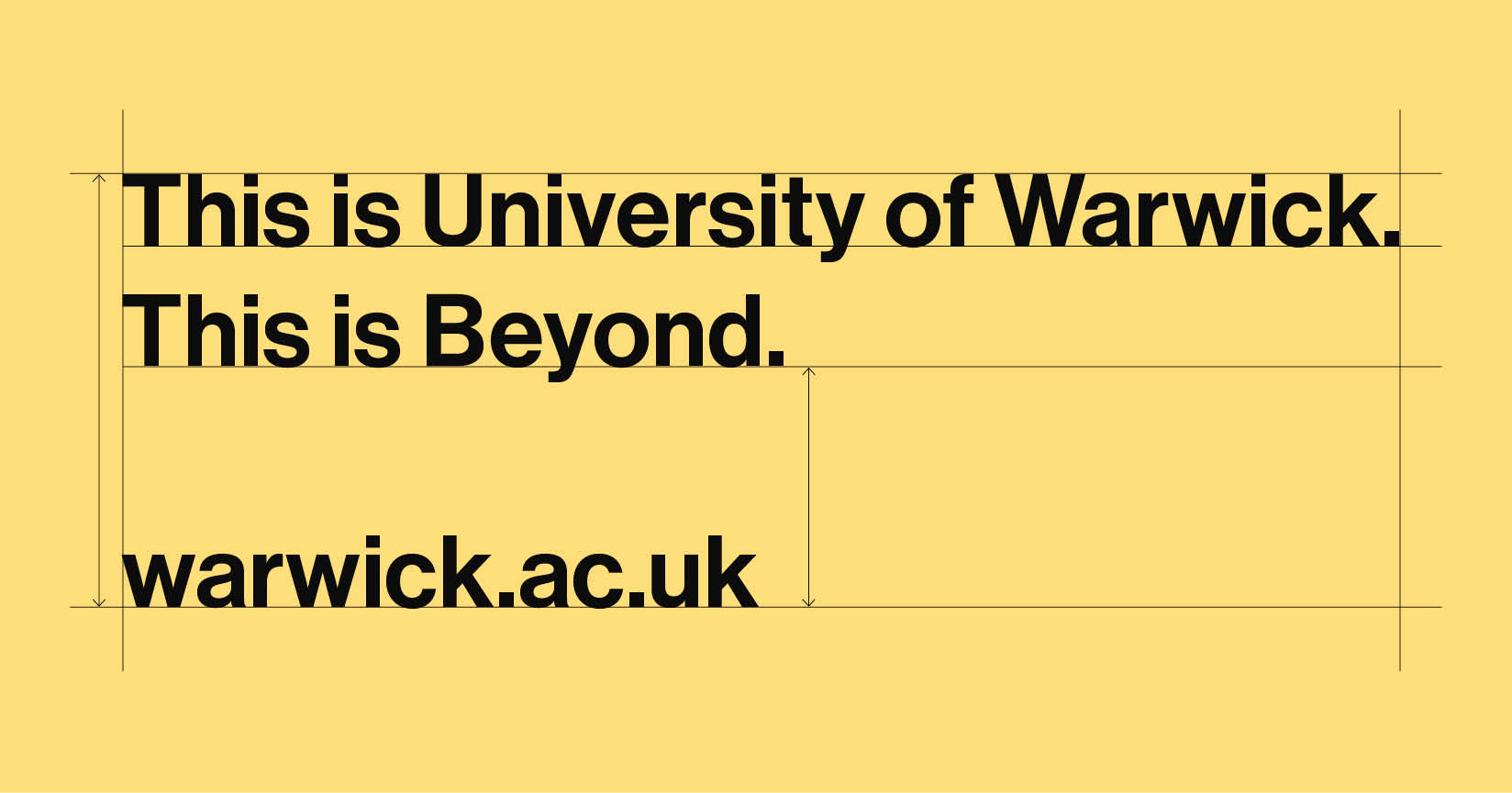
Sign off
Neue Haas Grotesk Medium, left aligned, metric 10, auto leading 120%
2 x hard returns on keyboard for correct spacing between ‘This is Beyond.’ and ‘warwick.ac.uk’
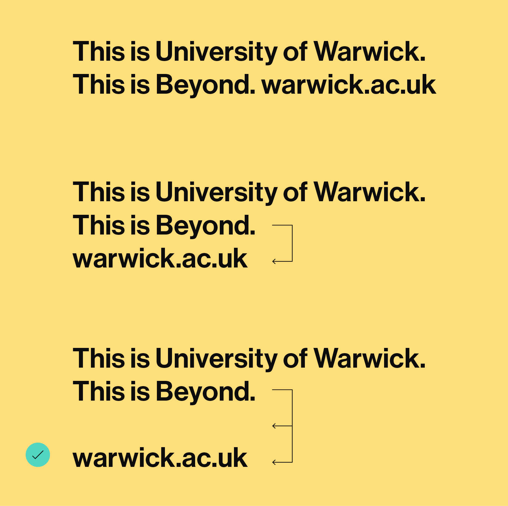
Process for correct return spacing for Web Address
This diagram shows how our brand sign-off should be laid out to ensure consistent spacing.
The type is set in Neue Haas Grotesk Medium. The leading (the space between adjacent lines of type) should be set at 120% of the point size of the text.
When the web address is included, it should sit with the spacing of two hard returns between it and the line above.
Step 1.
Web address written directly after ‘This is Beyond.’

Step 2.
One hard return to place onto the line below.

Step 3.
Second hard return to place web address onto the correct second line.

Brand Sign-off Web Address
When the web address is present in our brand sign-off, it can exist in two forms.
At an institutional level it should exist solely as:
warwick.ac.uk
However, when a communication piece is created by one of our key internal bodies, they can include a slug in the web address. For example:
warwick.ac.uk/sport
warwick.ac.uk/wmg
warwick.ac.uk/wbs
Institutional Web Address
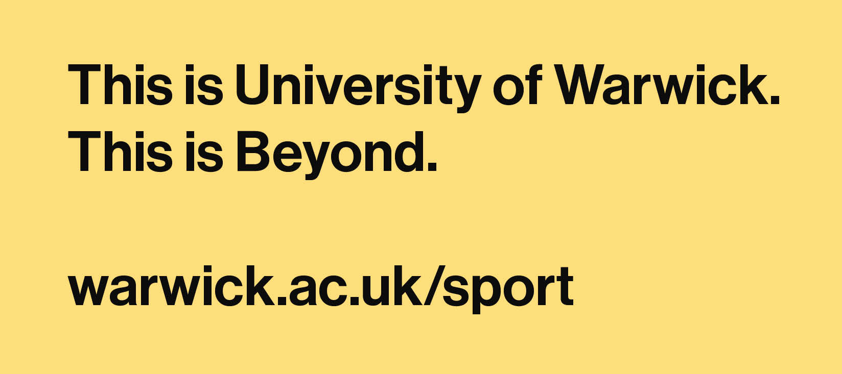
Key Internal Body Web Address
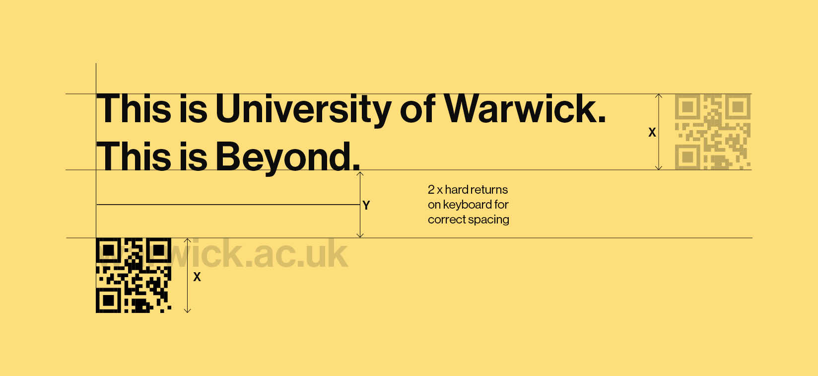
QR Codes Sign-off Layouts
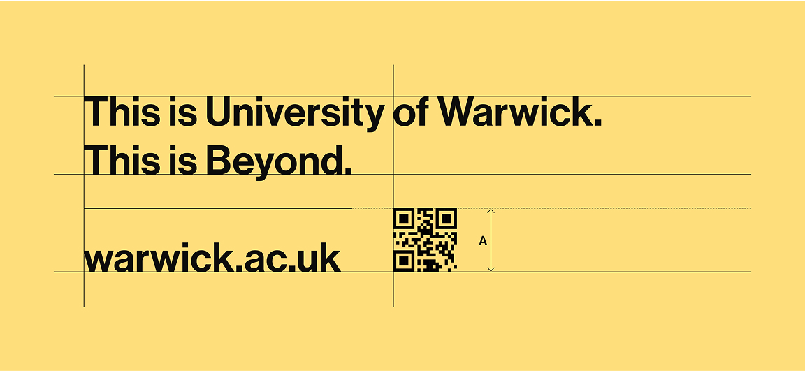
For stacked QR code sign-offs, where only the QR code is present (and not the web address), the height of the QR code should match the height of the brand sign off. This is marked X on the diagram.
A dividing line is placed centrally in the space between the top of the QR code and the baseline of the brand sign-off, and is marked as Y on the diagram. This space is two hard returns. The diagram shows a transparent web address from the sign-off, with the QR code sitting at the height of the ‘k’ from ‘.uk’. This web address is only shown here to demonstrate where the QR code should be placed.
Some stacked QR code sign-offs include both the web address and QR code for accessibility. The QR code is sized from the baseline of the web address, to the height of the dividing line. This is marked as A on the diagram. However, in some cases, the size should be increased to ensure it scans correctly. It should be positioned to the right of the web address.
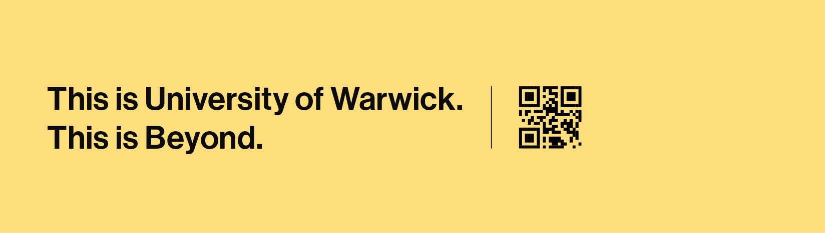
For landscape QR code sign-offs, the height of the QR code should match the cap height and baseline of the brand sign-off.
The distance between the edge of the brand-sign off and the edge of the QR code is calculated as the height of Y from the stacked QR code sign-off. A dividing line the height of X is placed centrally in this space.
Stacked QR Code Sign-off Layout - No Website
Two hard returns on the keyboard to set the correct spacing between 'This is Beyond' and where the height of the QR code should sit.
Stacked QR Code Sign-off Layout - Website
Landscape QR Codes
For landscape QR code sign-offs, the height of the QR code should match the cap height and baseline of the brand sign-off.
These examples illustrate how landscape QR codes should appear. There may be instances where adjustments are needed to suit the design requirements.
For example, if the QR code contains a long web address, the graphic will be more intricate and may need to be larger for readability by a phone camera. In such cases, increase the size of the QR code while maintaining the overall integrity of the layout.
Landscape QR Code Sign-off Layout - No Website
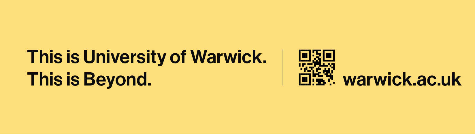
Landscape QR Code Sign-off Layout - Website
Brand Sign-off Positioning
There are no strict rules for the exact placement of the brand sign-off, as it will vary depending on the design layout. However, it should generally be positioned below headlines, subheadings, or body text, and typically in the bottom corners of a format.
In some cases, such as on larger formats with less conventional text placement, the sign-off may be positioned closer to the text. Good design judgement is required to maintain the visual balance of the layout.
In the pre-designed templates, the brand sign-off is set to a specific point size, which should match the body copy size. If the body copy is scaled up, the brand sign-off should be adjusted accordingly.
If you are working on a format outside of the pre-designed templates, use the closest template as a reference and scale the design (including the brand sign-off and other elements) to the new size. Then adjust the point size of the brand sign-off, rounding it to a whole number without decimals. Set the leading to 120% of the point size to ensure consistent spacing across formats.
Placement of the brand sign-off in the corner of the format underneath body copy.
Brand sign-off sitting bottom left away from body copy
Brand sign-off sitting bottom right with body copy
Brand sign-off sitting bottom right with body copy