Iconography
Iconography Style
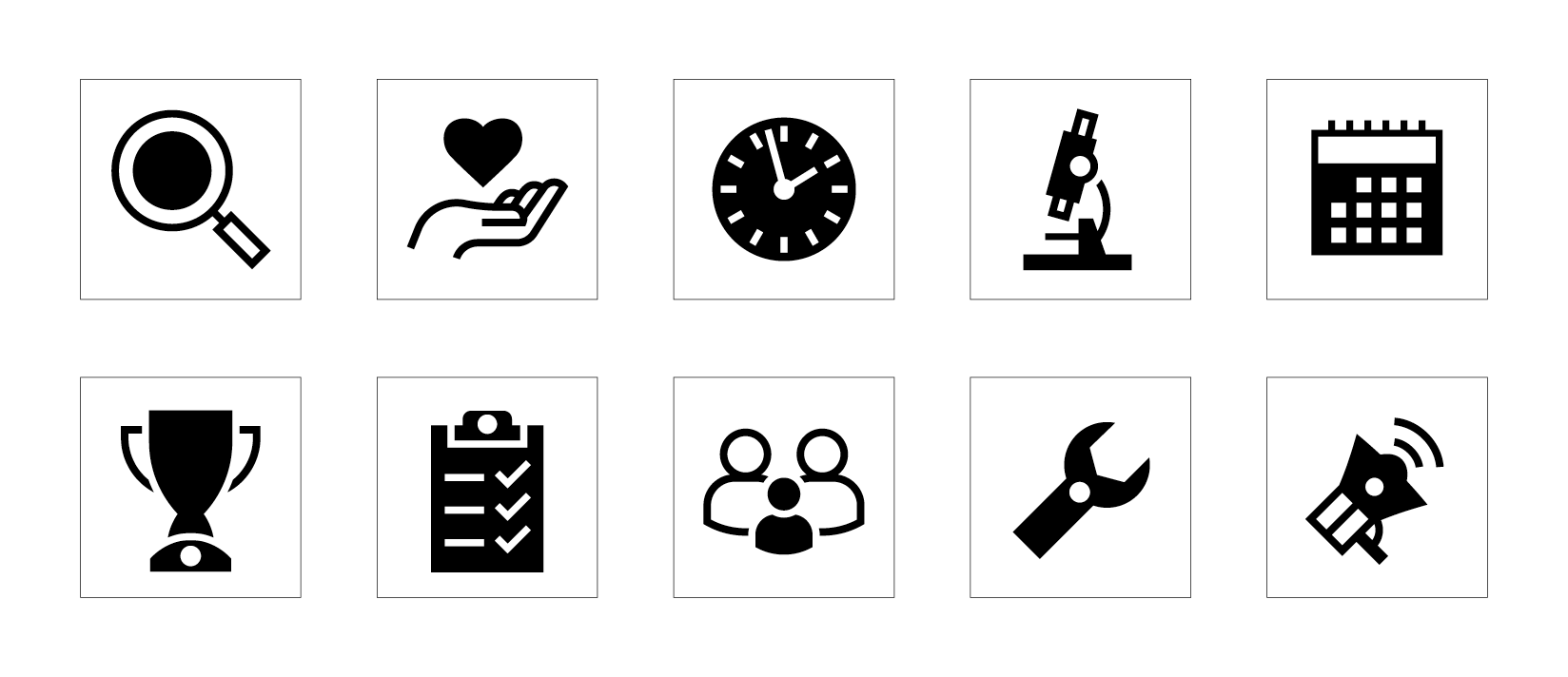
We have developed a distinct and ownable icon style that is simple to replicate consistently. The icons are designed to be minimal but not overly simplified—just enough detail is included to add character without losing clarity.
To ensure cohesion with our overall design system, we follow specific guidelines, the most important being the use of large colour areas to help with colour saturation.
Setup & Approach:
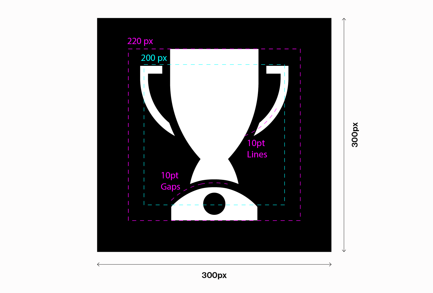
- Icons are set to 300px wide.
- The artwork zone ranges from 200px to 220px, depending on what provides the best balance for each icon.
- All gaps around solid shapes use a 10pt black stroke.
- All white lines are set to 10pt.
Any new icons created are subject to approval by the Brand Team.
Please get in touch with us via our Contact Form.

Iconography Colour Usage
Our icons can use any of our brand colours and always appear within a square shape.
When placing icons on pastel or white backgrounds, the square should be black, and the icon itself should match the background colour.
If the background is purple or black, the square should be white, and the icon should match the background colour (purple or black).
These rules help our icons to stand out.