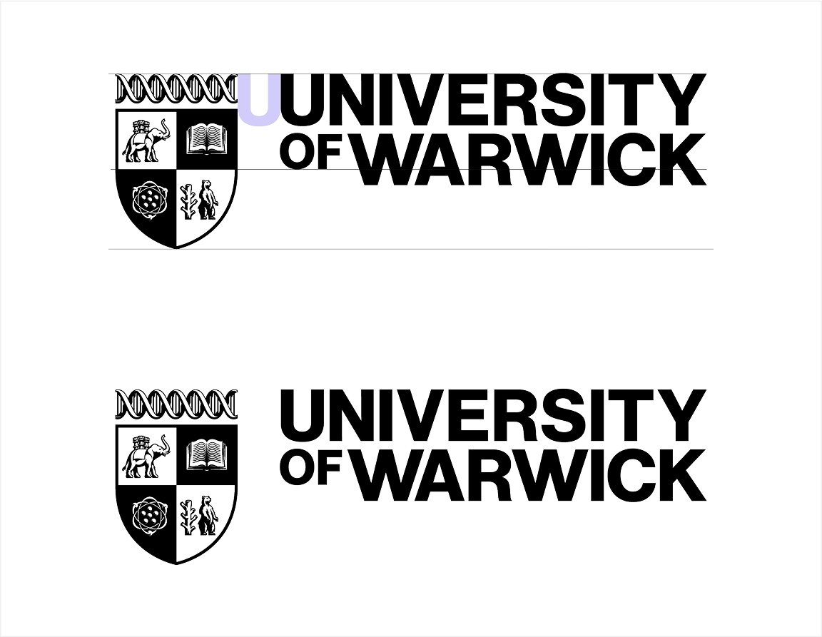
Visual Identity
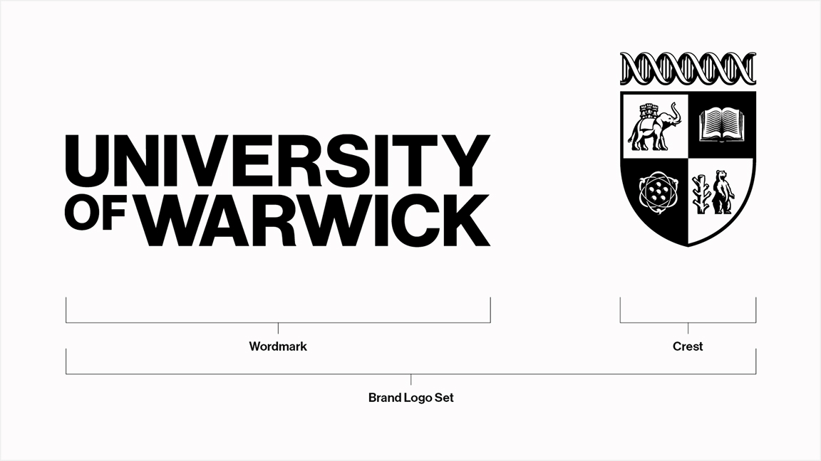
Brand Logo Set
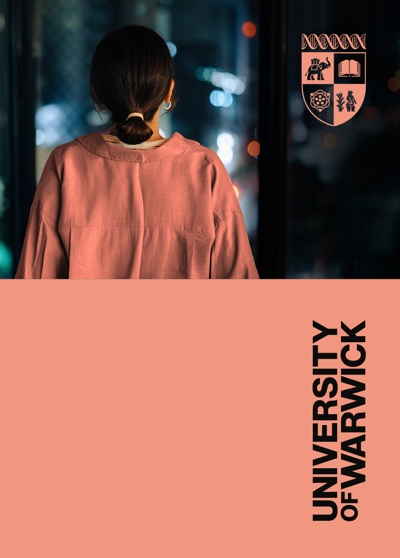
Our Wordmark and Crest should be present on all of our communications and most of our assets.
These elements are vital to our brand and both should be present on our communications. They should be separated and positioned in ways that bring balance to our layouts. We refer to this style as ‘split usage’.
Internally, on rare occasions, one element may appear alone due to size limitations of a format.
A lockup version of the Wordmark and Crest is available for third-party use only. Details on usage can be found in our Logo Lockup for Third Party Usage section.
Correct usage guidelines for the brand logo set and lockups for third parties is provided throughout this Visual Identity section of our Brand Book.
If you have any queries around the correct usage of these elements, please contact the Brand Team for further direction.
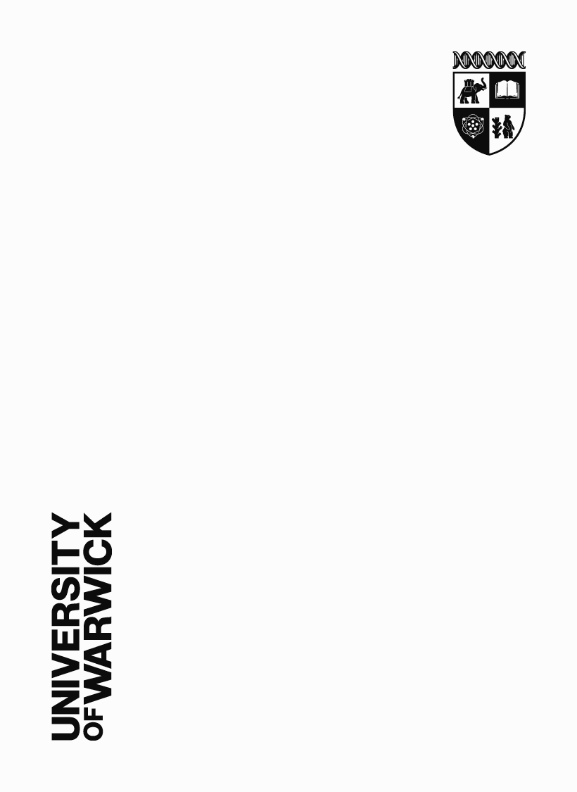
Wordmark
Our Wordmark is bold, confident and unconventional – just like University of Warwick.
The clean typographic design allows the Wordmark to create impact across a wide range of formats while remaining fully accessible.
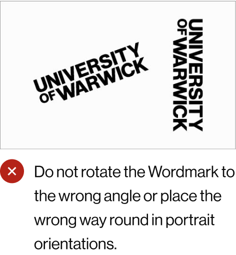
The Wordmark can be placed in both landscape and one specific portrait orientation.
For more information on the Wordmark and how it relates to our ‘split usage’ style, please refer to our Brand Logo Set and Brand Logo Set Sizing sections.

Wordmark Clear Space
To maintain clarity and visual integrity, our Wordmark must always have a minimum clear space surrounding it. This space is measured by the width of the letter W in WARWICK.
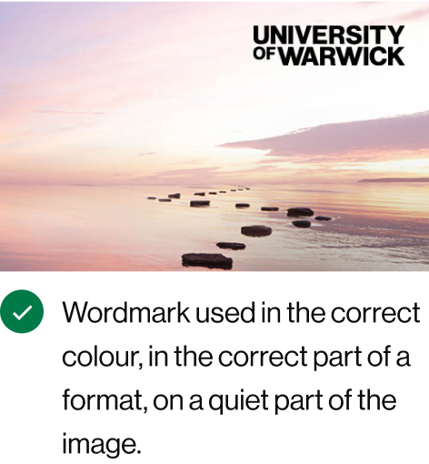
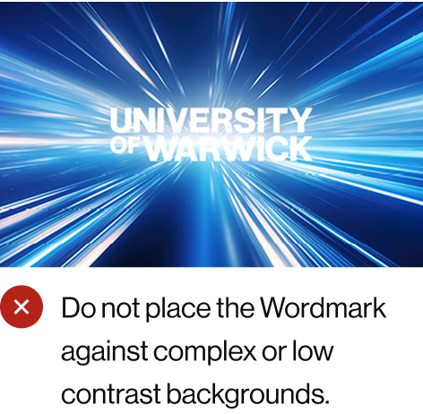
No other graphic elements, such as text or image boxes should intrude on this space. If the Wordmark is placed over an image, it should be positioned on an uncluttered area of the image to preserve clarity.
The Wordmark can also be used in portrait orientation, where the same clear space rules apply. The example shown is the correct orientation, reading from bottom to top, with the Y of UNIVERSITY at the top left corner. The portrait Wordmark should never be reversed or flipped.
On small assets or those with limited space, it may not be possible to adhere to the clear space rule. In these cases, the Wordmark should be made as large as possible within the available area.
Further information on the minimum Wordmark size can be found in the Minimum Sizing for Brand Logo Set section.
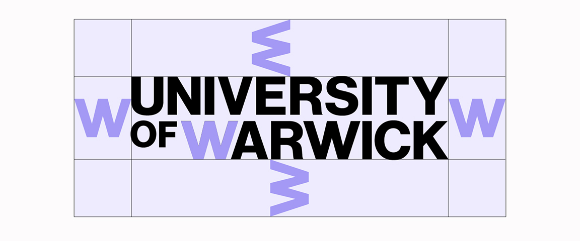
Wordmark Clear Space Landscape
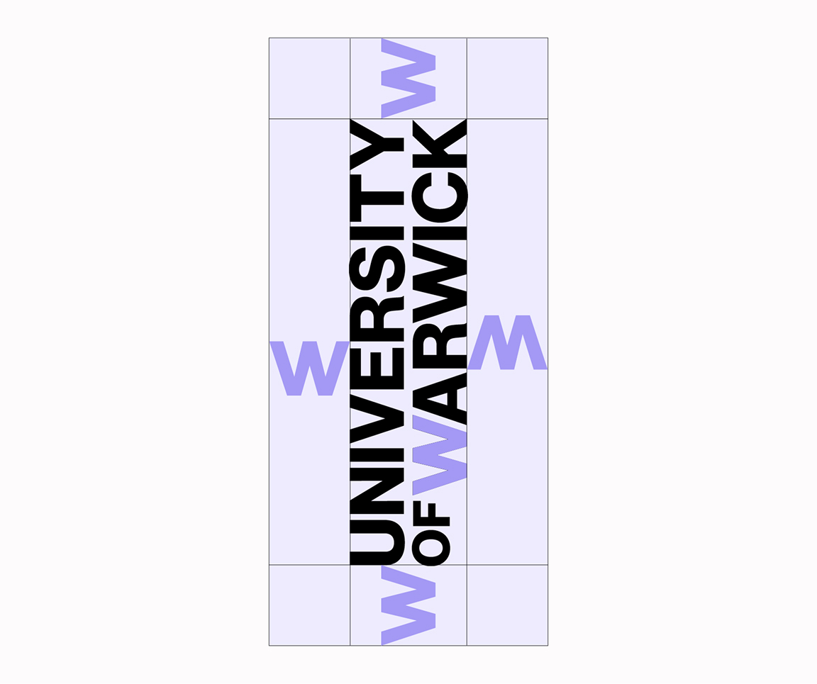
Wordmark Clear Space Portrait
Crest
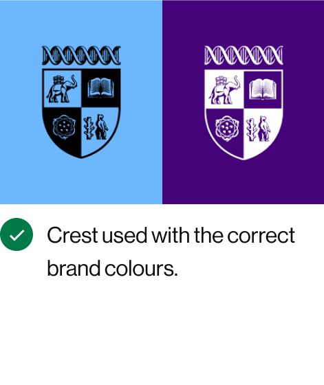
Inspired by our Coat of Arms, our Crest embraces our history while being suitable for use in the digital age. Positive and negative versions of our Crest exist to work on different backgrounds.
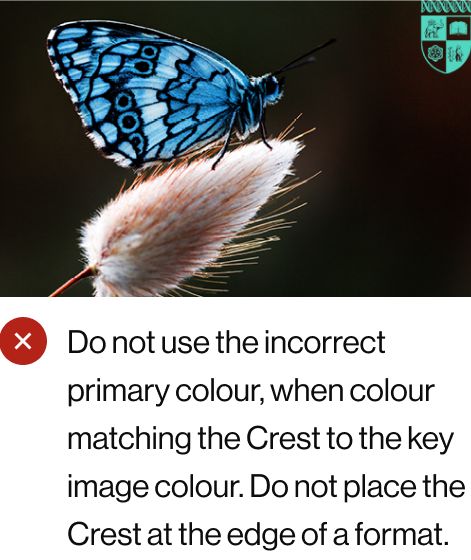
The Positive Crest can only be represented in black or purple. The Negative Crest can be used in white or the pastel shades, but only when on dark photographic backgrounds where there is a complementary colour to the pastel.


Responsive Crest
Our Responsive Crest has been designed to maintain its visual appeal and clarity in smaller formats. We use our Responsive Crest across web, digital and unique printing situations where it provides the optimal solution for capturing specific details.
Our Responsive Crest adheres to the same guidelines as the Primary Crest for proportional sizing to the Wordmark, clear space, proper usage, and colour.
Digital Responsive Crest Usage
The Responsive Crest is used as standard across all web and social formats where the Crest height is below 100px.
For video and digital Out of Home (OOH) formats where the Crest height exceeds 100px, the regular Crest can be used.
Print Responsive Crest Usage
The Responsive Crest should be used on any small format print assets where the main crest would lose detail, for example pens or lanyards. The Crest will be reproduced to different levels of detail, depending on the type of printer that prints it. As such, if the Crest needs to be produced at a size roughly less than 15mm, the Responsive Crest is the optimal version to use.


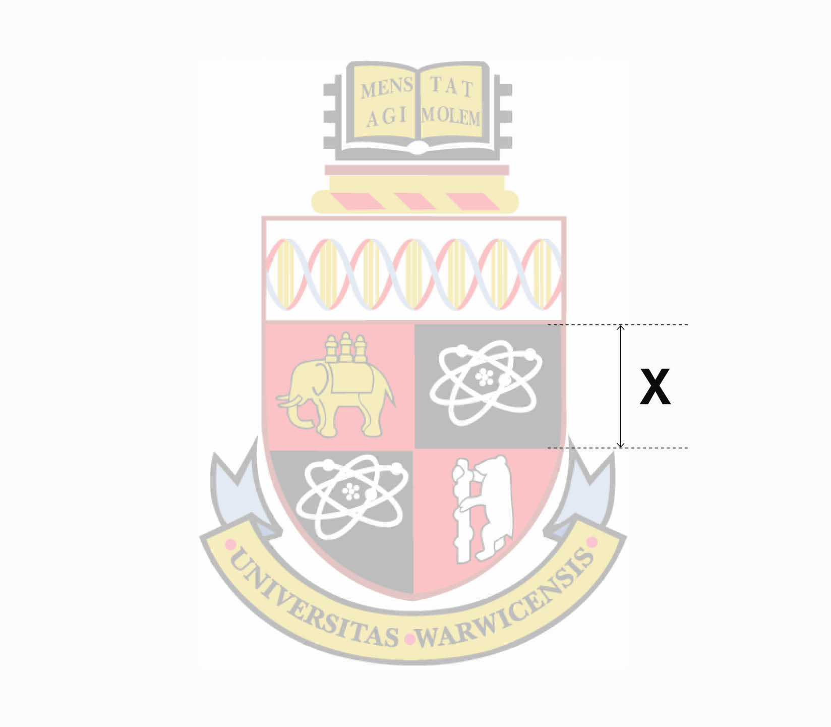
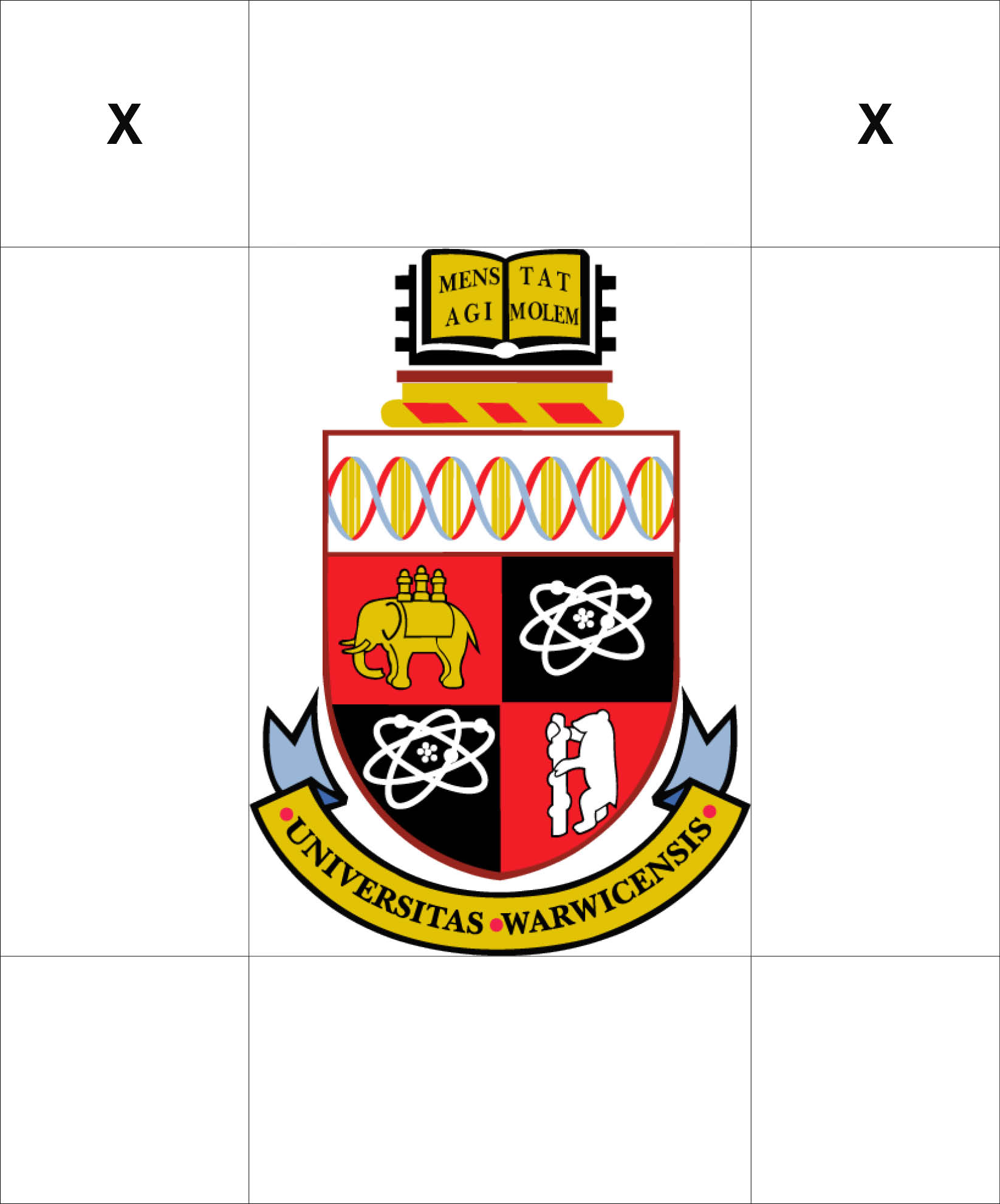
Crest Clear Space
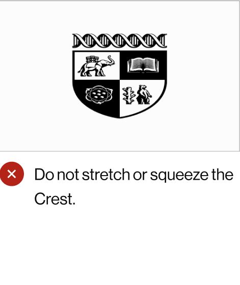
Similar to the Wordmark, our Crest requires clear space surrounding all sides, avoiding any obstruction from other graphic elements. The clear space is measured using the height of the upper quadrants of the shield.
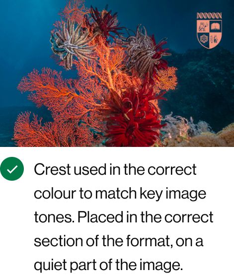
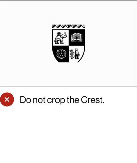
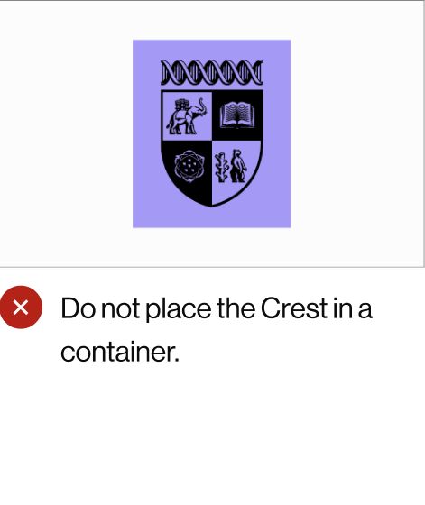
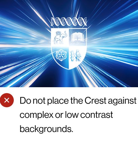
The Crest should be placed on a clean, uncluttered area of an image.
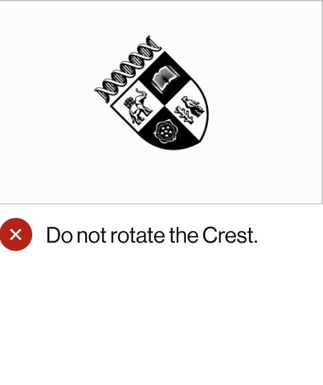
The Crest cannot be rotated or flipped.
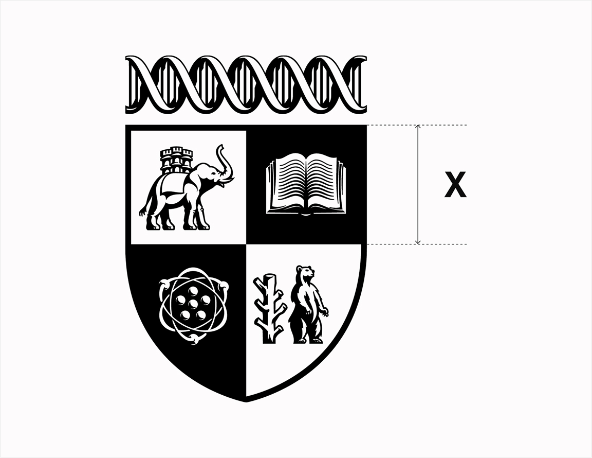
Clear Space Calculation
Minimum clear space is based on the height of the upper quadrants of the Crest’s shield. It is marked X on the clear space grid.
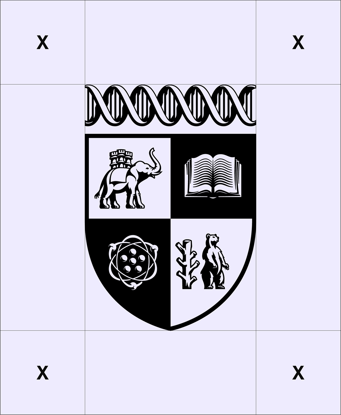
Clear Space
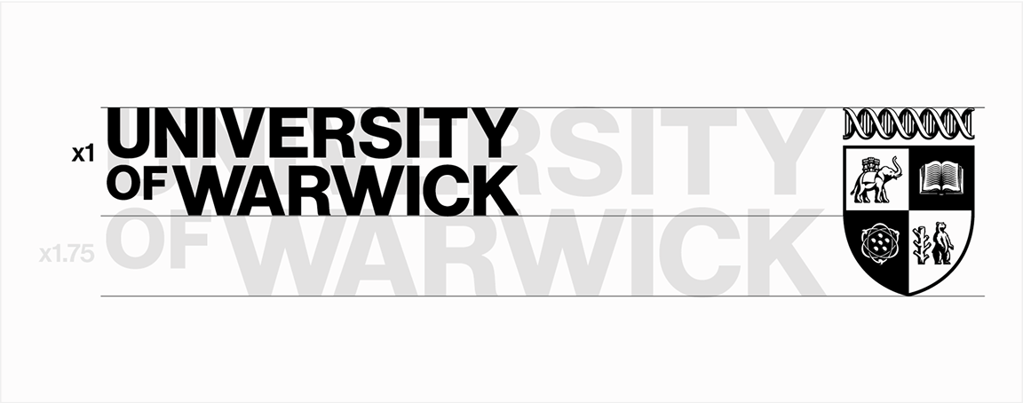
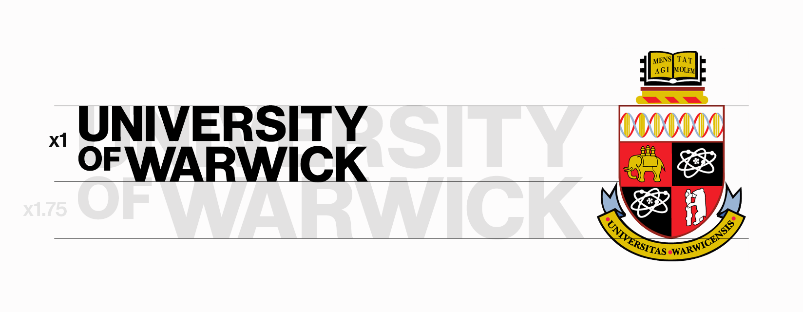
Brand Logo Set Sizing
The simplest way to achieve this ratio in design software is by matching the heights of the elements and then increasing the Crest’s size to 175%.
Split Usage Sizing Calculation
The Crest’s height is 1.75 times larger than the height of the Wordmark when used in a split format

Split Usage Sizing Calculation
The Crest’s height is 1.75 times larger than the height of the Wordmark when used in a split format
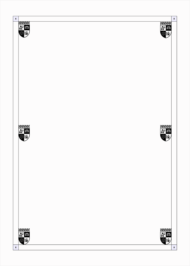
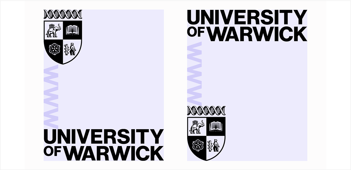
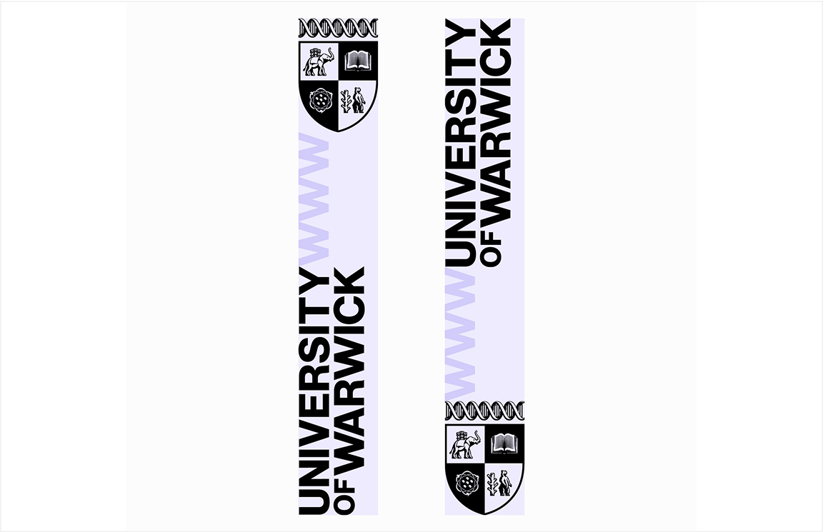
Brand Logo Set Positioning
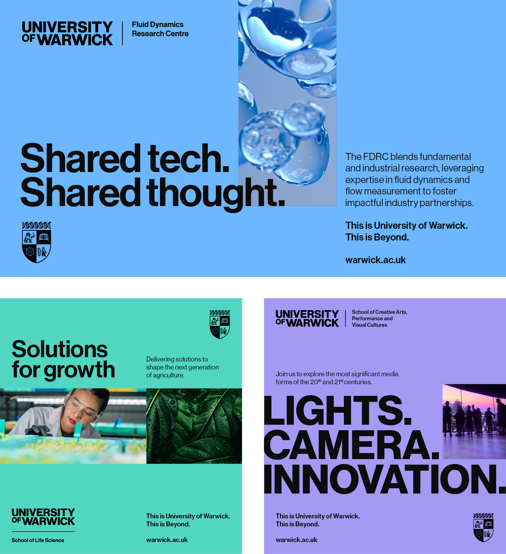
Our brand system is fluid and flexible, allowing the Wordmark and Crest to sit separately, occupying different sections of a layout.
Throughout this Brand Portal, you will find examples illustrating the various ways the two elements can be used to best fit any given format.
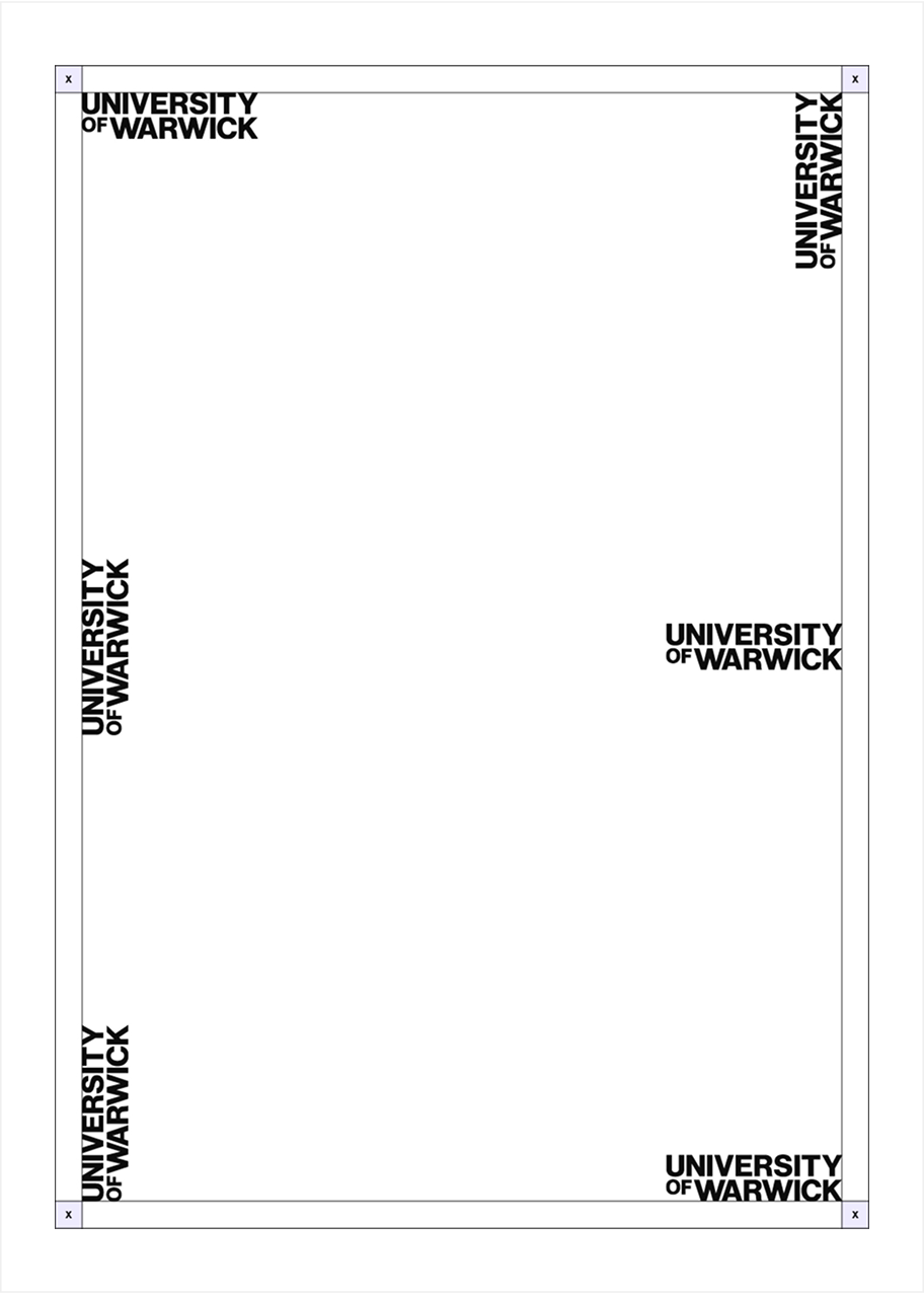
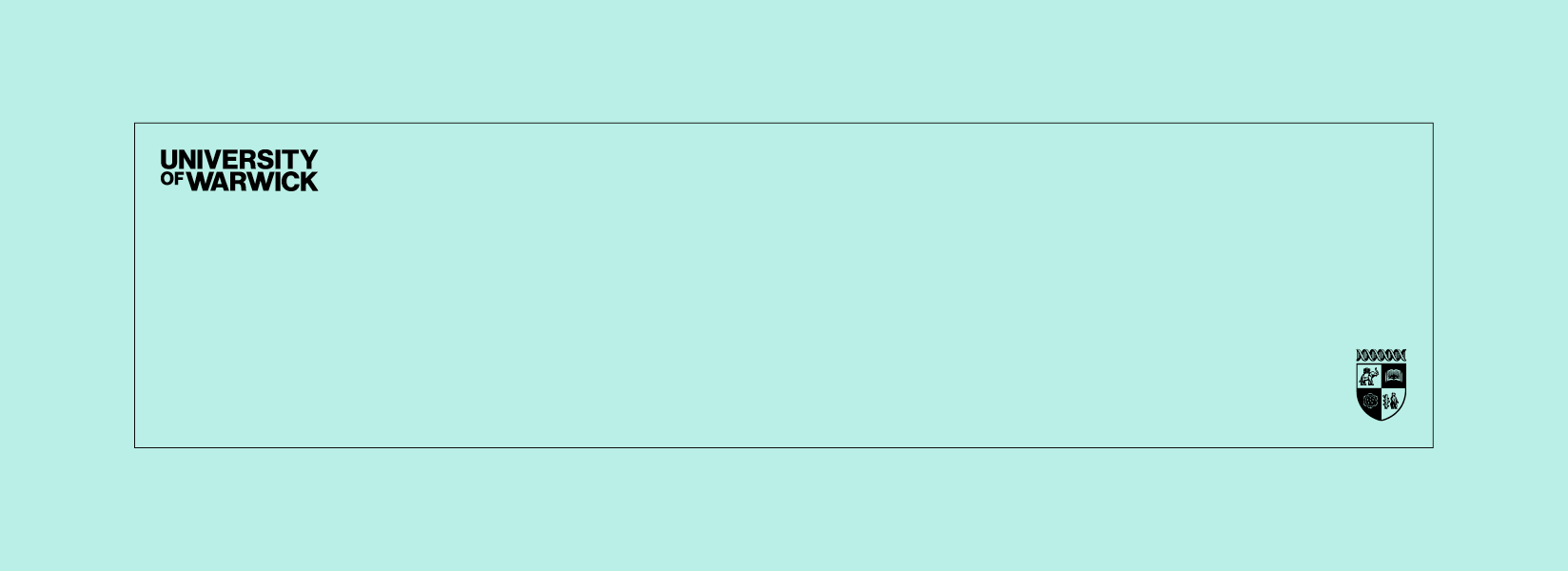
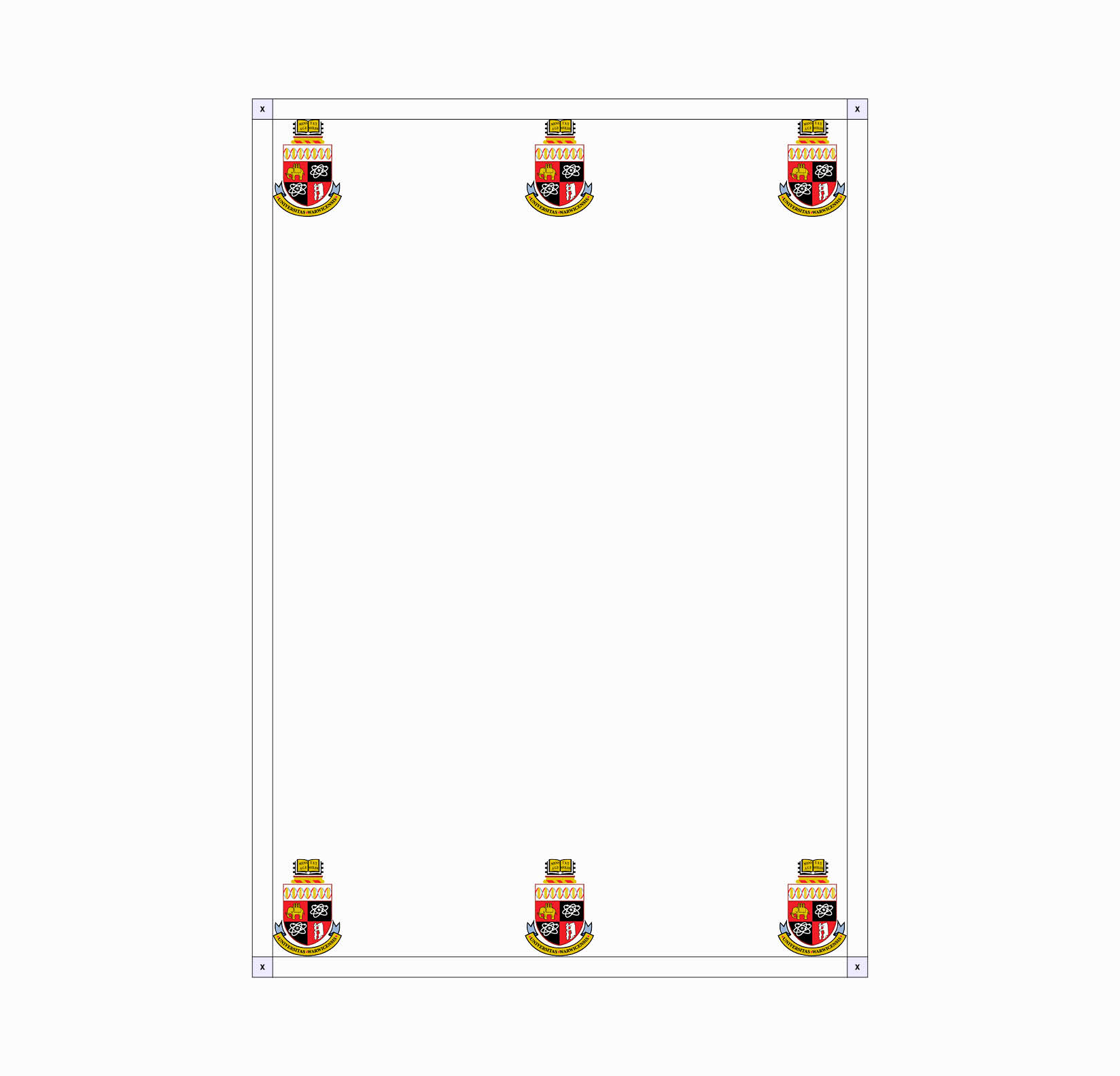
The Wordmark and Crest can be placed in corners or centred along vertical edges. These positions apply to portrait, landscape and square aspect ratios.
To calculate the minimum distance from the edges of a layout for either element, follow the Crest rules for clear space.
The positioning and orientation of the Wordmark and Crest depend on the design layout and how they interact with other graphical elements. Our ‘split usage’ style must always feature both the Crest and the Wordmark. The Wordmark can be placed in a portrait orientation but the Crest should never be rotated.
Here are examples of Crest and Wordmark placements. Following good design practices is essential for creating a visually balanced and aesthetically pleasing layout.
Neither the Crest or the Wordmark should be used independently unless specified
Brand Logo Set Positioning Examples
Inspired by our Heritage Crest, our modernised Crest embraces our history while being suitable for use in the digital age. Positive and negative versions of our Crest exist to work on different backgrounds.
A responsive version of the Crest sits within our toolkit. This simplified Crest should be used in both digital and print applications, when the height of the Crest sits beneath a certain size threshold. For further information, please refer to our Responsive Crest section.


Brand Logo Set Clear Space
The split usage elements should be clearly separated, each occupying its own space in the layout.
This ensures adequate clear space and prevents the appearance of a lockup.
However, if the format size requires the Wordmark and Crest to be close together, the minimum clear space between them can be calculated three times the width of the W of WARWICK in the Wordmark.

Minimum Brand Logo Set Spacing
Brand Logo Set Colours
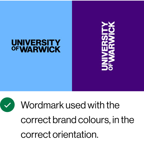
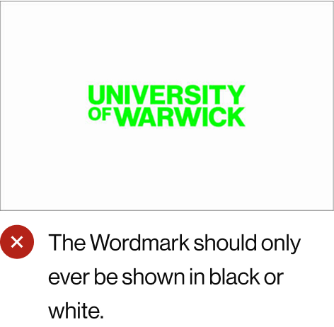
Our Wordmark exists in two colours: black and white.
Our brand colours have been crafted to ensure good contrast with the Wordmark. The correct uses of the Wordmark against each of our brand colours are shown here.
The Crest can be presented in brand colours as well as black and white, as shown in the Colour Palette section.


These examples show how our brand logo set can be placed on top of full-bleed imagery in black and white. A high level of contrast is essential for this to work effectively.


Crest Usage
The Positive Crest can only be represented in black or purple. The Negative Crest can be used in white or the pastel shades, but only when on dark photographic backgrounds where there is a complementary colour to the pastel, see examples.
As an exception, a purple Crest can be used on a light background where lavender or light purple is the dominant colour, while a lavender Crest can be used on a dark background where purple is dominant. This is because they sit within the same colour family.
If a black or white Crest works better for the design, it can be used instead.
Wordmark Usage


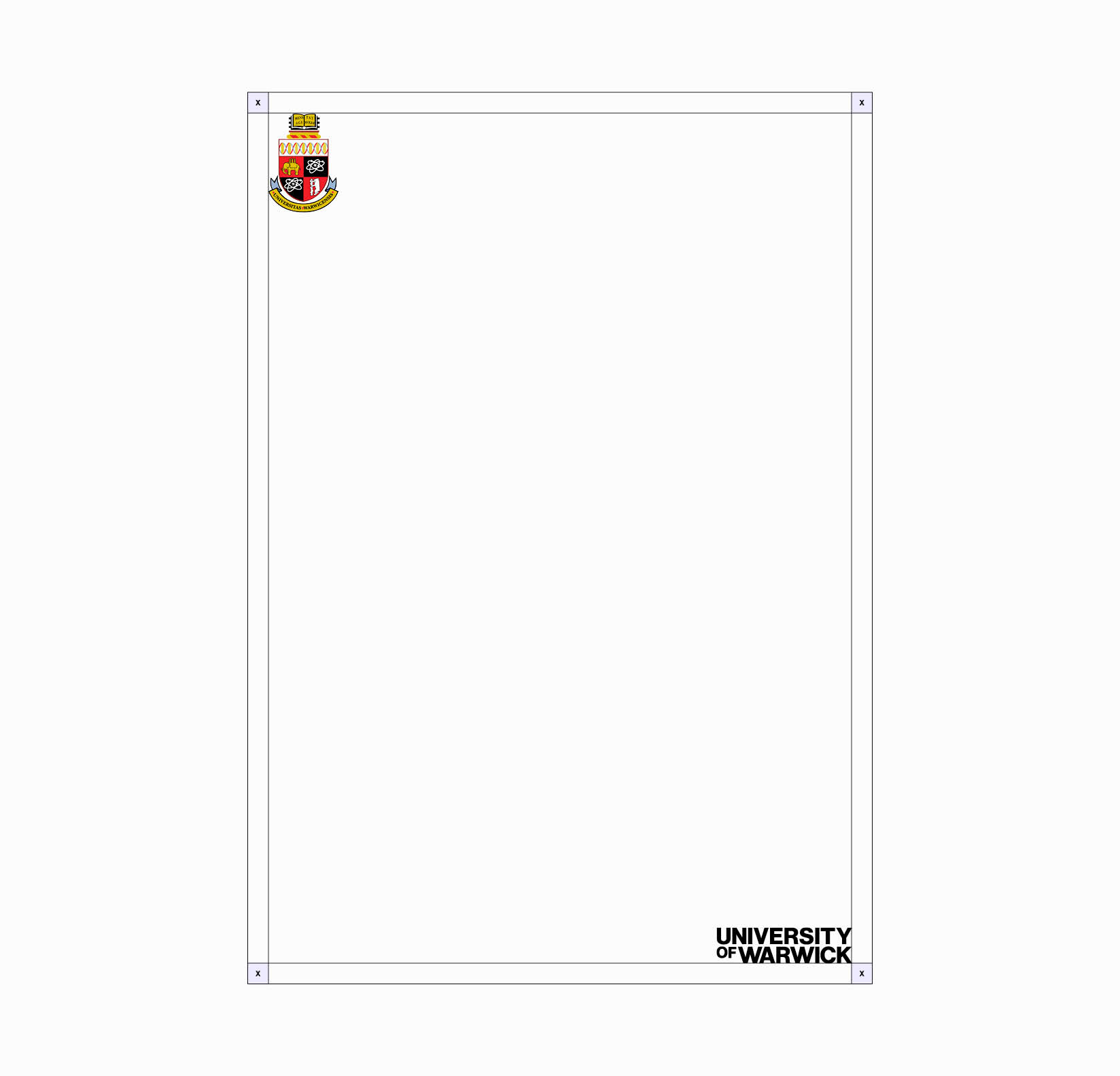
Minimum Sizing for Brand Logo Set
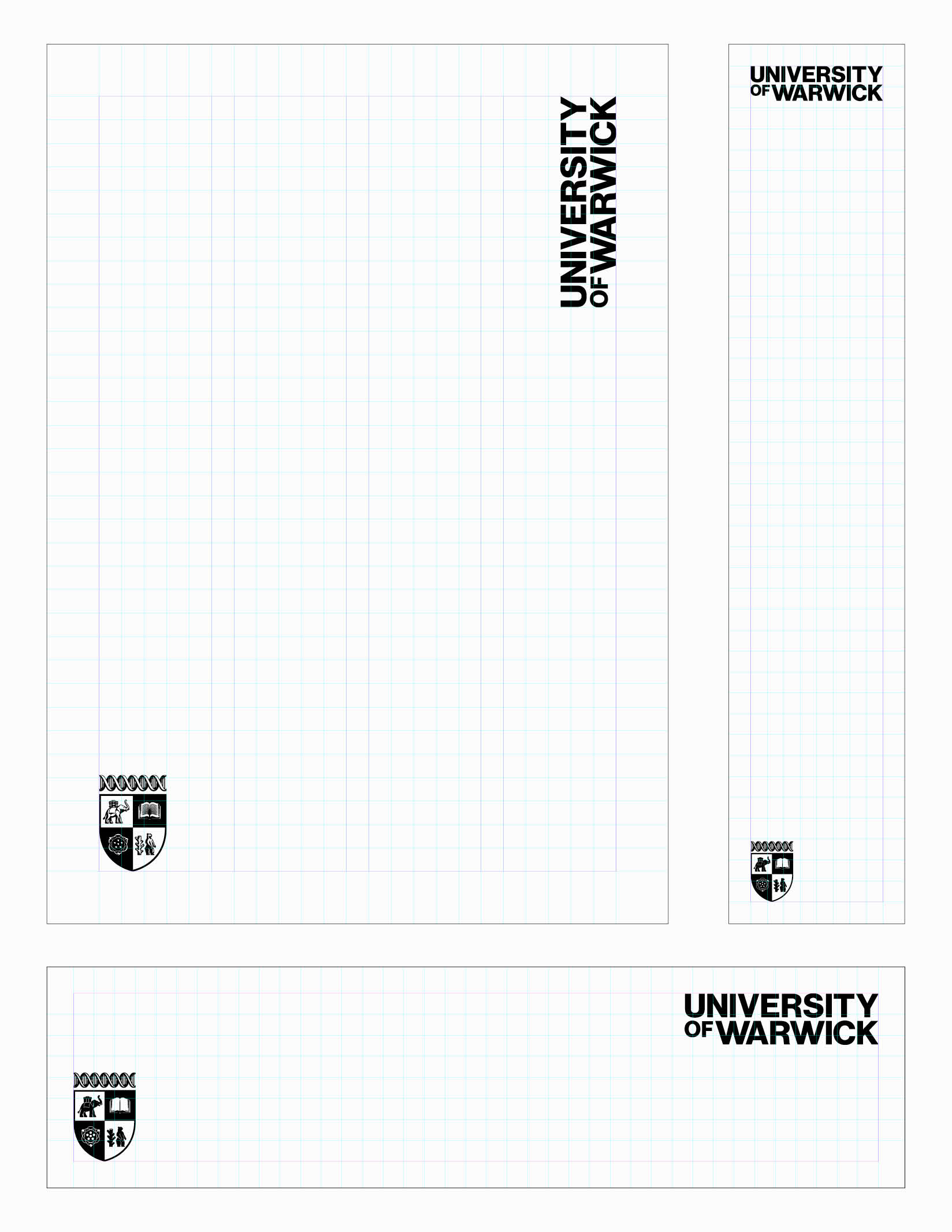
We have created a series of templates for common print and digital formats, with the Wordmark and Crest split, placed and sized correctly.
The Crest size is based on the underlying grid of each format, with the width aligning to a specific number of colums. The Wordmark is scaled to keep the correct proportions between the two elements. However, in narrow landscape formats, this approach may not apply. In such cases, the height or width of the format determines the size of the brand logo set.
If you are creating a document that does not conform to the available template sizes, use the closest template as a reference and scale appropriately. Always follow the size ration explained in the Brand Logo Sizing section, which states that the Crest height should be 175% of the Wordmark height.
The placements in these examples use the minimum size for each format. Depending on your design, you may adjust the Wordmark and Crest to a larger size. There is no maximum size, as long as your design adheres to clear space rules and good design judgement is implemented.
Please refer to the Minimum Sizing for Brand Logo Set section for more information on the minimum size of the Crest.
Minimum Brand Logo Set Spacing caption
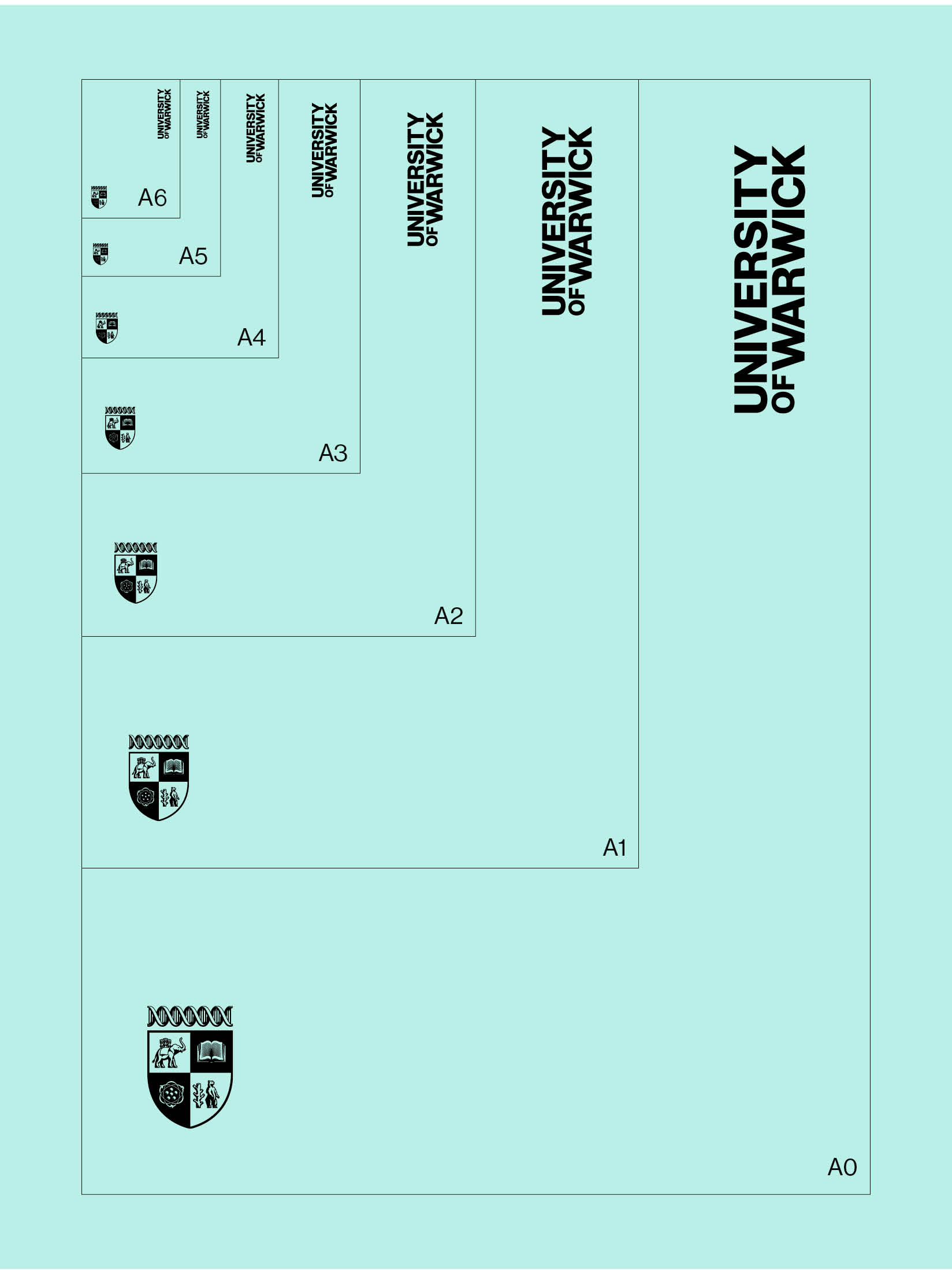
Our print templates range from A6 to A0 in size. Please do not reduce the Wordmark and Crest below their set sizes within each format. They can be enlarged if it enhances the design, with strong intuition guiding the appropriate size.
Minimum Brand Logo Set Spacing
Large Format Print
Our large print formats include 6-sheet, 48-sheet, and 96-sheet sizes. Please do not reduce the Wordmark and Crest below their set sizes in each format. They can be enlarged if it enhances the design, with strong intuition guiding the appropriate size.
6-sheet
48-sheet
96-sheet
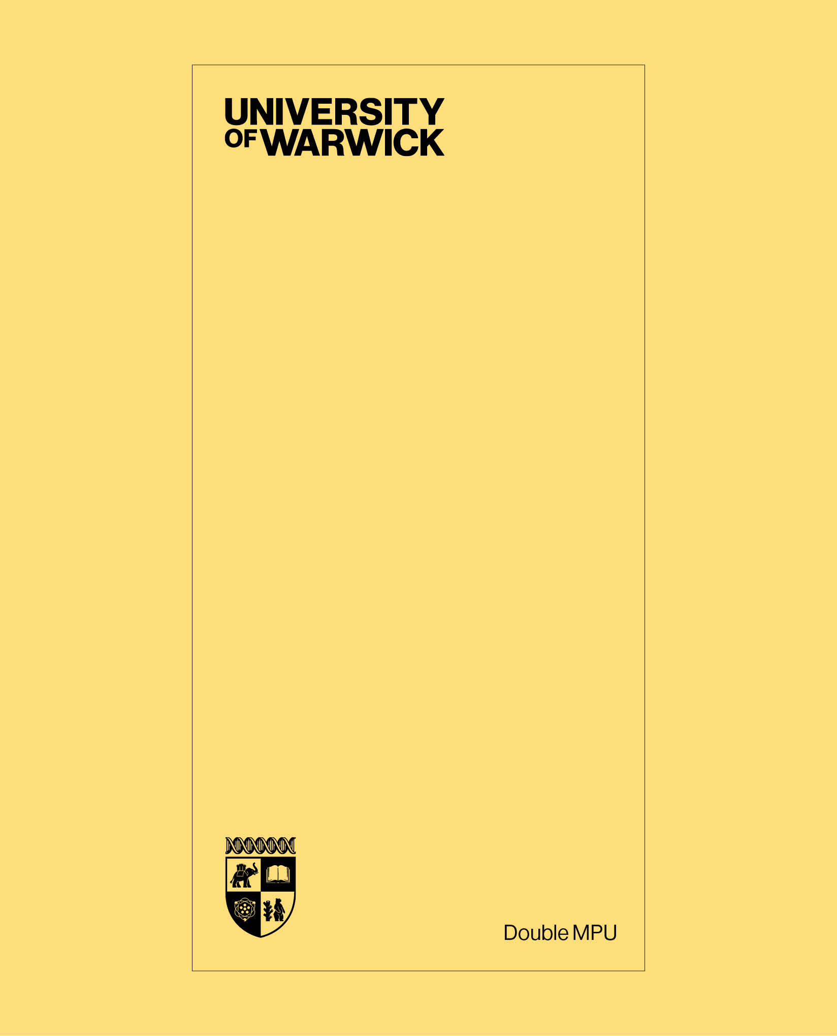
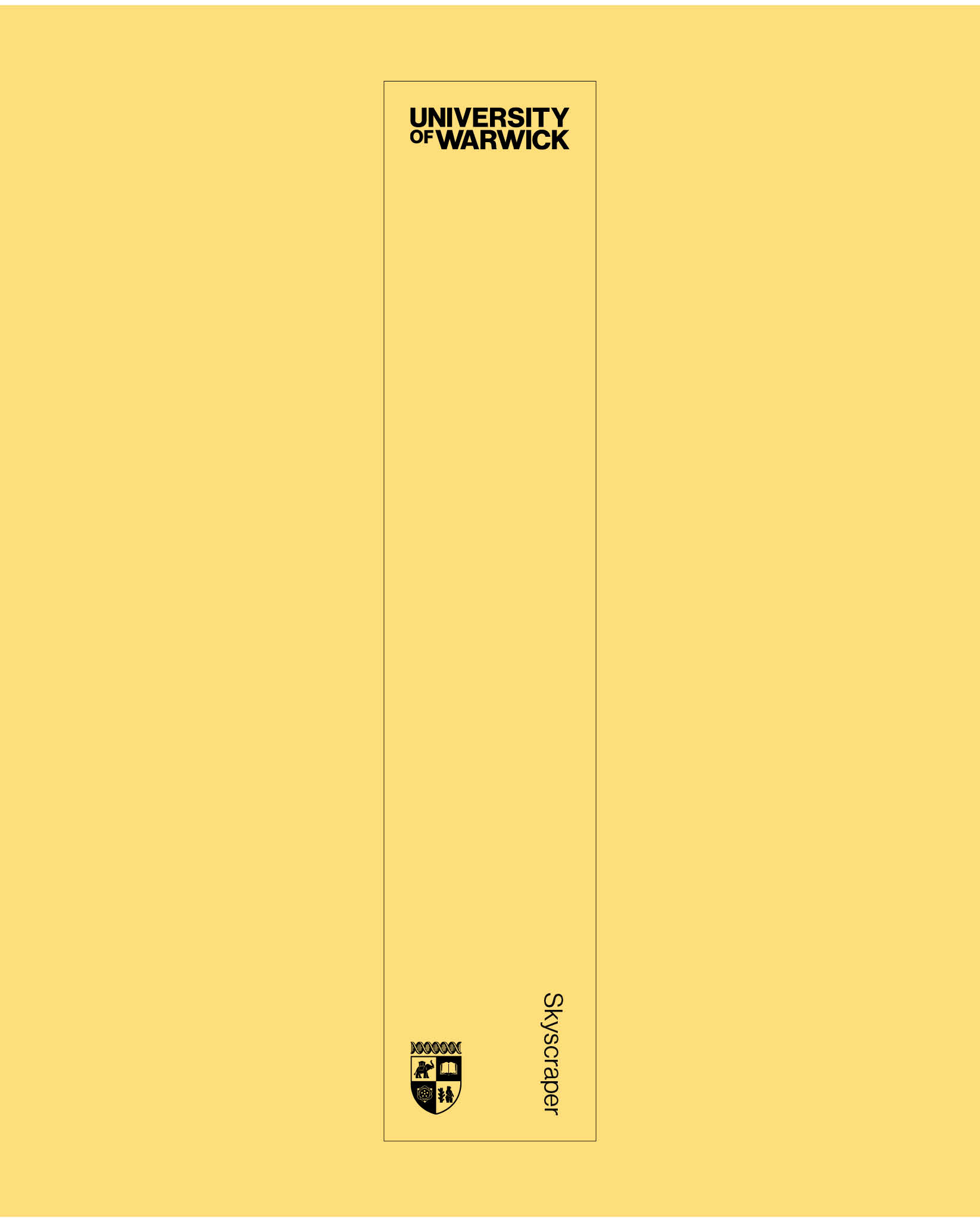
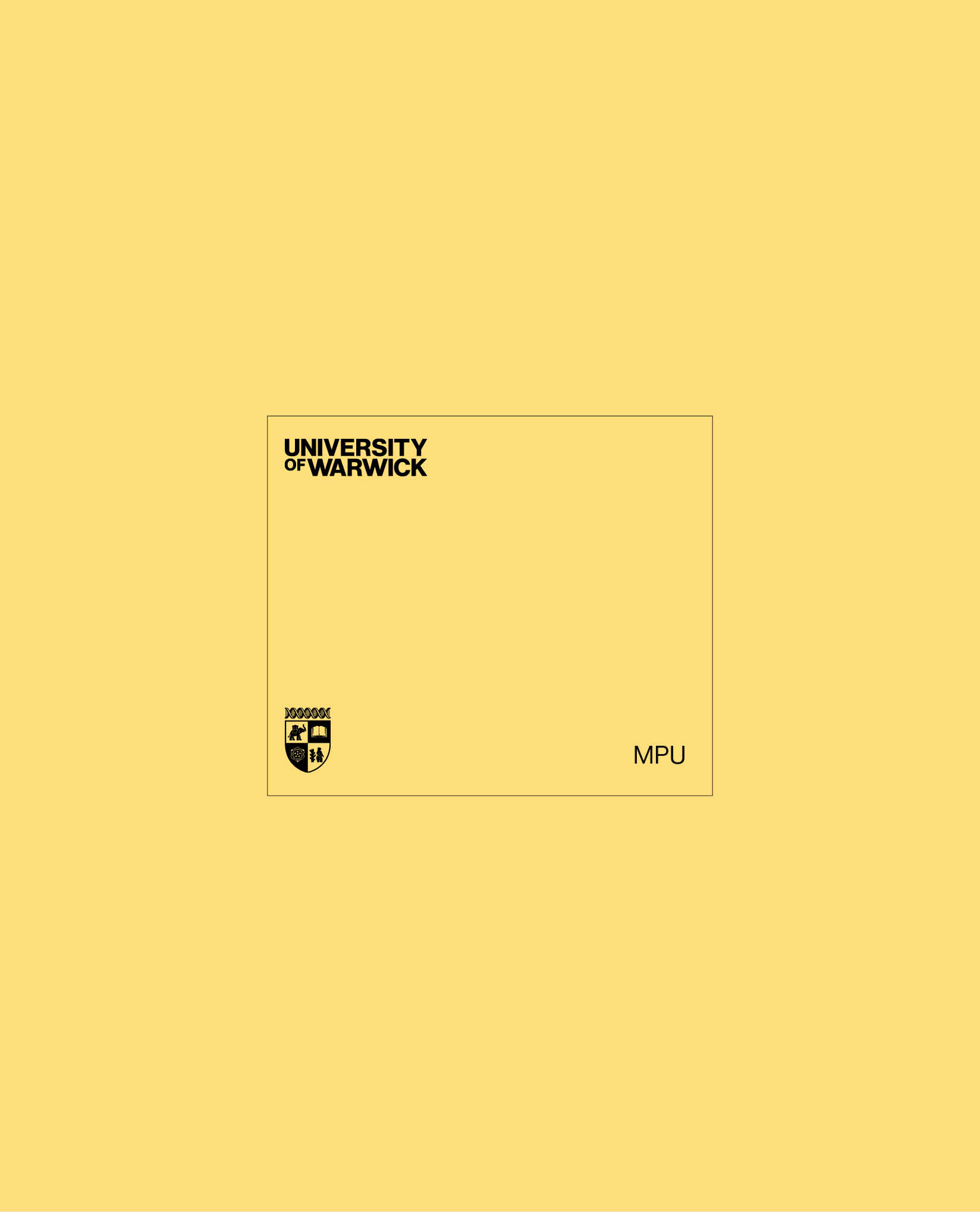
Digital Banners
A wide range of digital banners exist. These banner sizes are:
- Skyscraper
- MPU
- Double MPU
- Billboard
- Leaderboard
For narrow landscape banners like the leaderboard, the Crest is sized to fit within the vertical margins. Please do not reduce the Wordmark and Crest below their set sizes in each format. They can be enlarged if it enhances the design, with strong intuition guiding the appropriate size.
Digital Banners use the Responsive Crest, as the pixel height is below 100px.
Digital Screens
Our large digital screen templates include both landscape and portrait layouts. These templates should be used for presentations, TV screens and digital advertising hoardings.
Please do not reduce the Wordmark and Crest below their set sizes in each format. They can be enlarged if it enhances the design, with strong intuition guiding the appropriate size.
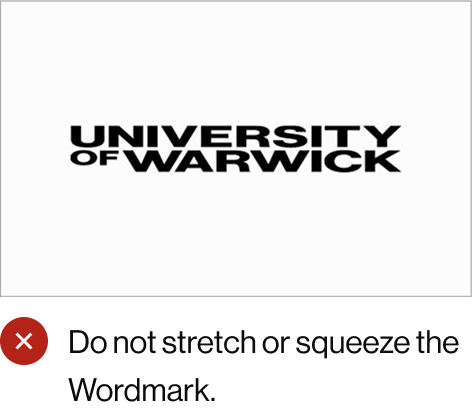
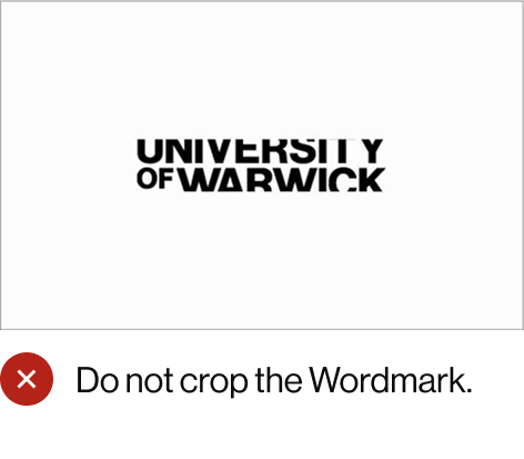
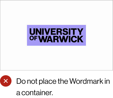
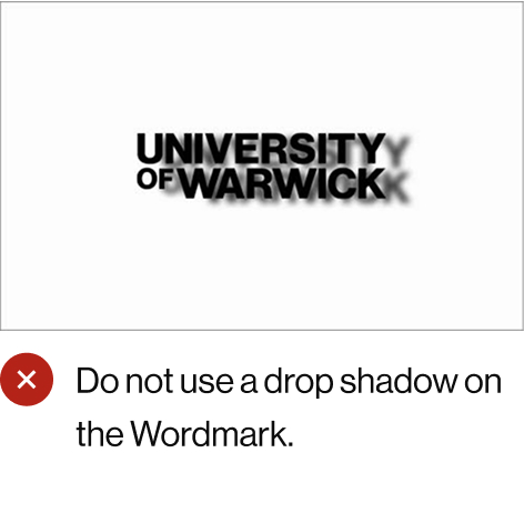
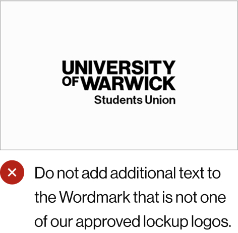
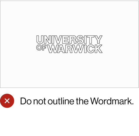
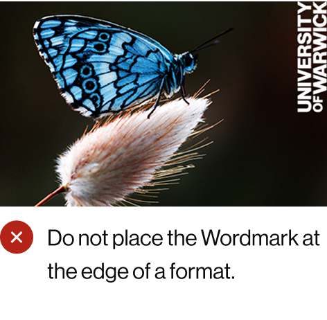
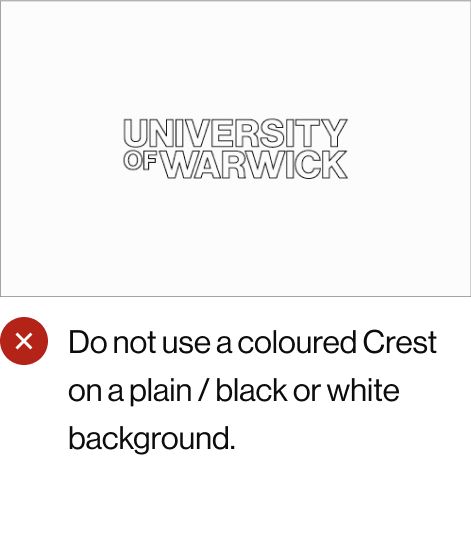
Correct and Incorrect Wordmark Usage
These examples show the correct and incorrect usage of the Wordmark. This is a general overview, not a comprehensive study of every eventuality. Good design judgement is essential to ensure correct usage of the Wordmark.
If you are unsure on using the Wordmark, please contact the Brand Team.
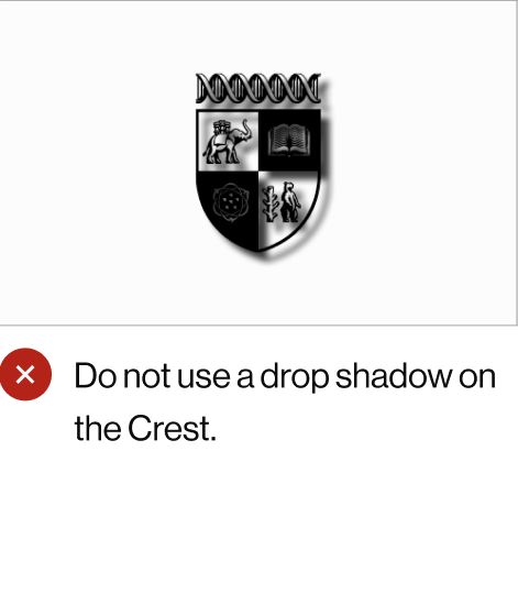
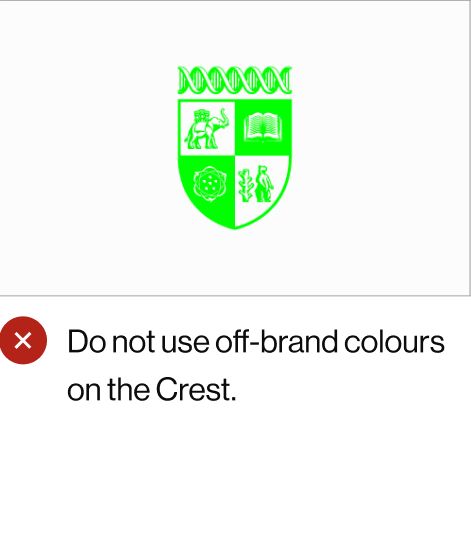
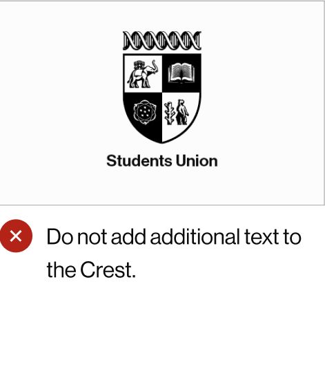
Correct and Incorrect Crest Usage
These examples show the correct and incorrect usage of the Crest. This is a general overview, not a comprehensive study of every eventuality. Good design judgement is essential to ensure correct usage of the Crest.
If you are unsure on using the Crest, please contact the Brand Team.
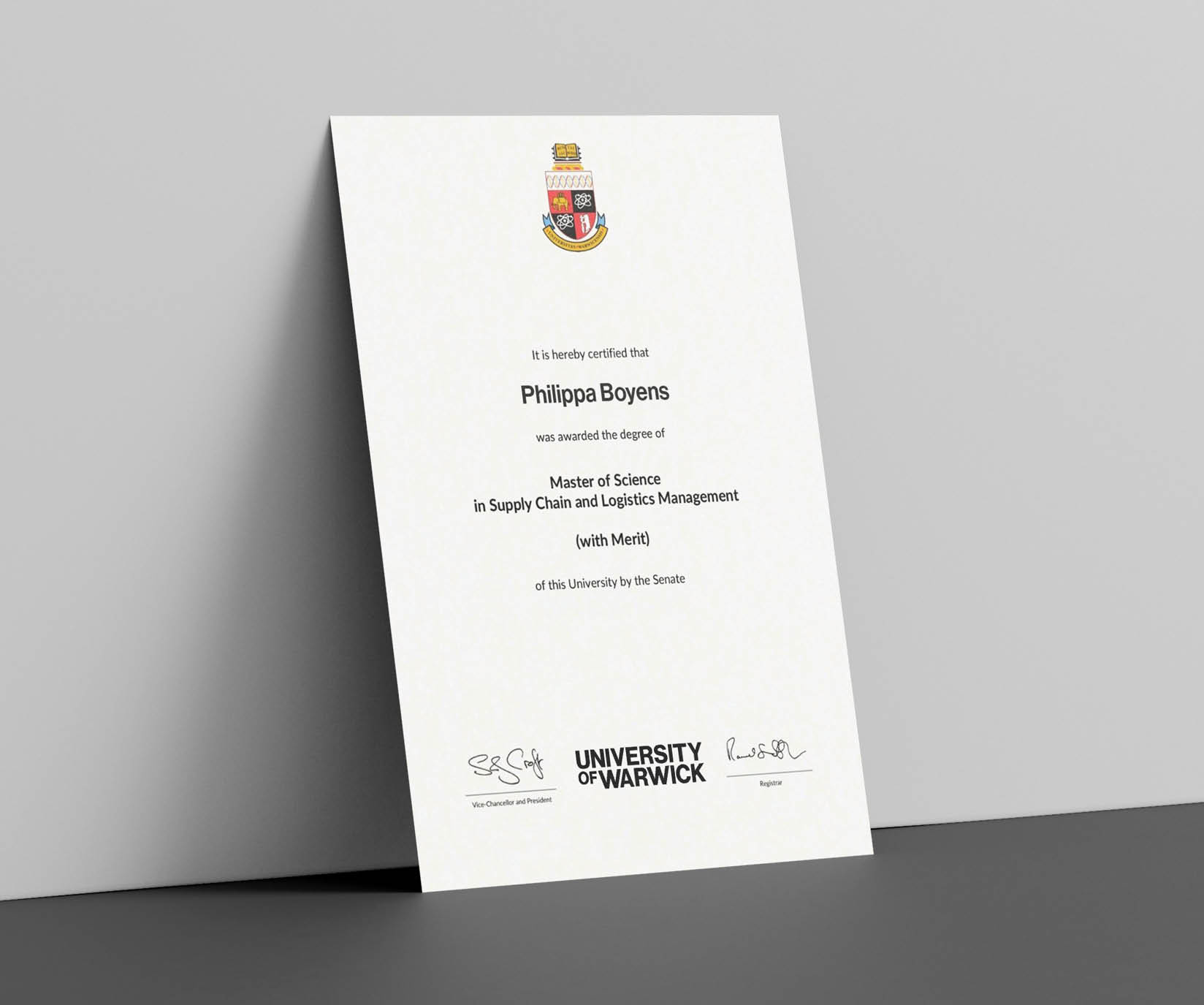
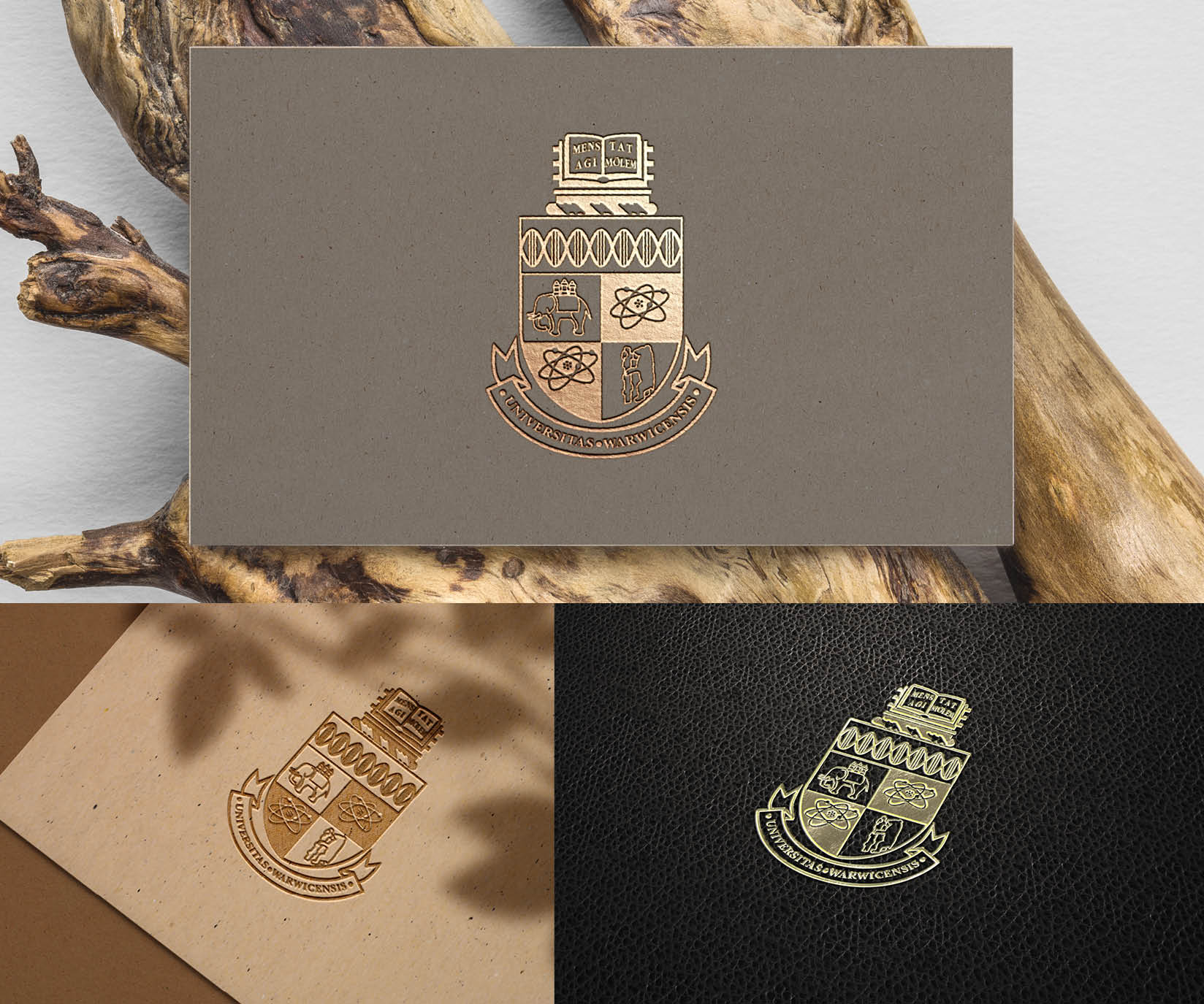
Coat of Arms
The Coat of Arms can only be used on graduation-related materials, student thesis covers, and high-end institutional applications such as merchandise and gifting. It provides a mark of quality, and gives a sense of our rich history and academic rigour.
The Coat of Arms should be used alongside the Wordmark for specific purposes, such as graduation certificates. However this is not always compulsory.
The Coat of Arms and the modernised Crest should never be used together.
The Coat of Arms should be used as follows:
- In full colour on white backgrounds
- In black on light backgrounds
- In white on dark backgrounds
The Coat of Arms can also be reproduced using print finishing techniques such as embossing or foil blocking.
If you are unsure about Coat of Arms usage, please contact the Brand Team.

Coat of Arms
Coat of Arms Clear Space
Similar to the clear space rules for our modernised Crest, the clear space for the Coat of Arms is based on the height of the upper quadrants of the shield. This is used to create a square (marked as X) that defines the area where other graphic elements should not intrude on the Coat of Arms.
The text on the Coat of Arms should be legible where possible. As it is predominantly used on printed materials, the size may vary depending on the application and printing method. We recommend a minimum width of 40mm.
Certain merchandise, such as pens, may require the Coat of Arms to be very small. All such designs should be approved by the Brand Team before production
Clear Space Calculation
Minimum clear space is a square based on the height of the top quadrant of the Crest and marked 'X' on the Clear Space grid.
Clear Space
Coat of Arms and Wordmark Sizing
When the Coat of Arms and Wordmark are paired together, a similar sizing formula is used to that of the brand logo set.
The shield of the Coat of Arms should be sized at 1.75 times the height of the Wordmark.
Split Usage Sizing Calculation

Split Usage Scale
Coat of Arms and Wordmark Placement
On a given layout, the Coat of Arms can be positioned in the corners, or centred at the top or bottom.
On certain merchandise, placement rules may be more flexible to suit design and production requirements.
When pairing with the Wordmark, similar to the split usage style for the brand logo set, the Coat of Arms and Wordmark should be separate. The Wordmark should be positioned only in the same areas as the Coat of Arms shown in these examples and must never be rotated.
This visual example of a graduation certificate demonstrates how the Coat of Arms can sit centrally at the top of the format, with the Wordmark placed centrally at the bottom.
Coat of Arms Treatment
We can use special print techniques with our Coat of Arms to add a premium feel to high-end institutional applications such as certificates, merchandise and gifting. Some examples of these techniques are:
- Embossing/Debossing
- Spot UV
- Foil blocking
These examples are not an exclusive list and any printing method chosen should take into account how the final result will reproduce.
These visual examples of special print treatments show how these techniques can enhance our high-end institutional communications.
Brand Lockups
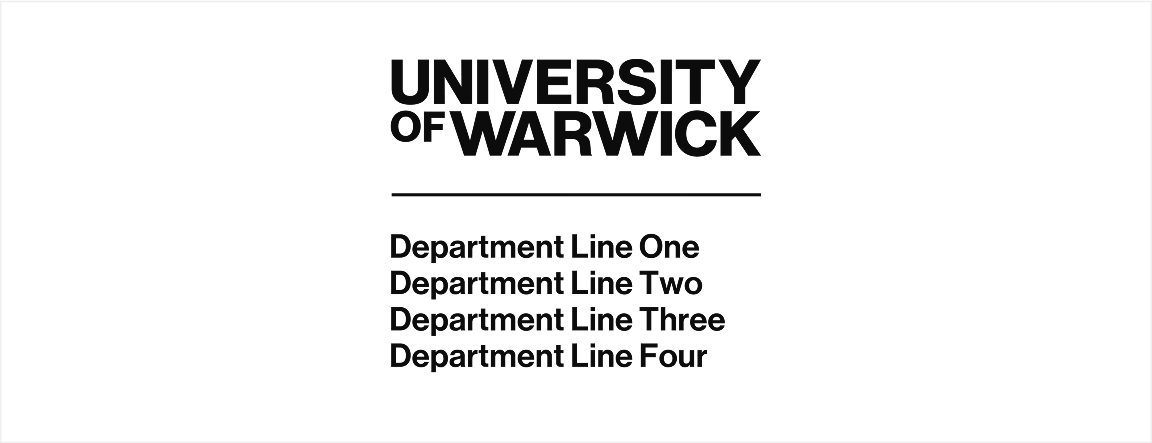
Departmental Lockups
With a diverse community of faculties, departments, research institutes and other entities, our brand lockups provide a cohesive framework to ensure consistency, clarity and flexibility. These lockups enable all areas of our University to communicate effectively while reinforcing our collective strength as a world-leading institution.
The ‘departmental lockup’ approach is standard for most of the University, encompassing Departments, Schools, Centres and other institutional entities. Departmental lockups have already been created for those previously agreed. Please contact the Brand Team for more information.
For more information on which type of lockup a specific University entity should use, please contact the Brand Team.

Departmental Lockup Landscape
Departmental Lockup Stacked
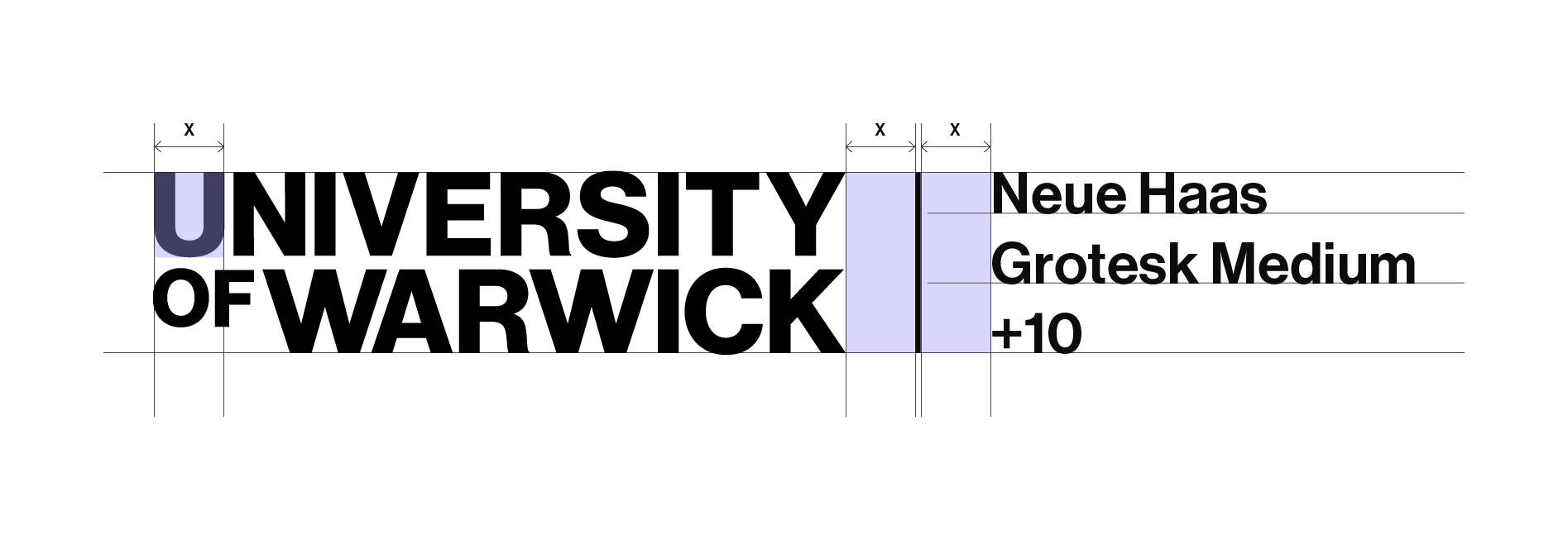
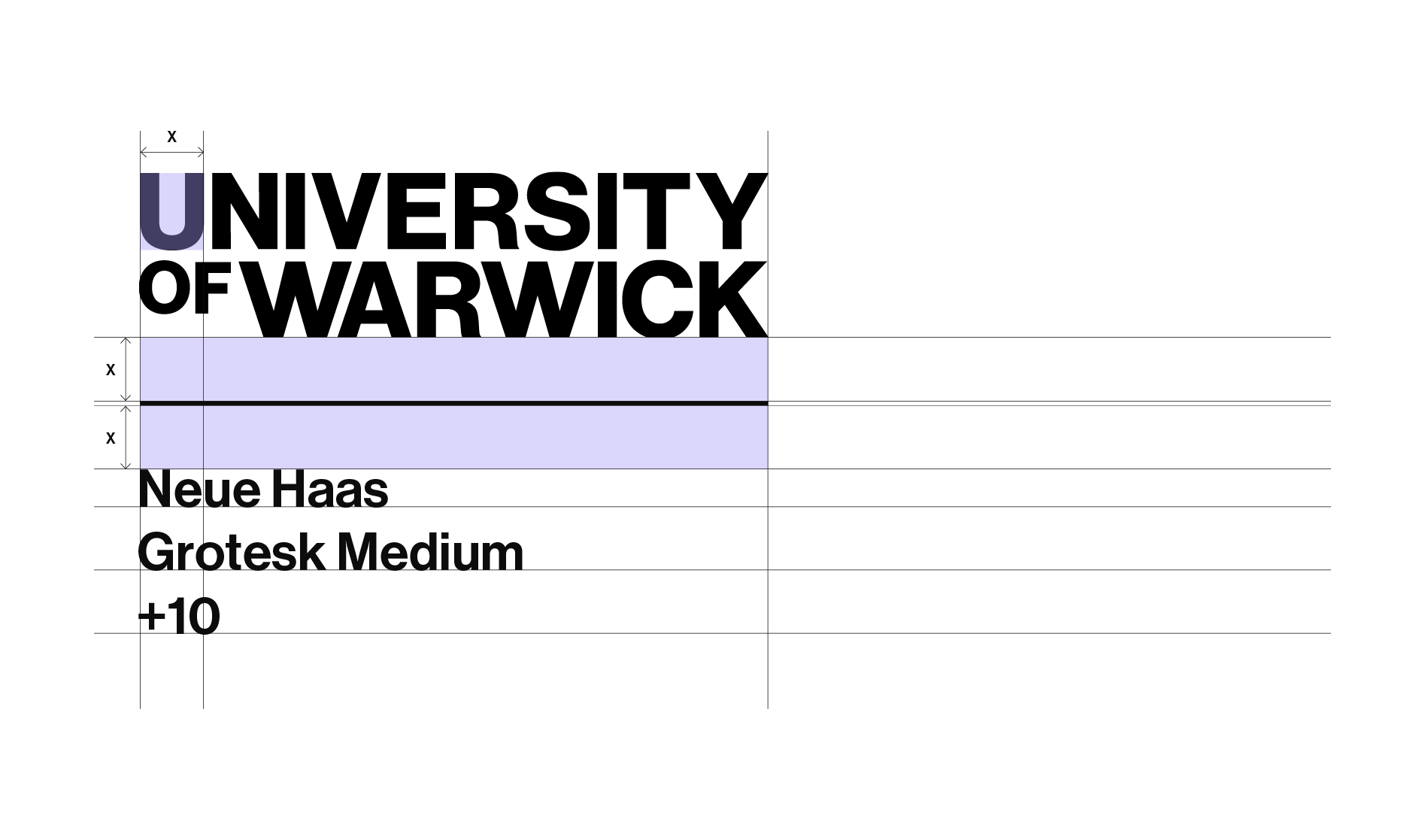
Departmental Lockup Construction
Rules have been developed to ensure consistent sizing and spacing for departmental lockups. Unlike our stand-alone Wordmark, which has the ability to rotate and sit in a portrait orientation, departmental lockups should only be used in a landscape orientation.
Text should sit either to the right of the Wordmark (landscape) or below (stacked). In both versions, text should always be set in Neue Haas Grotesk Medium with +10 tracking.
A line splits the Wordmark and text in both versions. The spacing between them is the width of the letter ‘U’ from the Wordmark (marked as ‘X’ on diagrams).
Text should be no more that three lines deep in either format. For the stacked version text must fit within the width of the Wordmark. If the text exceeds the three-line limit, a fourth line may be added but only if necessary to accommodate the wording. Good design sense will dictate what looks visually correct within our three-line limit.
Landscape Version
Stacked Version
Departmental Lockup Examples
Here are several examples of departmental lockups, all designed with careful consideration of line height, width, and overall layout. Attention has been given to line breaks and text spacing to create harmonious compositions.
The size and weight of the Wordmark are balanced to maintain a strong visual relationship with the lockup text.
There is no maximum width for landscape orientations, so text should never sit on more than three lines. Good design judgement should be used when deciding how lockup text should sit next to the Workmark and how, if necessary, it should be split across a maximum of three lines.
For stacked orientations, text must fit within the width of the Wordmark. If the text exceeds the three-line limit, a fourth line may be used but only if necessary to accommodate the wording.

Landscape Orientation Layouts

Stacked Orientation Layouts
Departmental Lockup Visual Examples
These visual examples illustrate how our landscape and stacked text lockups work in context. The same placement and sizing rules apply to text lockups as our stand-alone Wordmark.
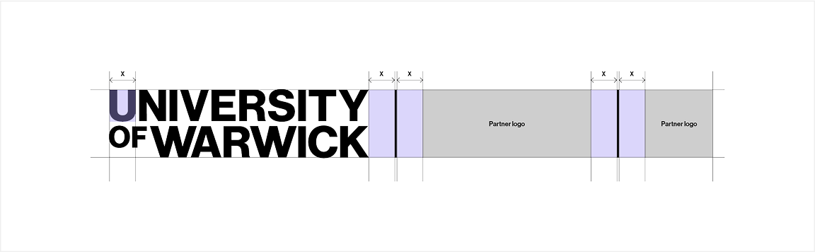
Logo Lockup Guidance
The University of Warwick uses two types of logo lockup to ensure brand consistency in communications. The correct lockup depends on who is responsible for creating the artwork - the University or a third party.
1. University-Led Lockup
Overview
This lockup is used when the University of Warwick is responsible for designing the creative or leading the communication. It includes the University of Warwick Wordmark alongside a third-party or partner logo.
Usage Context
- The University is the primary creator of the communication.
- The usage is in co-branded materials where Warwick leads the collaboration.
- The University Crest will appear in the artwork using the approved split usage method.
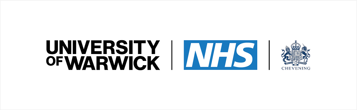
2. Third-Party Lockup
Overview
This lockup is used when a third party develops creative materials.
In this scenario, the University crest and wordmark are used as a formal endorsement but are kept separate from the main creative content.
Usage Context
- Communication is led or created by a third party.
- The format is used in materials where the University’s involvement is secondary or supportive.
- The Crest is not part of the creative artwork itself.
Summary of Usage
Usage Content
- Warwick leads design or campaign
- The third party leads design or campaign
Lockup Type
- University-Led Lockup
- Third-Party Lockup
Who Creates Artwork
- University of Warwick
- Third Party
Brand Logo Set Usage
- Brand Logo Set may be used in the split method
- Crest may be used alongside the wordmark
University-led Lockup Construction
Our University-led lockup adhere to the same rules as departmental lockups in terms of creation, orientation, sizing, placement and clear space.
The University-led lockup should never overpower our Wordmark. In most cases, the University-led lockup should sit no larger than the height of the Wordmark in landscape orientations. However there maybe occasions where the design of the University-led lockup sits beyond the height of the Wordmark, to ensure the correct visual balance is attained. Good design sense will govern this.
University-led Lockup Clear Space
The clear space for the University-led lockups are the same as our Wordmark, as demonstrated here. The partner lockup should be treated as a single unit, with clear space extending across its width and depth.
University-led lockups are reserved assets that are strictly subject to approval by the Brand Team to ensure consistent and appropriate use across all communications. Access to these lock-ups is limited and must align with brand guidelines and strategic partnerships.
To request the use of a University-led lockup, please contact the Brand Team.
Lockup Construction
Lockup Layout
University-led Lockup Placement
This visual example demonstrates how the lockup can be place at the bottom of the format, with the Crest placed at the top, following our ‘split usage’ style.

Partner Lockup Placement
Third Party Logo Lockup
A lockup of the logo set is reserved exclusively where we have an agreement with a third party to use our brand identity in their marketing materials.
Use is restricted to instances, always by approval of the Brand Team, where a logo appears on a third-party website or other marketing asset.
Lockups are a reserved asset that is strictly subject to approval by the Brand Team to ensure consistent and appropriate use across all communications.