Brand Videography
Mood and Tone
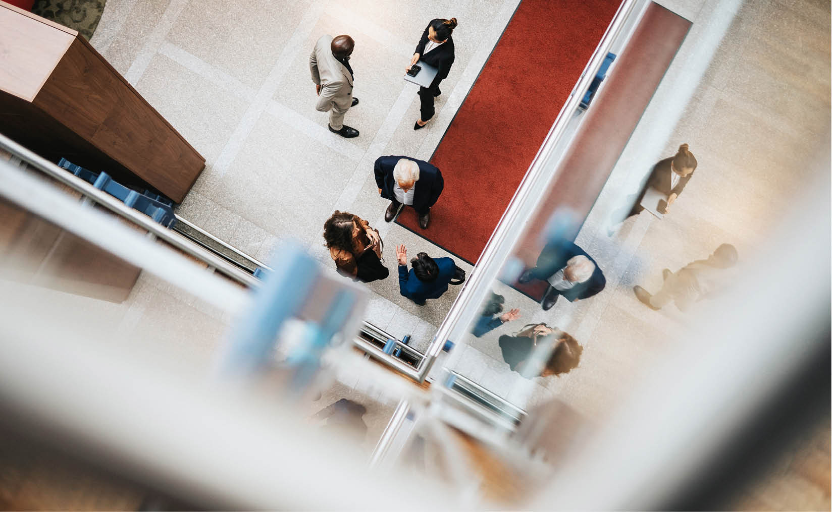
Our cinematographic style aligns seamlessly with our photography, our mantra of Beyond and our unconventional approach to storytelling.
Our creative vision for moving images is shaped by our core marketing themes:
- Active Innovation
- Global Mindset
- People-Powered
This section of the Brand Portal provides valuable direction and insights to help you approach videography in a way that authentically reflects our University of Warwick.
Tier Systems
It is crucial to define the purpose of your video content before creating it:
Is it a ‘Hero’ tier video - a large-scale campaign that embraces conceptual and abstract imagery?
or
Is it an ‘Everyday’ tier video - a smaller, functional campaign that highlights the University’s environment and communities?
Hero Tier
A premium-quality video designed for corporate, external-facing, and strategic use across multiple platforms including websites and advertising.
This type of content typically involves extensive production planning and leans towards the Beyond theme with elements of conceptual and abstract imagery.
If you need a high-production video, first consult your department marketing team.
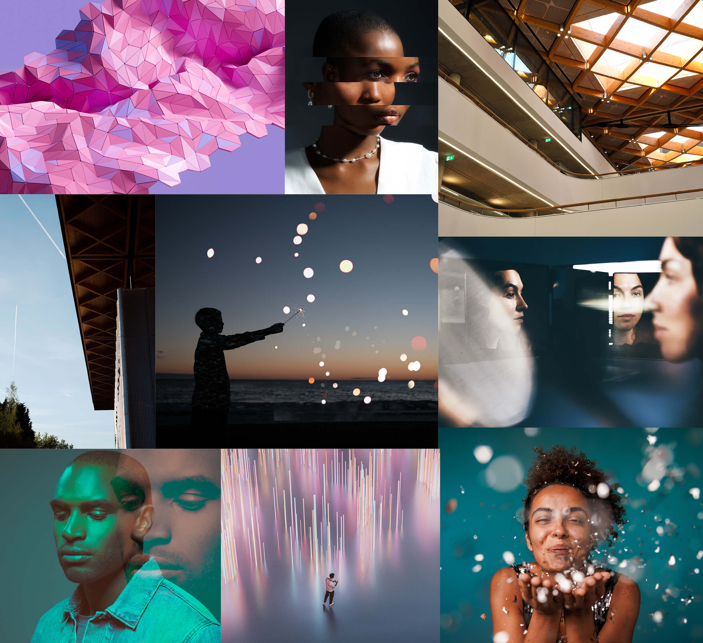
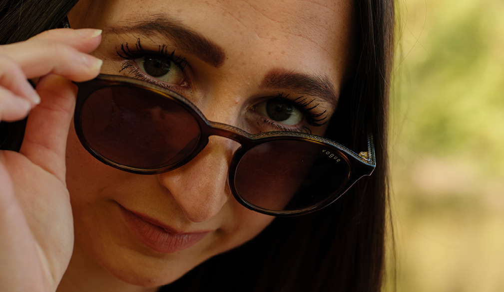
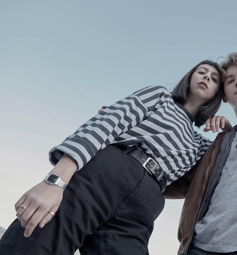
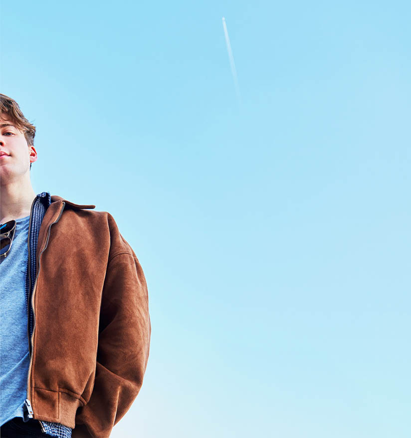
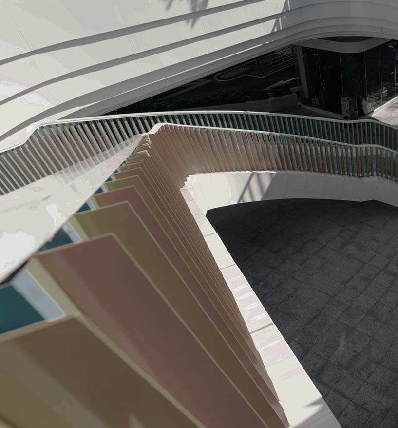
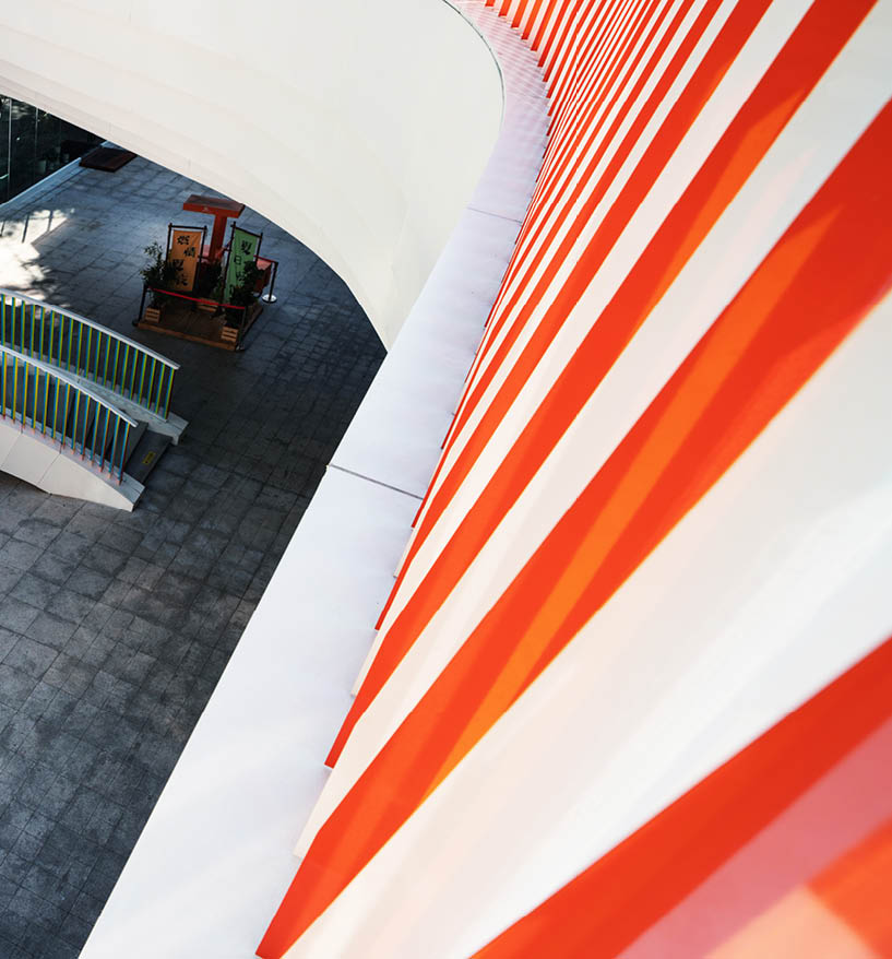
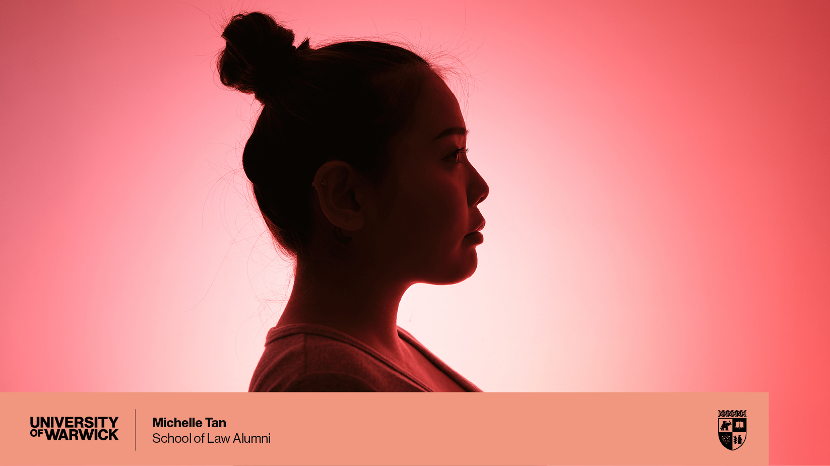
Style: Cinematic Unconventionalism
We want to convey the unconventional spirit of Warwick through our video content by using abstract footage (whether that be live production or stock), innovative camera angles and creative lighting.
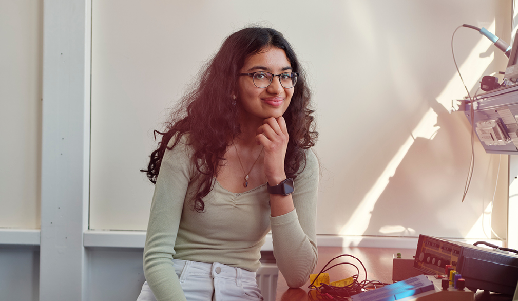
Everyday Tier
Functional Day-to-Day Videos
- Created by experienced staff and typically include lectures, events, and talking head videos.
- These videos incorporate essential branding elements such as intros, lower-thirds, dividers and outros.
Quick Response Videos
- Designed for reactive, fast-turnaround content with minimal planning for storyboarding or scripting.
- Varies in length and quality, primarily produced for social media platforms like Facebook Live or Instagram Stories.
- Uses only the standard branding elements (intro, lower-thirds, dividers, and outro).
Social Media Videos
- High-quality videos intended for websites and social media, requiring less production time than Hero tier content.
- Typically includes a basic script, talking heads, cutaways, and some graphics.
- Must adhere to branding elements (intro, lower-thirds, dividers, and outro).
- For Instagram and TikTok, content should be recorded in portrait mode, and can be filmed using a mobile phone or tablet.
- Additional guidance on capturing and publishing social media content is available via SharePoint.
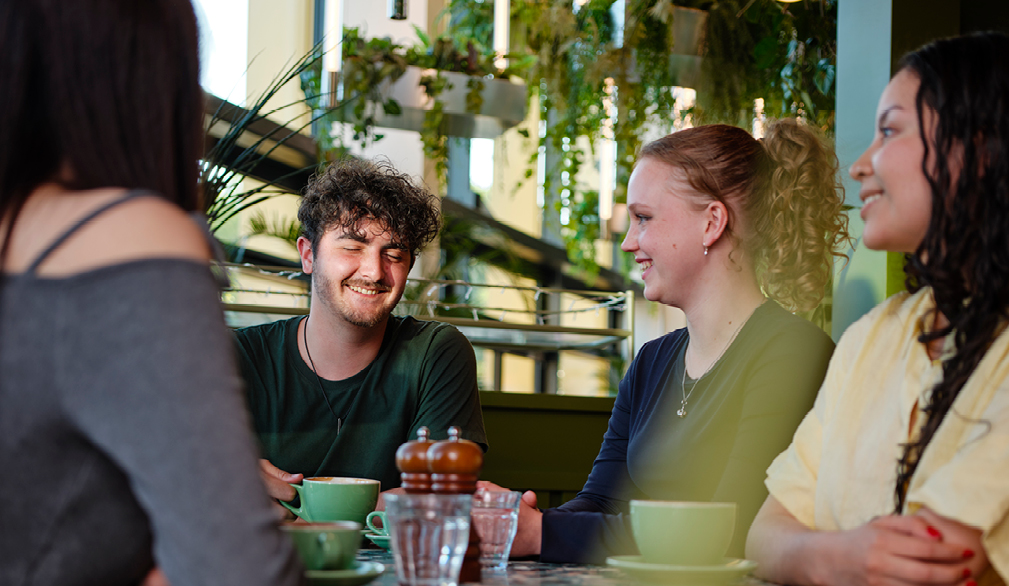
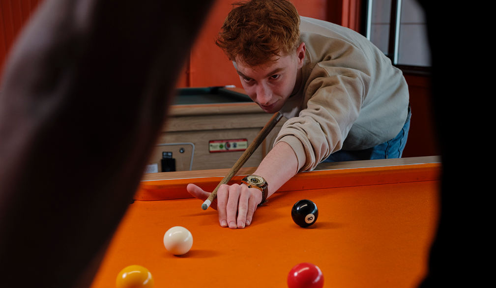
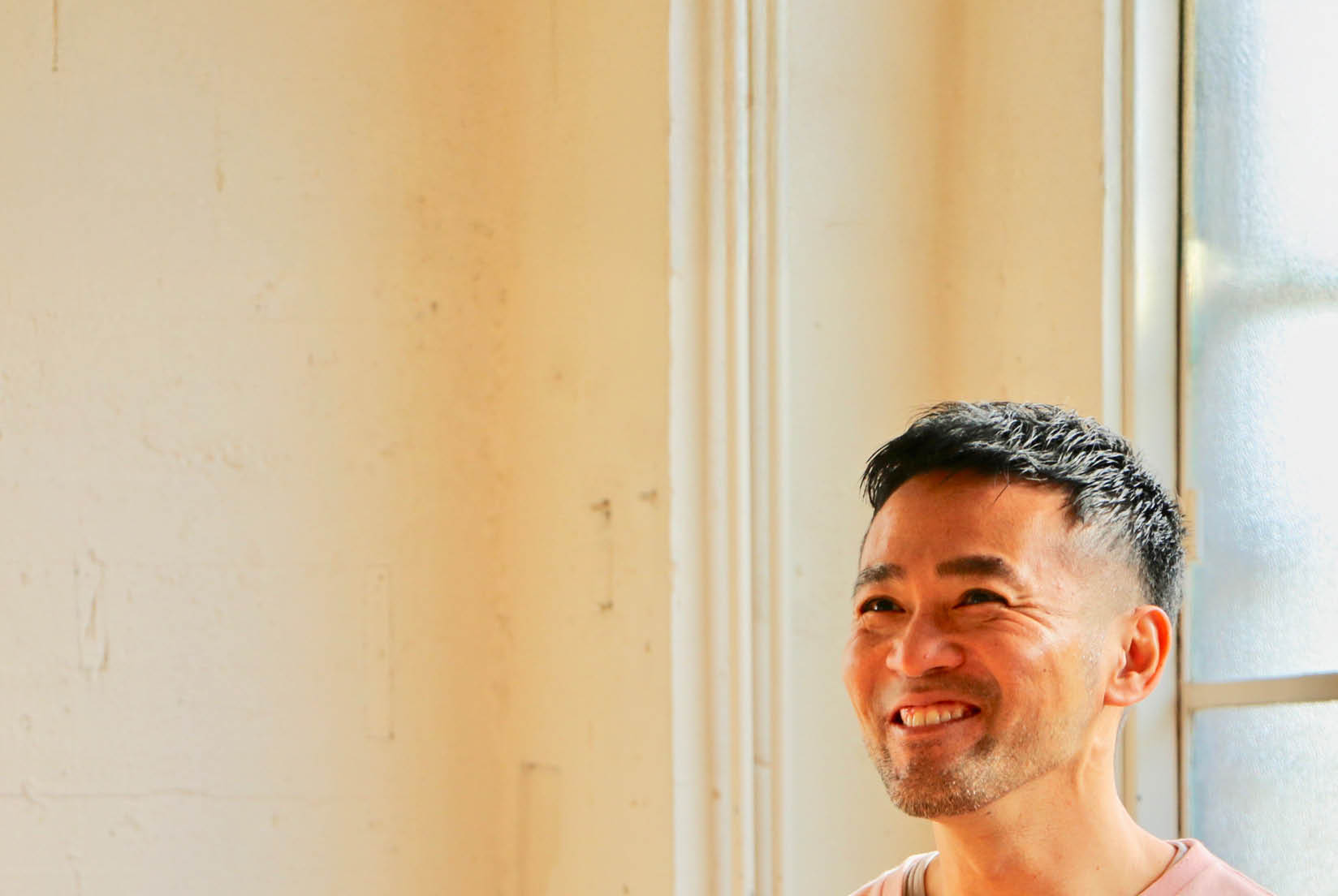
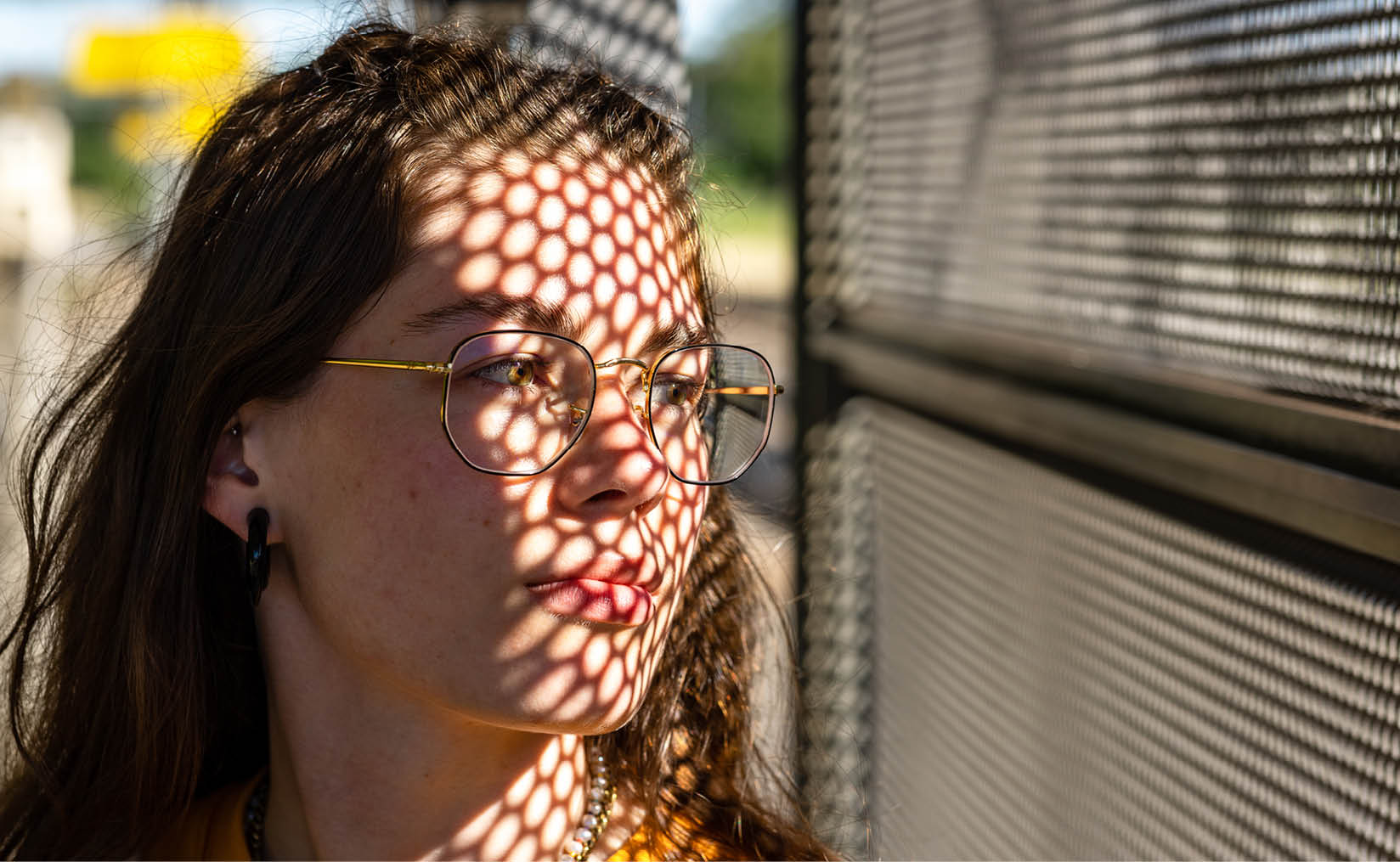
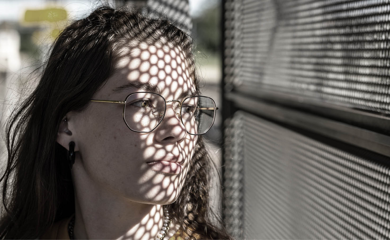
Style: Cinematic Realism
- Disarming yet understated ‘active’ and functional imagery of University people and events without overly ‘staging’ scenes.
- An interpretation of Warwick as practical and unassuming but also proactive and enterprising.
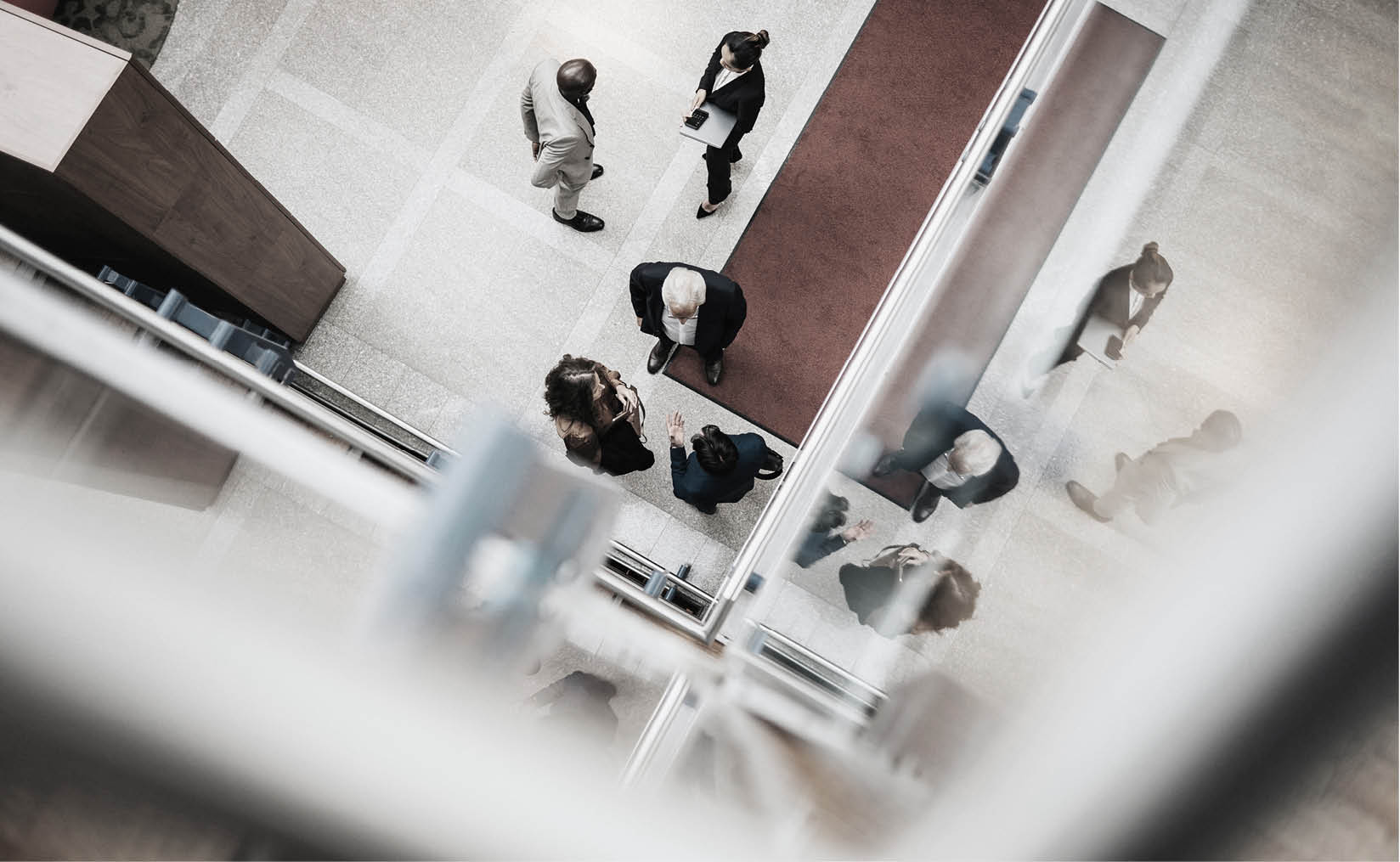
Colour Correction
Colour correction and grading are critical processes for achieving visual authenticity and tonal consistency. These adjustments should be performed exclusively by skilled professionals to ensure precise colour accuracy and aesthetic cohesion. Final videos should be graded to maintain natural colour fidelity, preserving true-to-life moments and accurate skin tones.
Black-and-white grading can be used when it suits the subject matter and narrative tone, but it should always be a purposeful and justifiable stylistic decision.
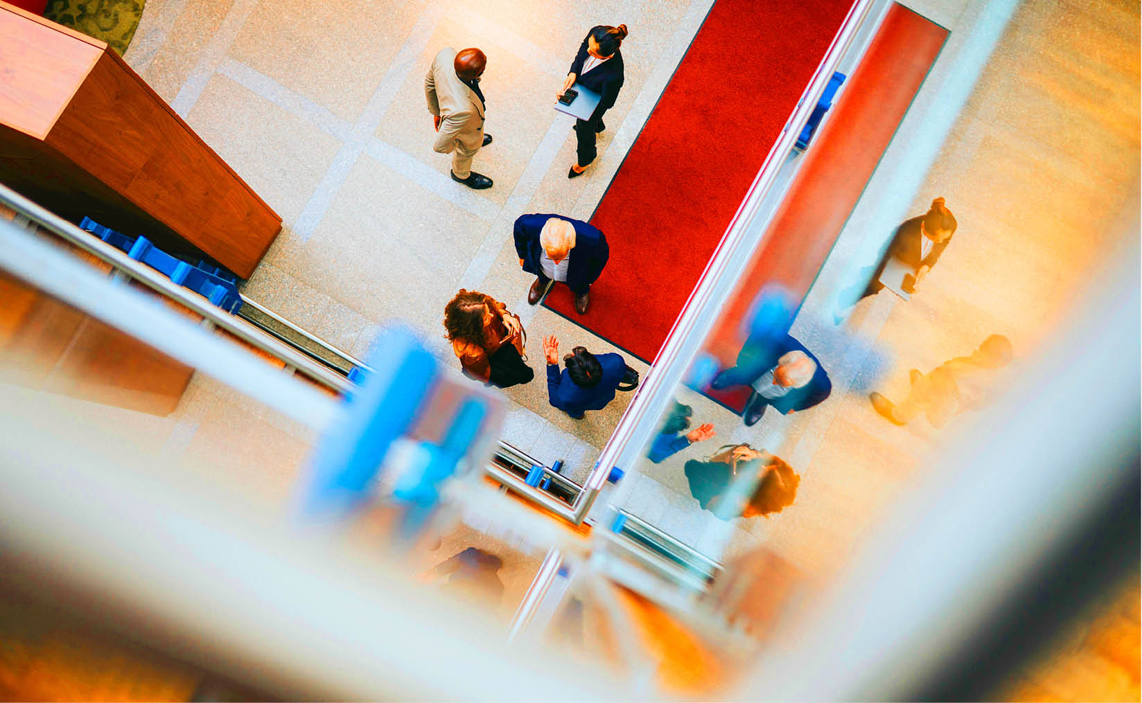
Colour Correction - What Not To Do
Avoid making the footage overly saturated or too faded.
Keep a balanced colour grade to ensure a natural, visually appealing look. Avoid excessive colour manipulation that overly favours one colour range, as this can make the footage look unnatural or excessively stylised (unless intentionally done for artistic reasons).
Strive for a colour balance that complements the storytelling without distracting from the content.

Lower Thirds Graphic
Our lower third is a branded on-screen graphic designed to display information in a consistent and accessible way. It appears as a bar in any of our primary-palette colours along the bottom of the screen, providing space for the brand logo set, names, and titles to sit.
The Wordmark is always positioned on the left, while the Crest sits on the right.
The animation begins with the bar moving in from the left of the screen followed by the wordmark, subjects name and title, and crest. These revealed one by one until all are in position.
Lower Thirds Graphic
Resolutions
There are multiple video resolution options available, but 4K (3840px × 2160px) is widely recognised as the industry standard.
Platforms such as YouTube and Vimeo automatically compress videos to optimise playback based on their specifications. However, uploading the highest possible quality ensures that the final output retains as much detail as possible.
It is important to distinguish resolution from aspect ratio — while resolution refers to the number of pixels in a video, aspect ratio determines the shape of the frame. Aspect ratio plays a key role in formatting content for different platforms and deliverables.
Below are some common aspect ratios and how they affect resolution sizes:
- TV and online hosting sites (Vimeo, YouTube, LinkedIn)
- Aspect ratio: 16:9
- Resolution: 3840px × 2160px
- Frame: Landscape
- Instagram posts
- Aspect ratio: 4:5
- Resolution: 1080px × 1350px
- Frame: Rectangle
- Instagram Stories
- Aspect ratio: 9:16
- Resolution: 2160px × 3840px
- Frame: Portrait
- Facebook videos and reels
- Aspect ratio: 16:9
- Resolution: 1920px × 1080px
- Frame: Landscape
- Facebook
- Aspect ratio: 9:16
- Resolution: 1080px × 1920px
- Frame: Portrait
- TikTok videos
- Aspect ratio: 9:16
- Resolution: 1080px × 1920px
- Frame: Portrait
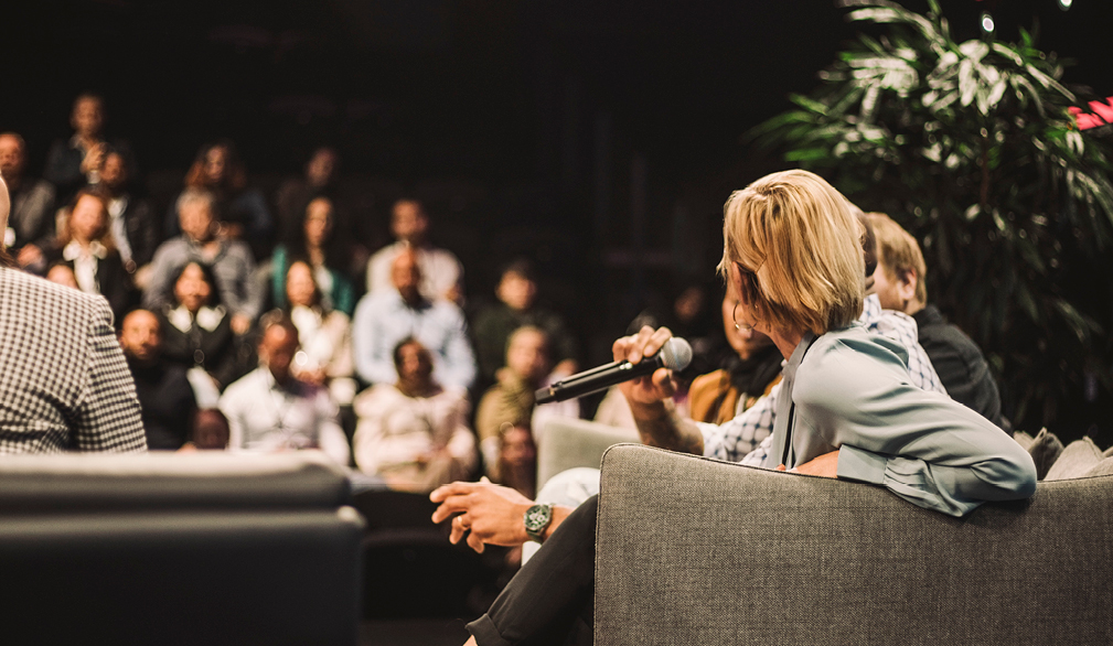
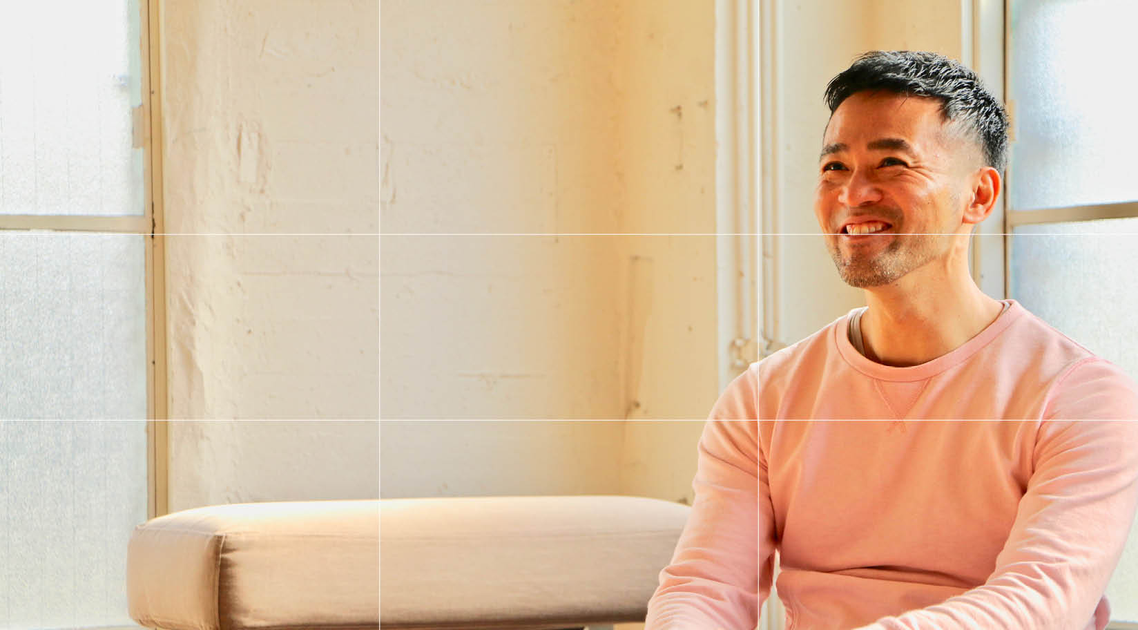
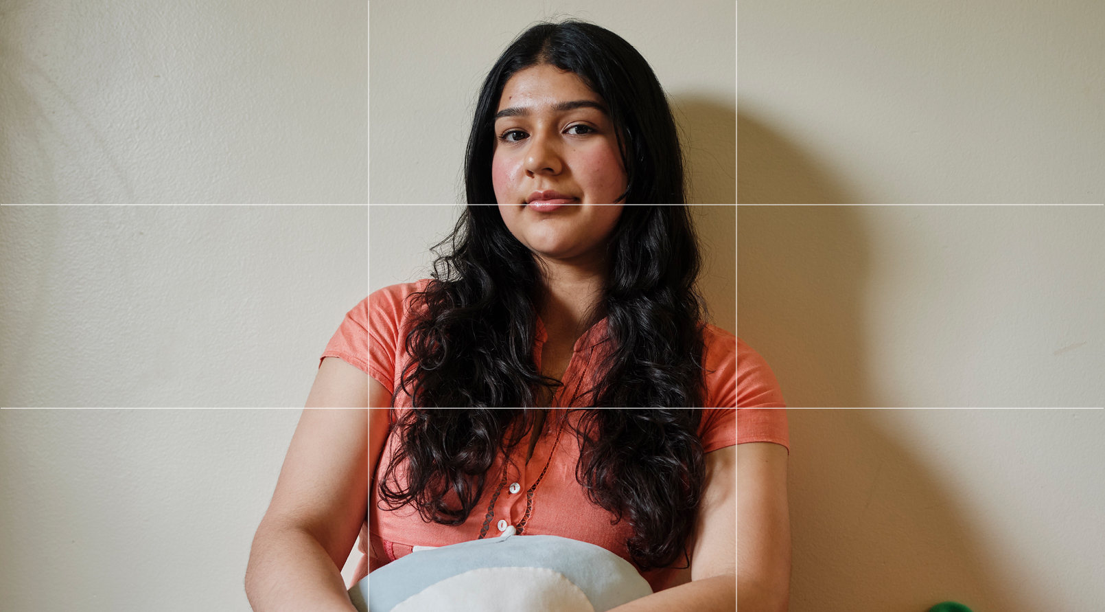
Framing Interviews
Best Practices
For a professional and visually appealing interview setup, we recommend using the rule of thirds. This widely accepted technique enhances composition by positioning the interviewee at either the top-left or top-right intersection of the imaginary grid.
To achieve the best framing:
- Keep the camera at eye level to maintain a natural perspective.
- Avoid extreme angles, such as high or low shots, which can distort the subject’s appearance.
- The interviewee can be placed on either the left or right side of the frame, ensuring a balanced and engaging composition.
Subtitles
If using subtitles, consider the caption placement on videos and refer to our brand typeface & colour sections for styling. Always ensure there is enough contrast for subtitles to be legible.
Framing Interviews - What Not To Do
Here are some examples of what should be avoided when framing interviews:
- Do not leave too much room above the subject.
- Do not position the subject too far to the left or right of the frame.
- Do not use really low contrast, otherwise the video will appear flat.
- Do not use overly dramatic or high-contrast lighting that is poorly judged, as this can take away focus from the interviewee.